
From awkward entryways and kitchen layouts to mucked-up circulation and wasted space, sometimes floor plans feel a little off. While you may think your home will need a complete overhaul to fix it, the truth is the smallest design adjustments can make a big impact—more than you can imagine.
The Christie Architecture team has an eye for small moves that create big changes. When a room feels too small, has a problematic shape, or has doors and windows on every wall, we look for unobtrusive ways to make the space feel just right.
Square it up
We often find the best strategy for making a non-functional space functional is by ‘squaring up’ the plan. Imagine a square with a bite out of one corner. When that bite is out of your room, guaranteed you will wish you had that little chunk of space back. By ‘squaring’ up the plan, we eliminate weird corners and can make the space work so much better. After many years of doing this, we know that efficient floor plans are made up of square and rectangular rooms.
Whether you are thinking about a problematic space in your current home or evaluating the possibilities of floor plans as you are house-hunting, here are some small moves, big changes to inspire you.
Small Moves Big Changes at Hawkridge Modern
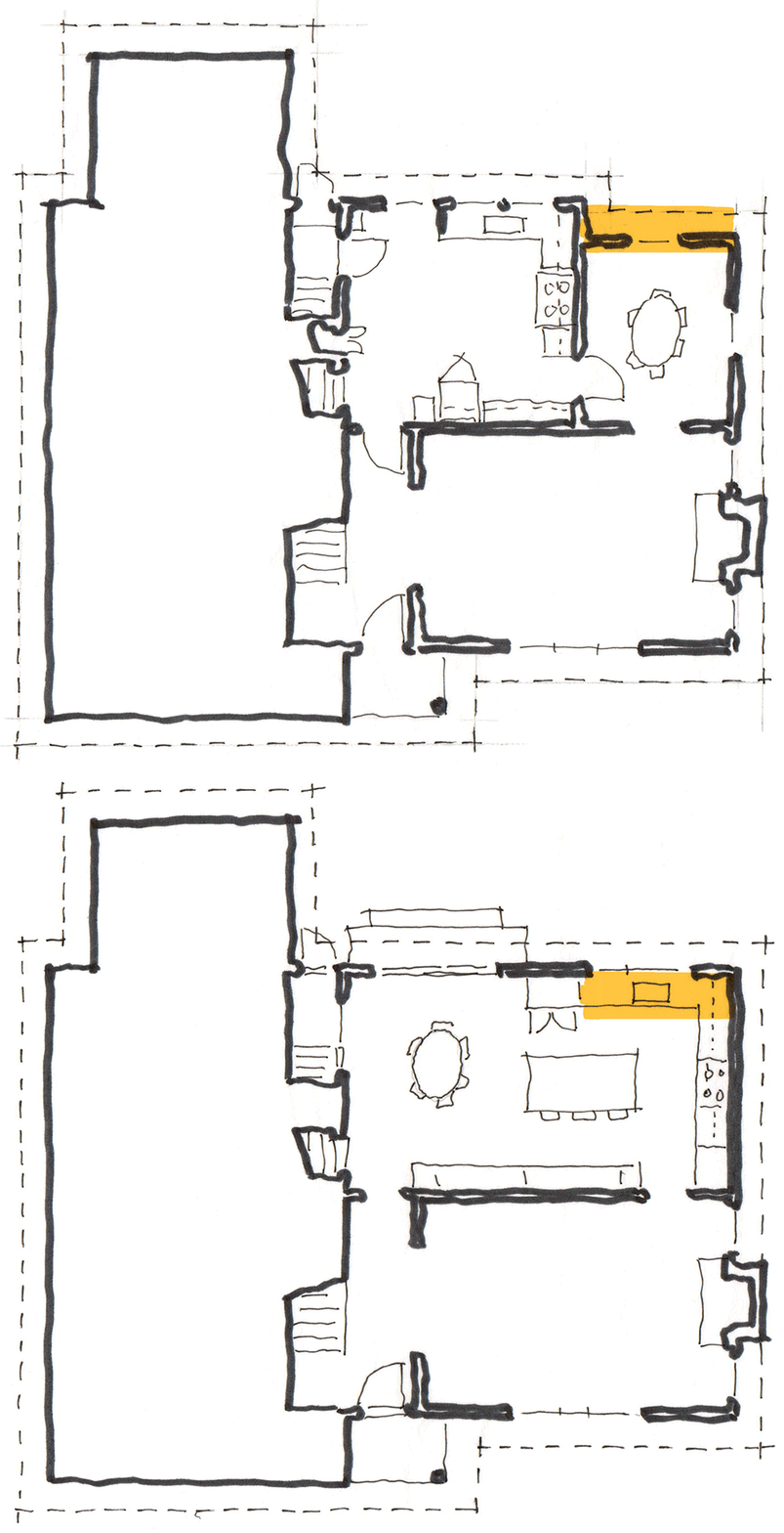
Challenge: The existing kitchen in this home was small and awkwardly configured. There was a dining area within the space, but no island. This client wanted an island–a space for food prep, a place for the kids to do homework, and a spot for guests to sit and enjoy mealtime conversations.
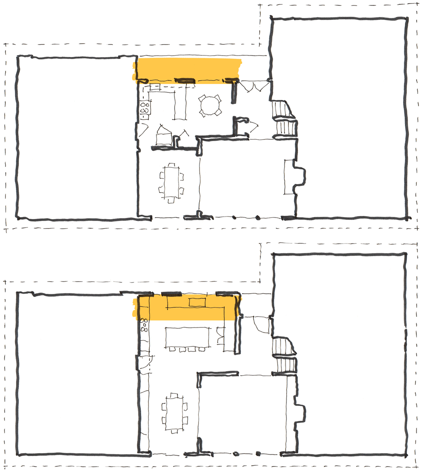
Solution: A 74-square-foot addition made all the difference in this kitchen design. The space was acquired entirely under the existing eave, so no changes to the roofline were required. In addition to capturing the additional square footage, we tore down the wall between the kitchen and dining room.
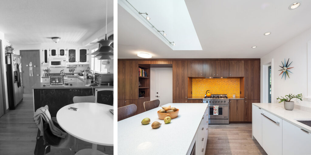
Now the kitchen feels twice as big. It has ample storage, functional prep space, and that coveted island.
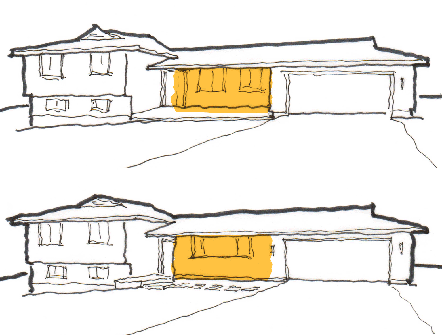
This small move also created a big impact at the exterior. Instead of walking right next to the house on their way to the front door, guests now traverse a new path separated from the house by lush landscaping. No more peeking in the windows!
Explore more Hawkridge Modern before/after plans and photos.
Small Moves Big Changes at Marshall Park Renovation
Challenge: Sometimes a small move plays a special role in a whole house remodel. In this project, the existing laundry room was located in the basement. Who wants to tackle the stairs if they don’t have to? A peculiar closet in the hall on the first floor (with a window in it) presented a unique opportunity to transform a useless and difficult-to-access space into something efficient and useful.
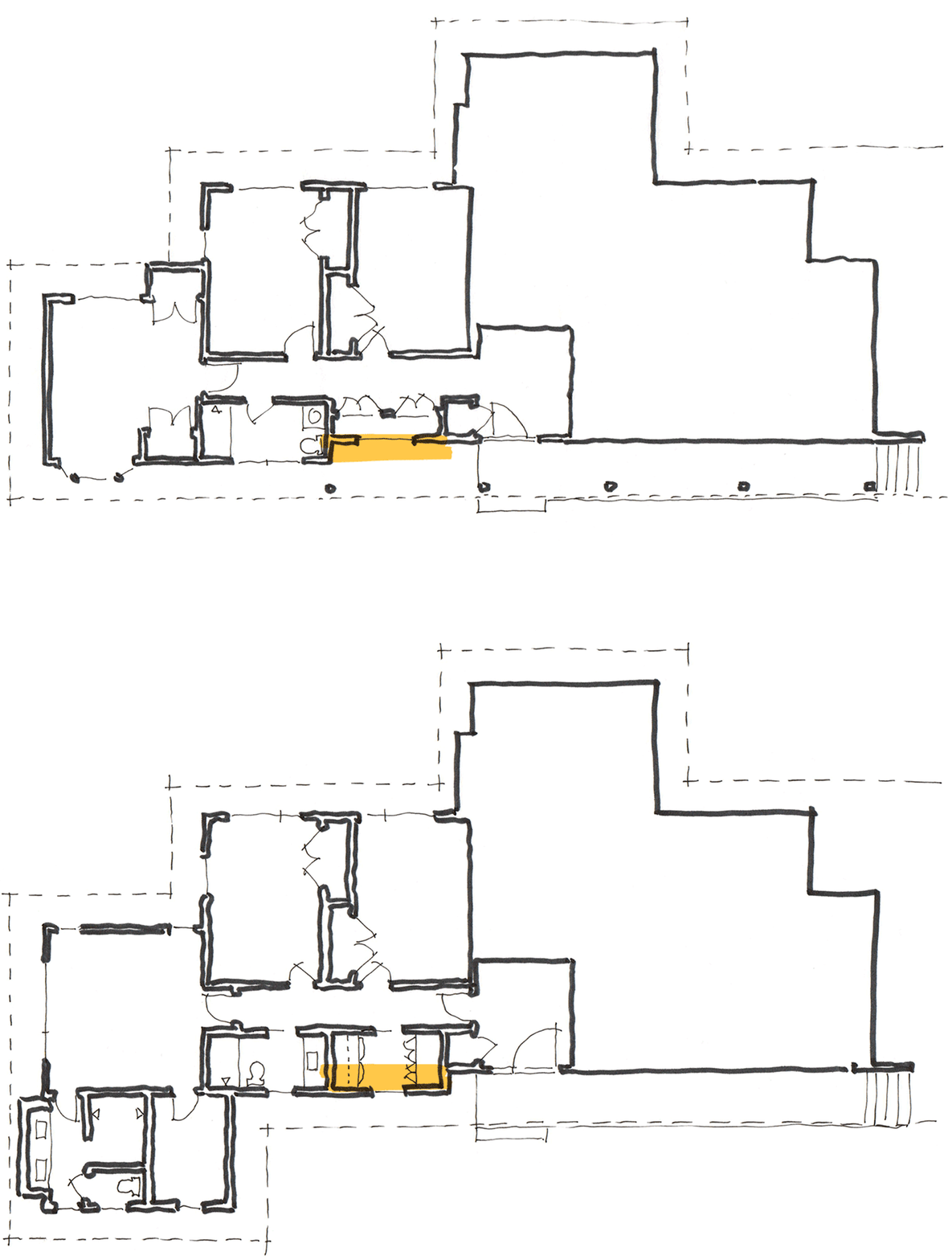
Solution: We love to make the most of wasted space. We grabbed a little extra room from the hallway and pushed the closet wall out 24 inches to line up with the main exterior wall. Voila! A 17.5-square-foot addition. Like the previous project, the addition was created entirely under the existing eave, so no changes to the roofline were required. This acquired enough space to get the laundry out of the basement and on the first floor, right next to the bedrooms. What is more efficient than having a laundry room across from a teenager’s room?
Small Moves Big Changes at Concordia Renovation
Challenge: When a kitchen has a door and window on every wall, it can feel more like a hall than a kitchen. This existing space was small with an awkward configuration, and no room for an island.
Solution: A 22-square-foot addition set the stage for a complete kitchen overhaul. We tore down the wall between the kitchen and dining room and flipped their locations in the plan. The small addition created enough space to square up the room and provide a proper kitchen configuration with a full island and dining room.
Now the kitchen has full walls for cabinets, appliances, and storage. And the new location minimizes disruptions in the kitchen work zone. The spacious dining room area serves as a natural pass-through space with improved access to the backyard.

Since this addition was not under the eaves, adjustments were made to the roof to make everything work out just right.
While this small move looks simple, it was a structural challenge. A big beam was wedged into the ceiling to hold up the second floor, but it also needed to be concealed to maintain the clean aesthetic of the new kitchen. Thank you to Hamish Murray Construction for helping us make a big impact with this small, complicated move.
Learn more about the successful plan flip at Concordia Remodel.
Small Moves Big Changes at Happy Valley Kitchen
Challenge: Remember what we said about squaring things up? This house had two bites out of the plan and lots of awkwardness. The island had a cooktop with no room for seating or food prep. There was no room for large, modern appliances and the kitchen table blocked access to the exterior. The corner window over the kitchen sink had a view of a fence and the family room was just too small for much of anything.
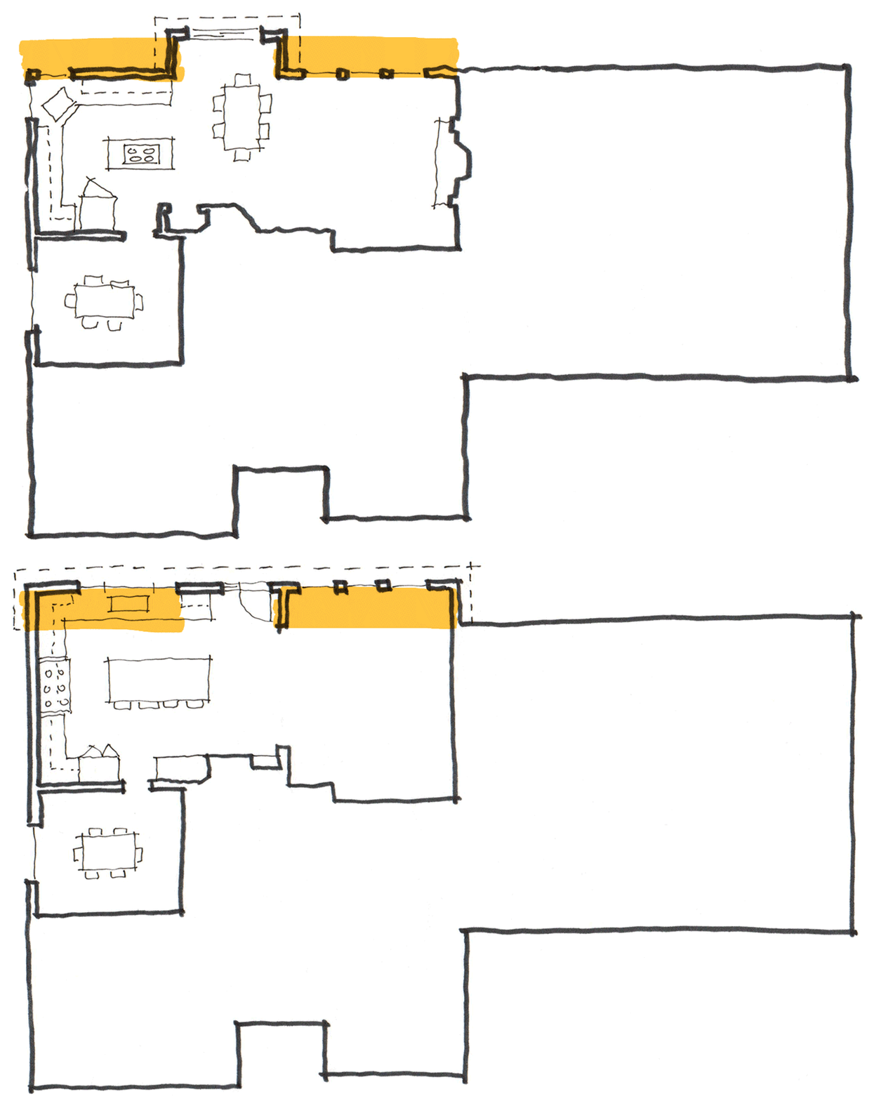
Solution: Square it up and square it up again! A 72-square-foot addition will be added to the house to square up the space. This single-story addition will extend to align with the small one-story bump-out already on the house. 34-square-feet will be added to the kitchen side and 38-square-feet to the family room area.
Simple, right? Well, once again a bit more complicated—but it will be worth it. The project requires two, 20-foot-long by 10-inch deep steel beams (one for the kitchen and one for the family room) that will weigh over 800 pounds each! And of course, we did not want to see the beams, so they will be recessed into the ceiling.
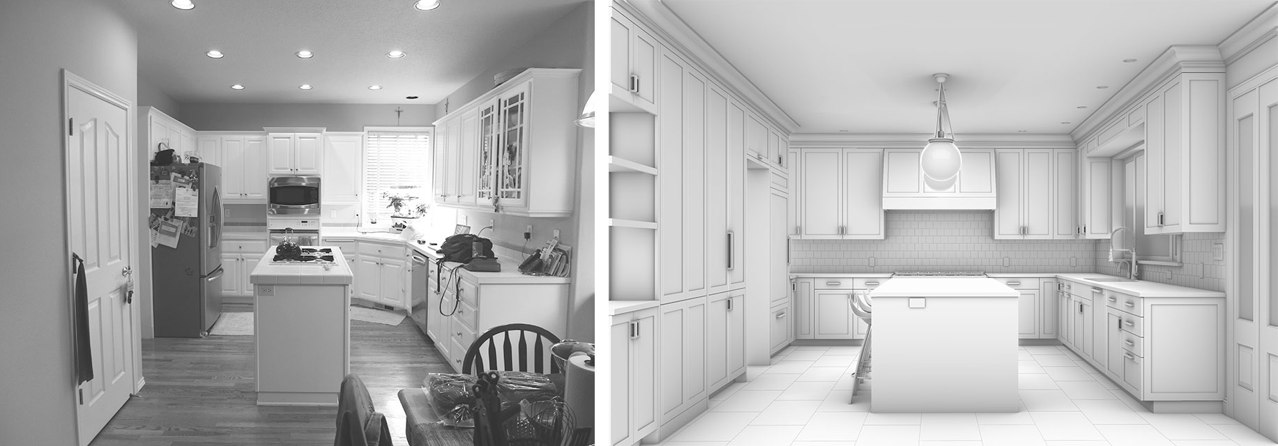
The new and improved kitchen design has space for an island that supports both food prep and seating. The plan accommodates a 48-inch wide range and a 36-inch wide built-in fridge. A new big window over the kitchen sink will look out at their lovely landscaped backyard and the family room will have space for proper furniture.
Small Moves Big Changes at NE Dormer
Challenge: We even love tackling small moves in our own homes. This former house of ours had an attic with two bedrooms but not enough space for a bathroom. It’s no fun to go down a flight of stairs to pee in the middle of the night! And don’t get us started with storage. The existing closets had sloped ceilings—pretty terrible for storing anything.
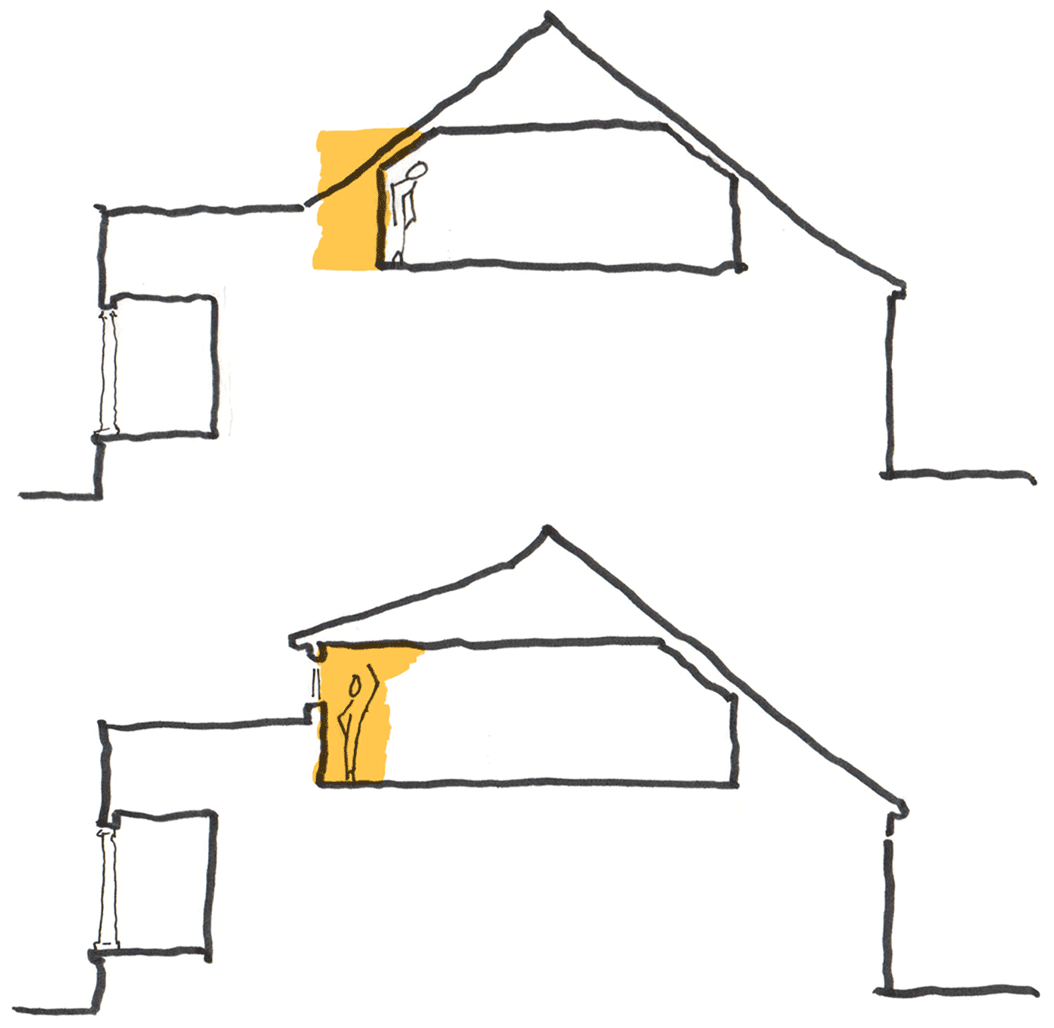
Solution: The right answer to this space challenge was to build a shed dormer on the front of the house, squaring up the ceiling. This added 22 square feet, but it feels like so much more! The unusable sloped portion of the existing attic became a full-height space. Now there are two bedrooms (the larger one includes a sitting area), good closets, and a full bathroom.
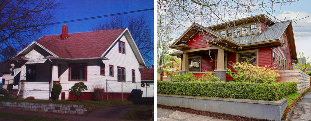
Dormers are great examples of the maximum impact of a small addition. While it is actually very little new floor space, you get a lot of new usable space because you gain head height where there wasn’t any before. A shed dormer on the front of a house also adds visual interest to the street presence and opens up the second floor to the street. You can now see out the front of your house. Hello neighbors!
Ready to make a big change with a small move?
As you can see, awkward spaces and funky floor plans can be full of opportunities for improvement. We love a good space plan challenge and helping clients maximize the potential of their homes. Let’s explore the small move options in your home.
