Visit our website on your desktop for more project info.
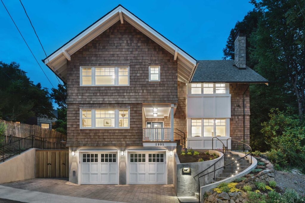
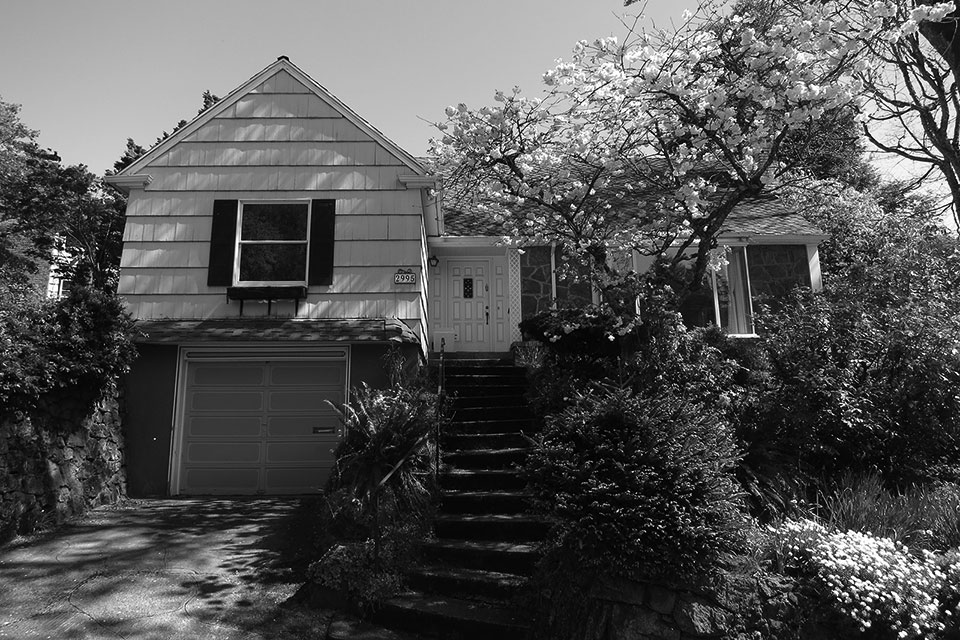
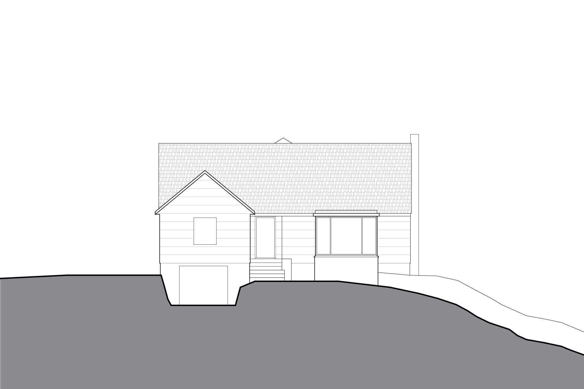
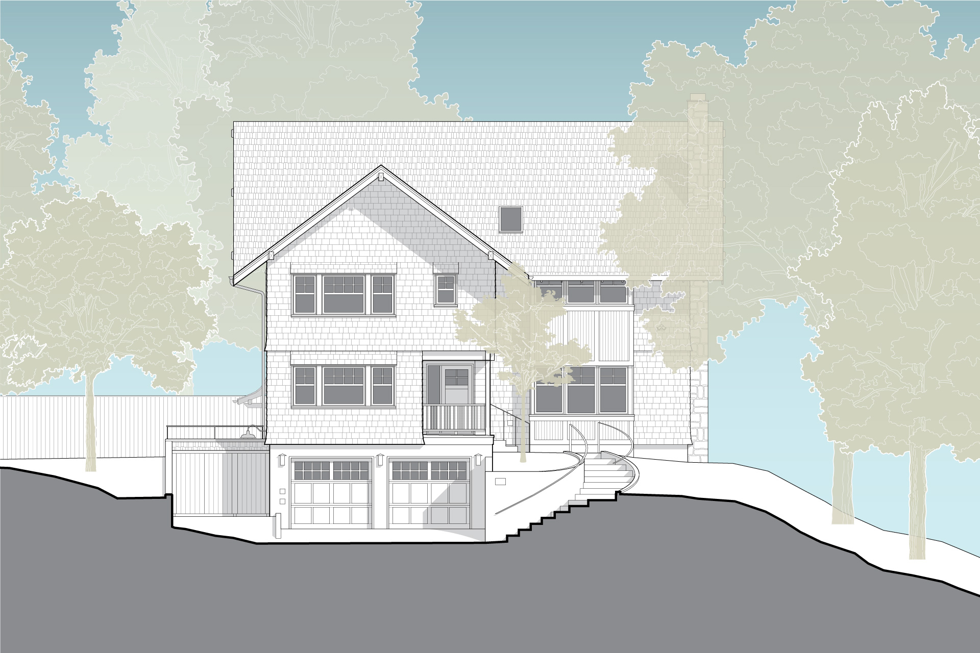
The owners of this 1940s single-story house were expecting, so they wanted to expand their home to meet the needs of their growing family. The list of ‘needs improvement’ areas included—a small one-car garage, low ceilings in the basement, a compact first-floor layout and minimal second-floor space. A savvy design strategy makes this a masterminded down to the studs remodel. The key to this plan started by digging the basement deeper.
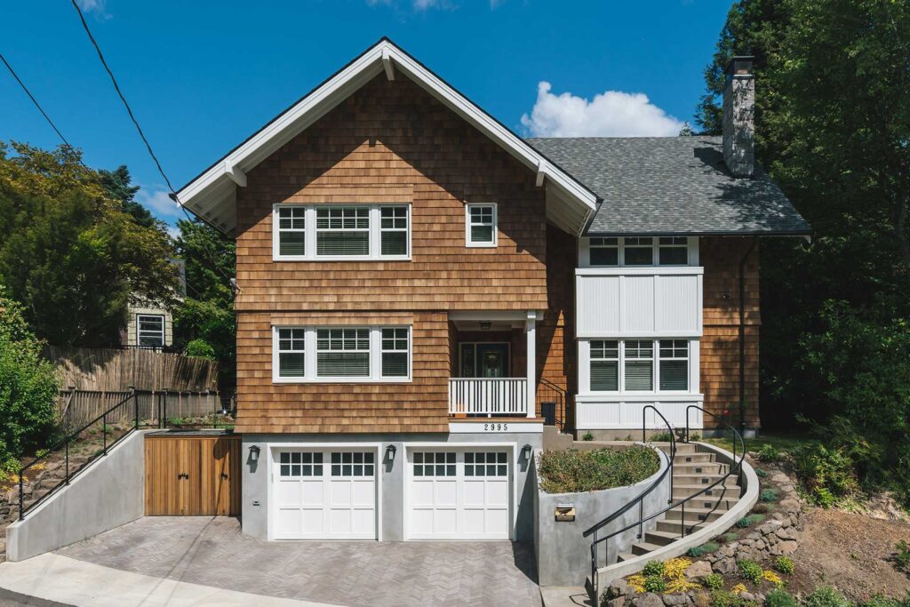
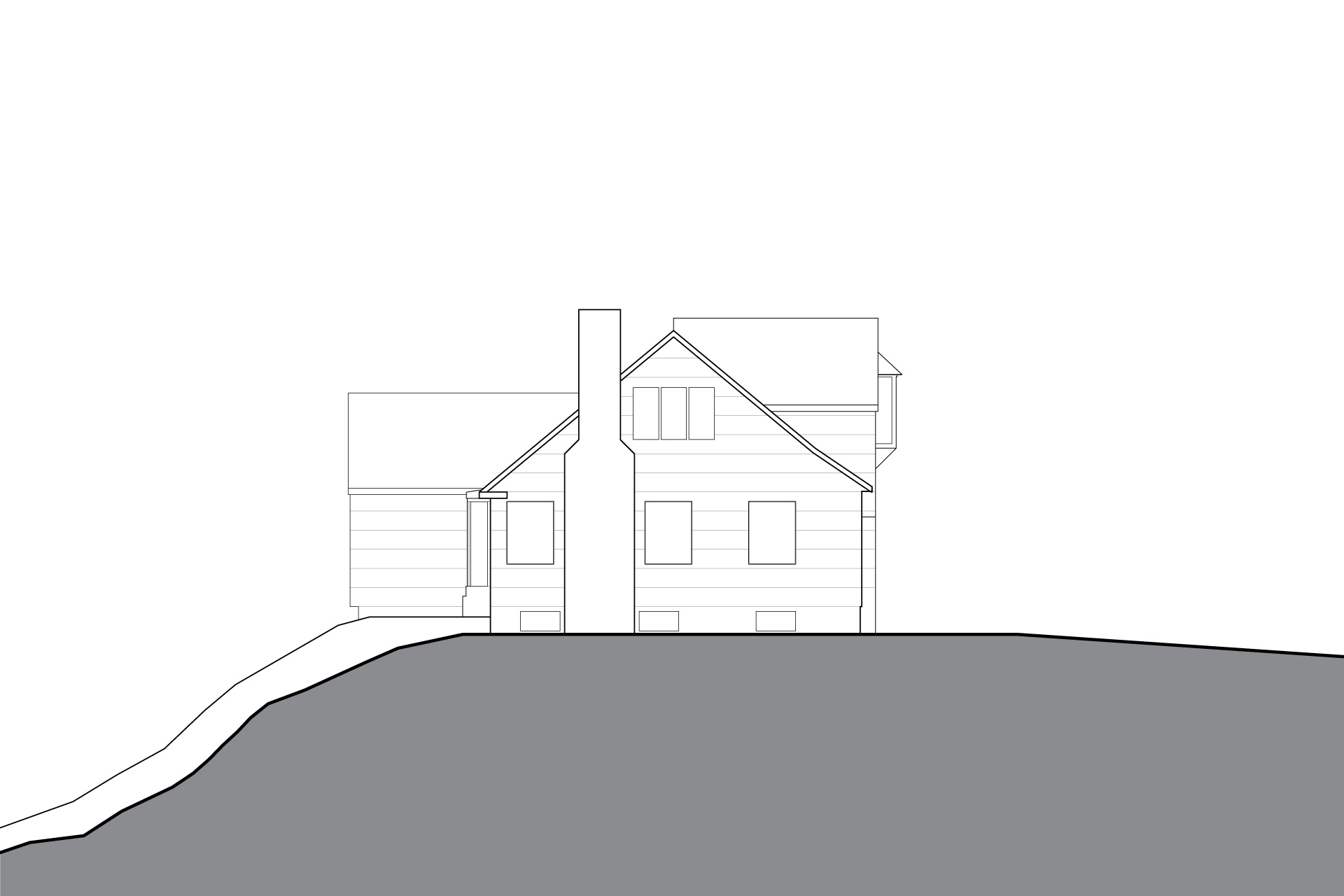
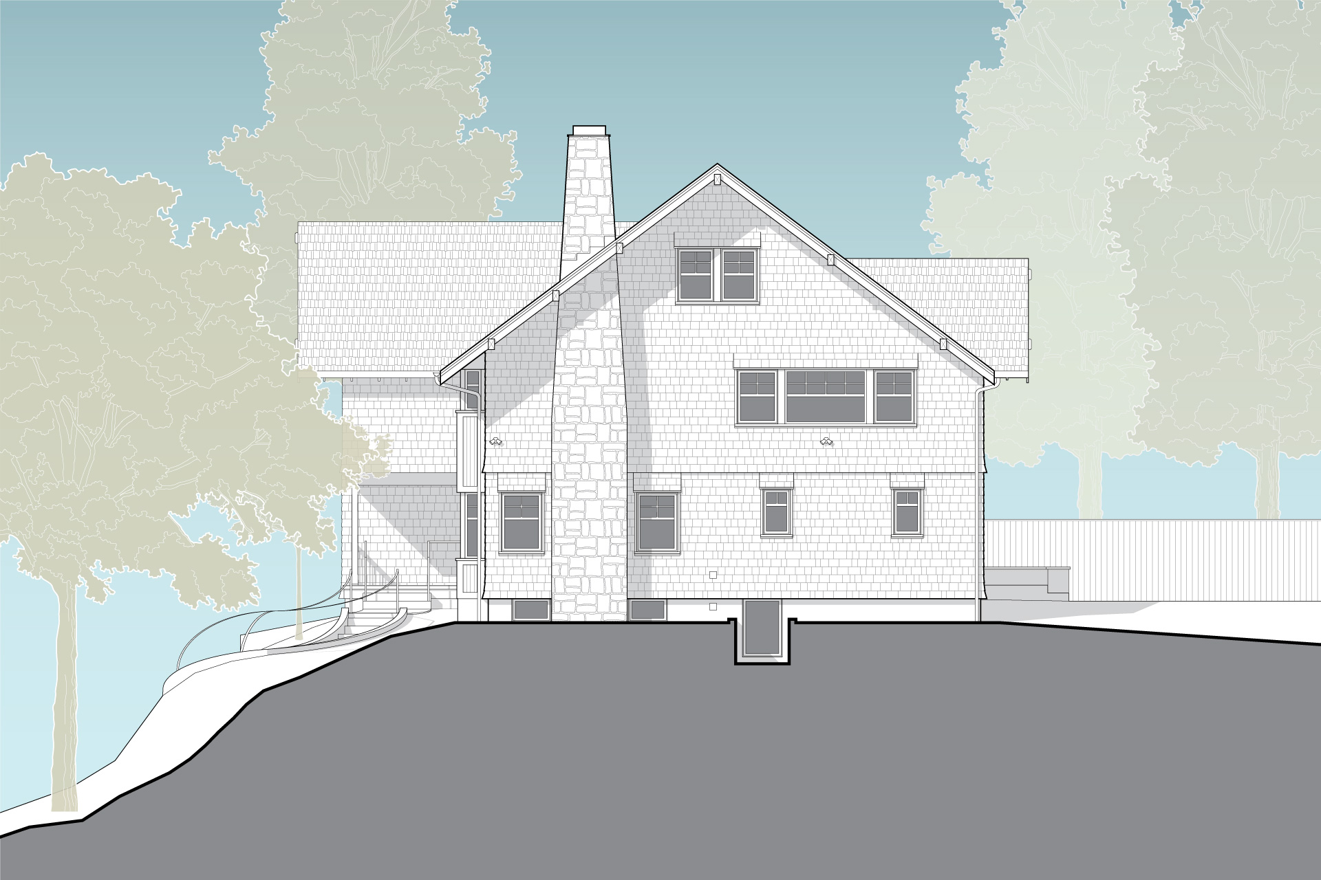
In addition to changes below grade, the remodel involved removing everything above the first floor and gutting the remainder of the structure down to the studs. In the end, the home extends upward to include a second floor and occupiable attic.
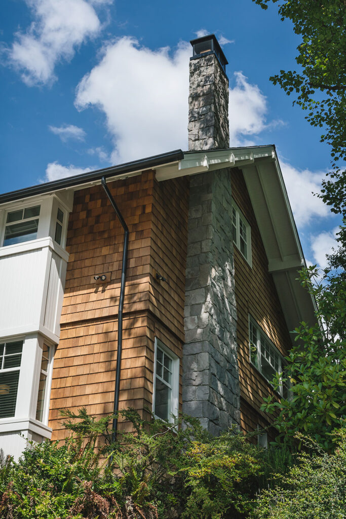
A down to the studs remodel is an opportune time to address critical energy-saving ideas.
For example, rainscreen cladding with exterior insulation at the walls provides several benefits. It allows the wall cladding to dry as well as reduces energy leaks. And it allows the mechanical system to be right-sized. At the roof, this strategy starts to look foreign as it inflates the roof edge beyond the expected traditional lines. However, foam insulation, sprayed just underneath the roof deck, solves the problem. Furthermore, this insulating supports the entirety of the building volume. It also prevents some of the leaky spots associated with traditional construction while providing traditional exposed wood-framed eaves.
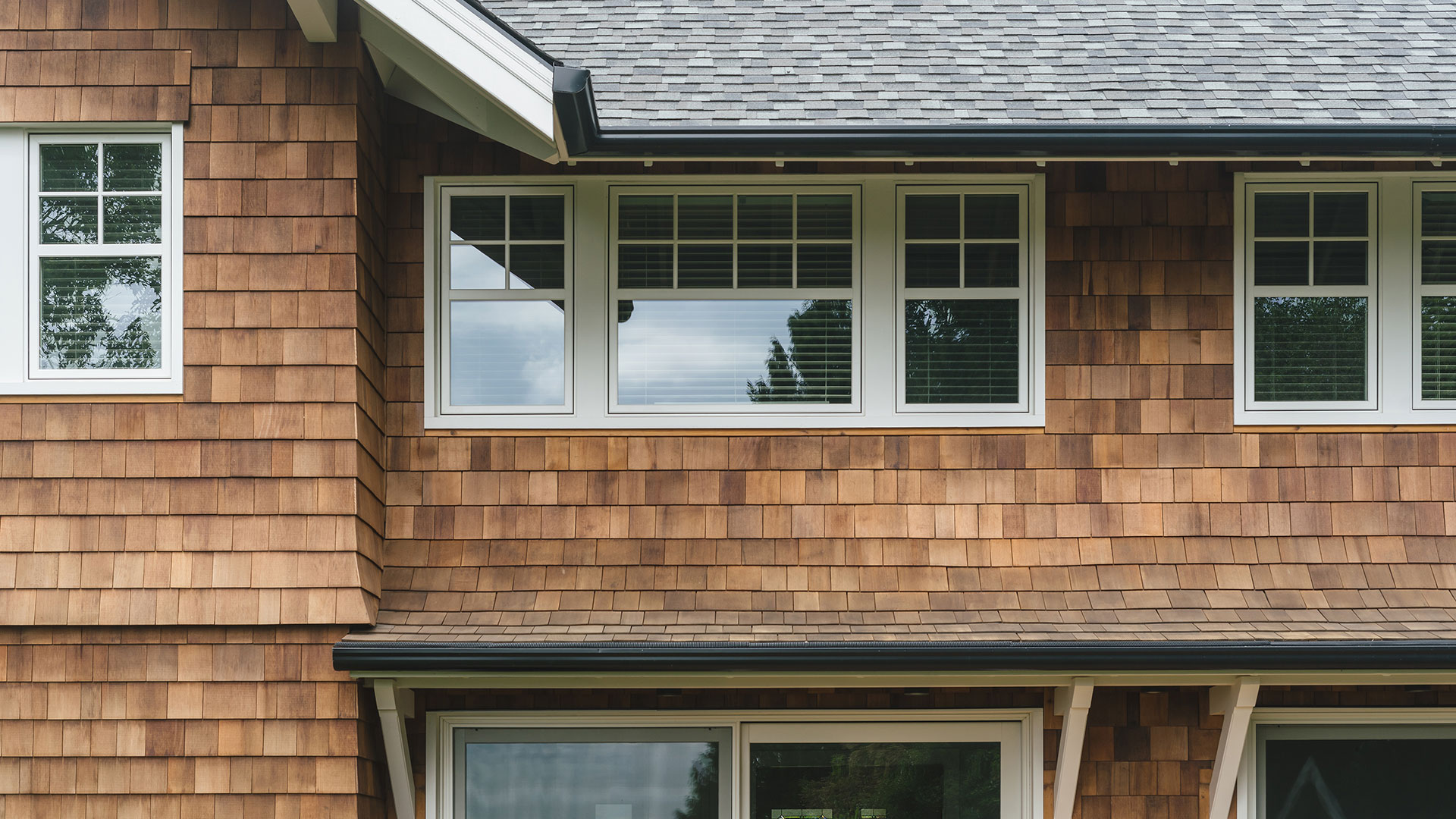
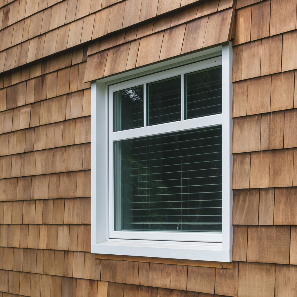
In addition, a custom flare detail divides the floors in the shingle cladding. This breaks down the perceived height of the structure while adding a lovely shadow line.
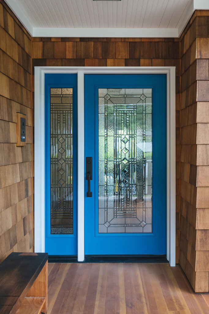
A heavy 9/4 (two-inch) window trim suggests traditionally built solid wood windows.
However, the windows are actually modern insulated casements with simulated cottage-style divided lights. The shingle flare detail extends to each window, creating a natural drip that tucks up under the siding.
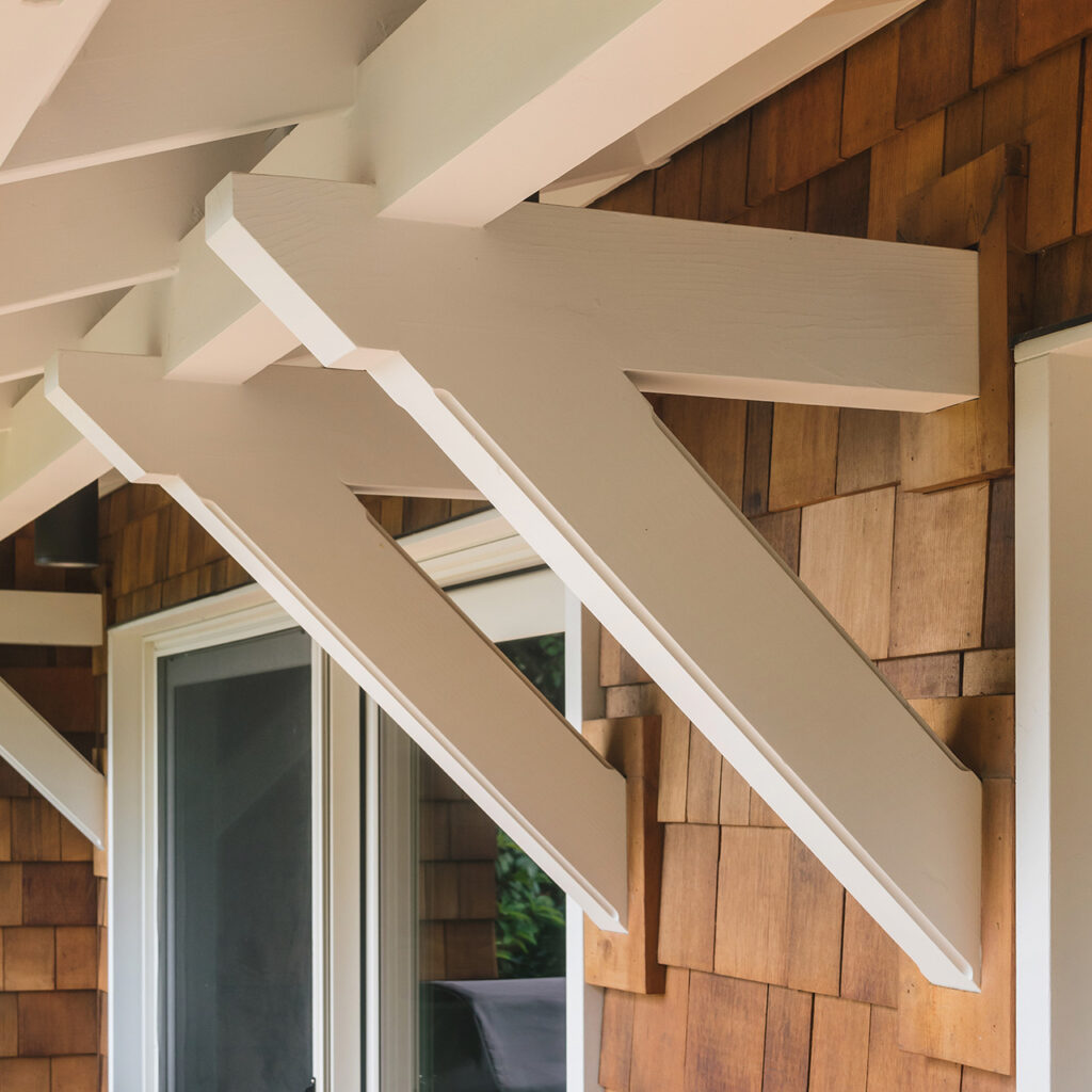
At the rear of the home, custom brackets support an awning. This detail breaks down the scale of the two-story elevation and provides a shaded respite space. If you want to step outside on a rainy day, this protected spot keeps you dry while you take in the breathtaking view of Mt. Hood in the distance.
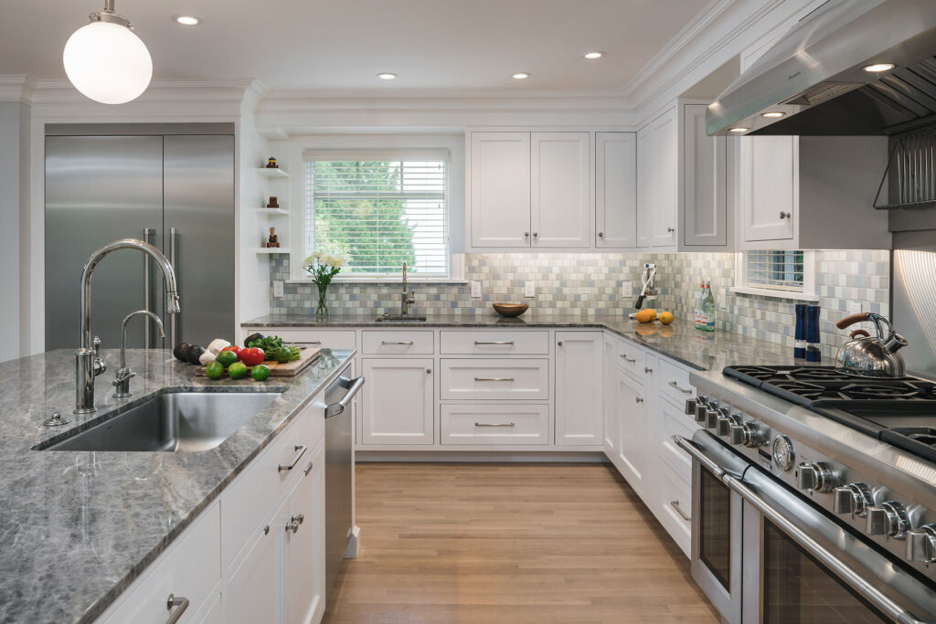
The revamped layout supports a large, luxurious kitchen. Granite counters, stainless steel appliances and polished nickel fixtures add a touch of shine. Painted cabinets and crown mouldings complete the look.
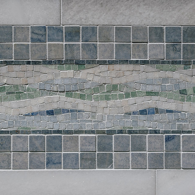
The Clayhaus tile backsplash is a tapestry of soothing blues and greens, the client’s favorite collection of colors.
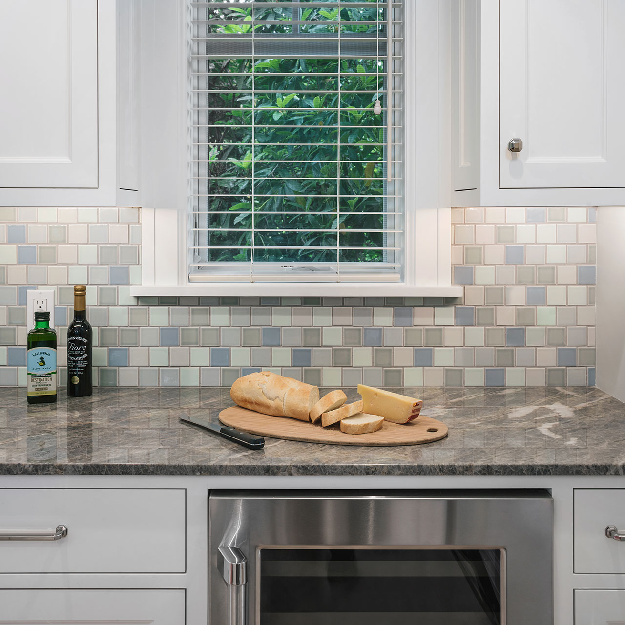
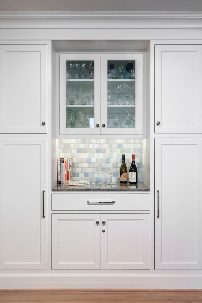
The delightful tile provides a kaleidoscope detail in the dining room niche.
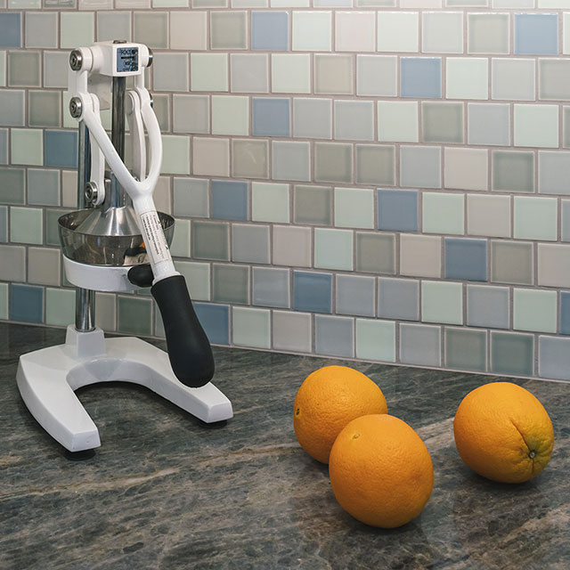
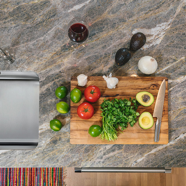
Details, details and more details.
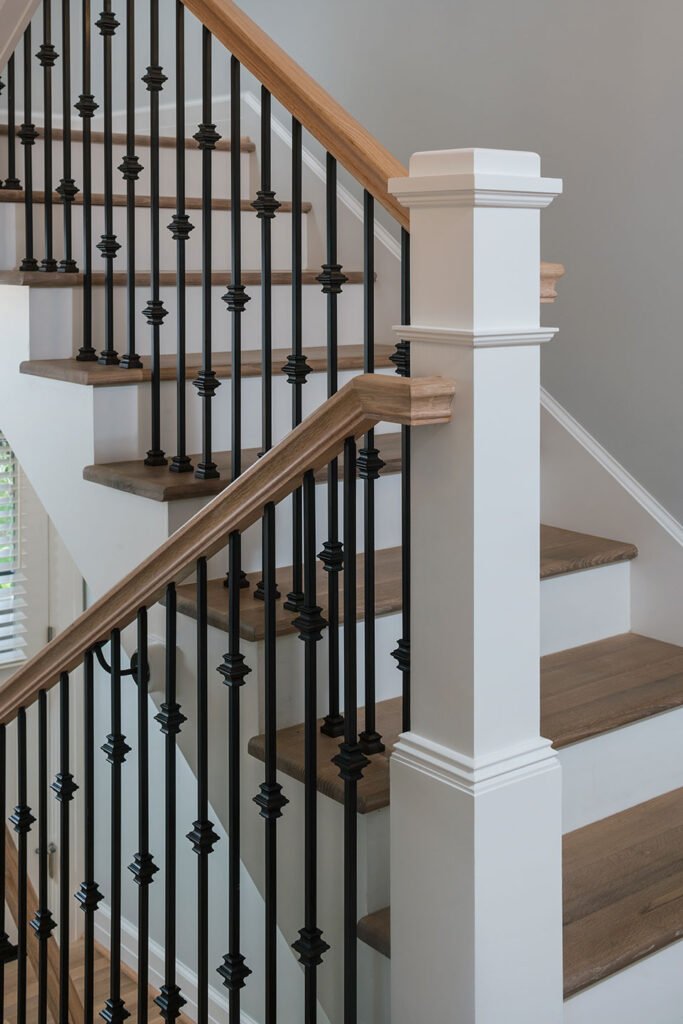
The stair design provides the classic white riser-wood tread combo. White oak treads and black iron pickets continue the traditional design.
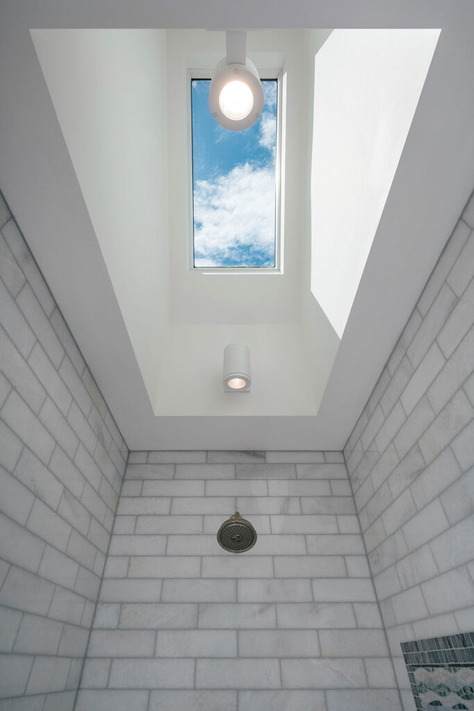
A dramatic skylight infuses the walk-in shower experience with ambiance—casting fun shadow shapes across the luxurious tile surfaces day and night.
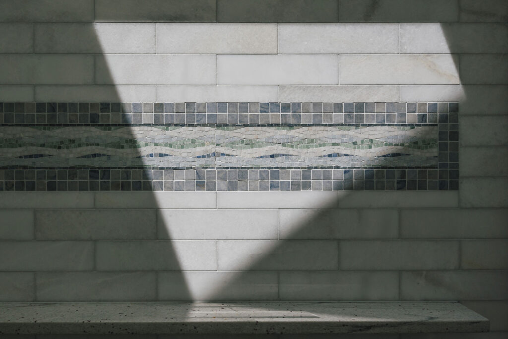
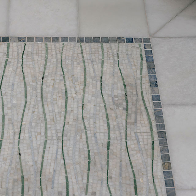
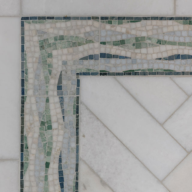
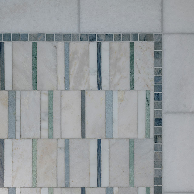
Tile is the design hero in the bathroom—gorgeous tile details everywhere.
