Visit our website on your desktop for more project info.
This 1960s split-level was a good home, but it was time to make it better. It lacked the charm and detail of a true home sweet home. And it needed a little reorganization. The design strategy makes subtle changes for maximum impact — a residential remodel that improves the home’s look and feel as well as its function.
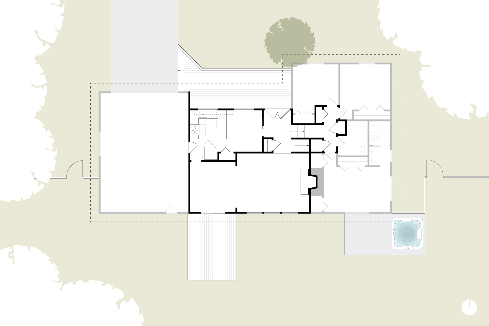
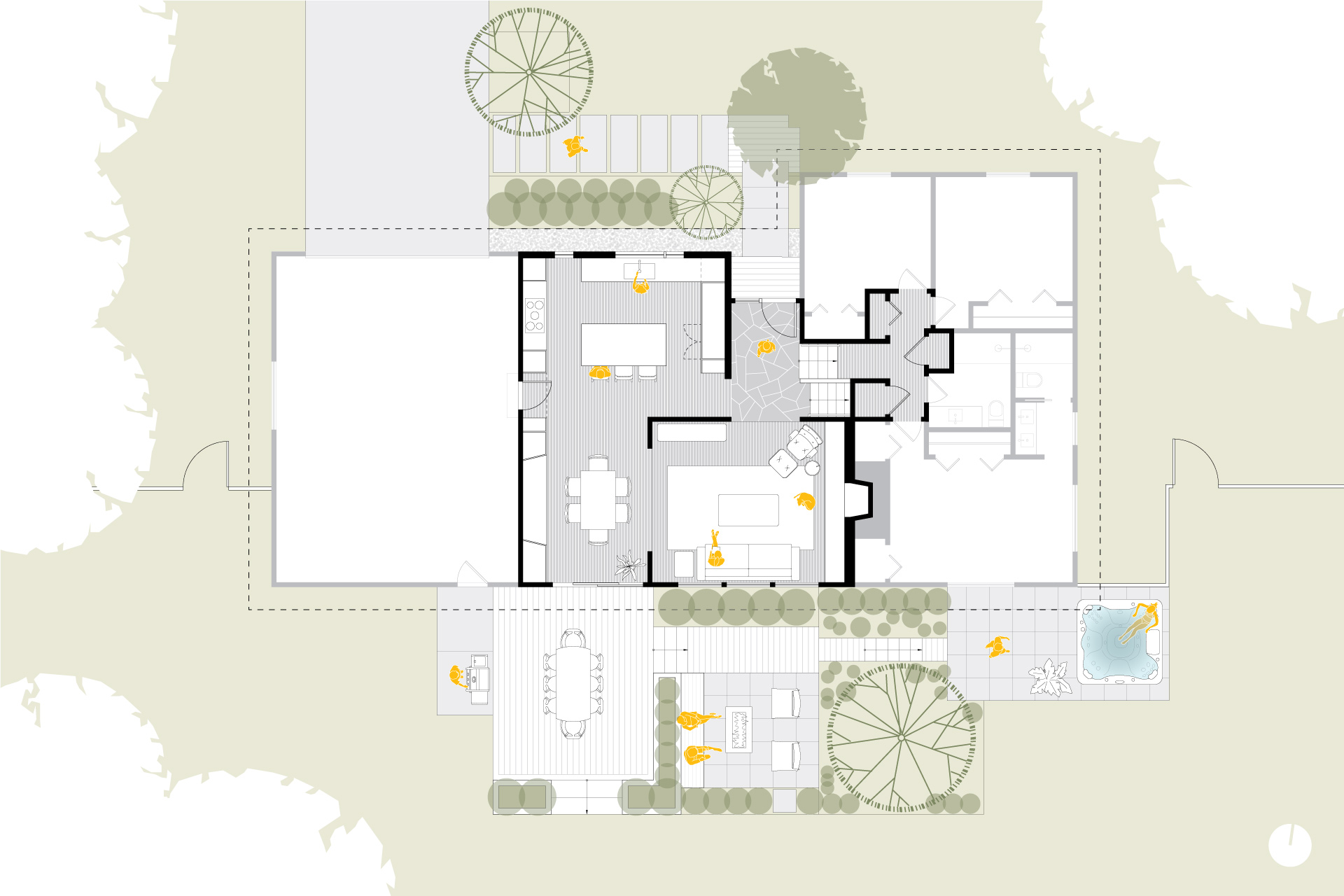
Sometimes, adding the smallest amount of space can make all of the difference. The remodel pushed the front wall of the house out by four feet, while maintaining the existing eave and roof line. This realignment, combined with a clear landscaped walkway, allows for a more defined entry sequence. Guests now experience a real sense of arrival at the well-appointed front door.
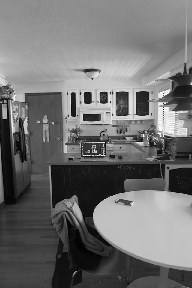
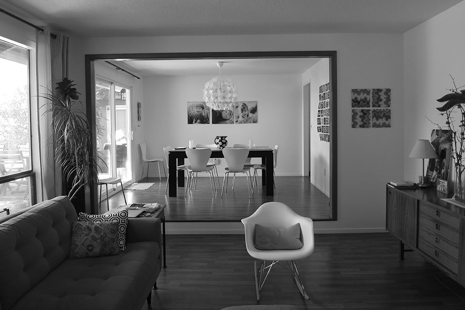
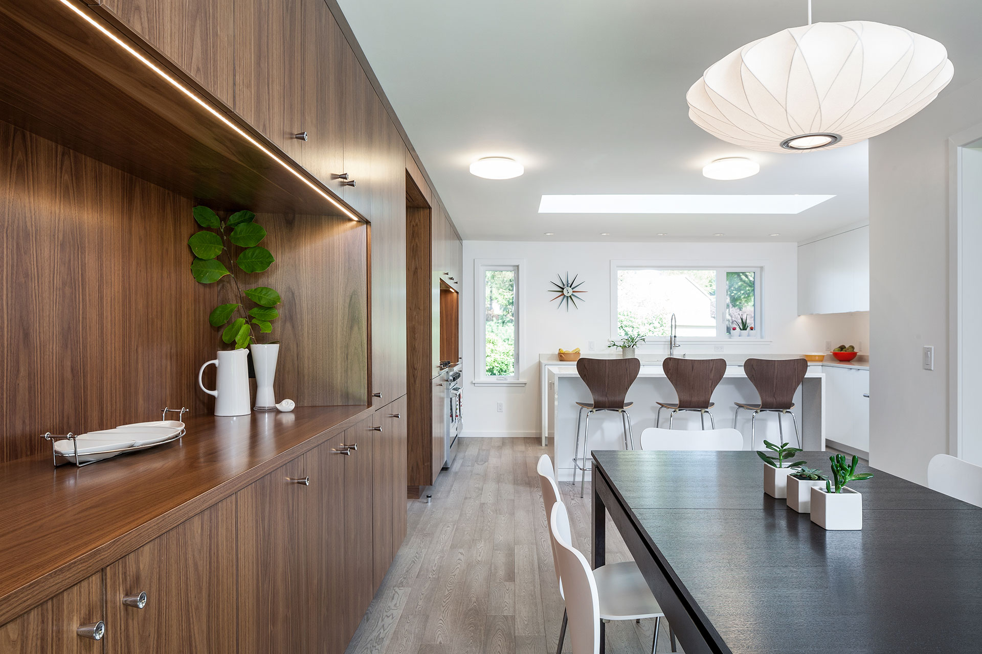
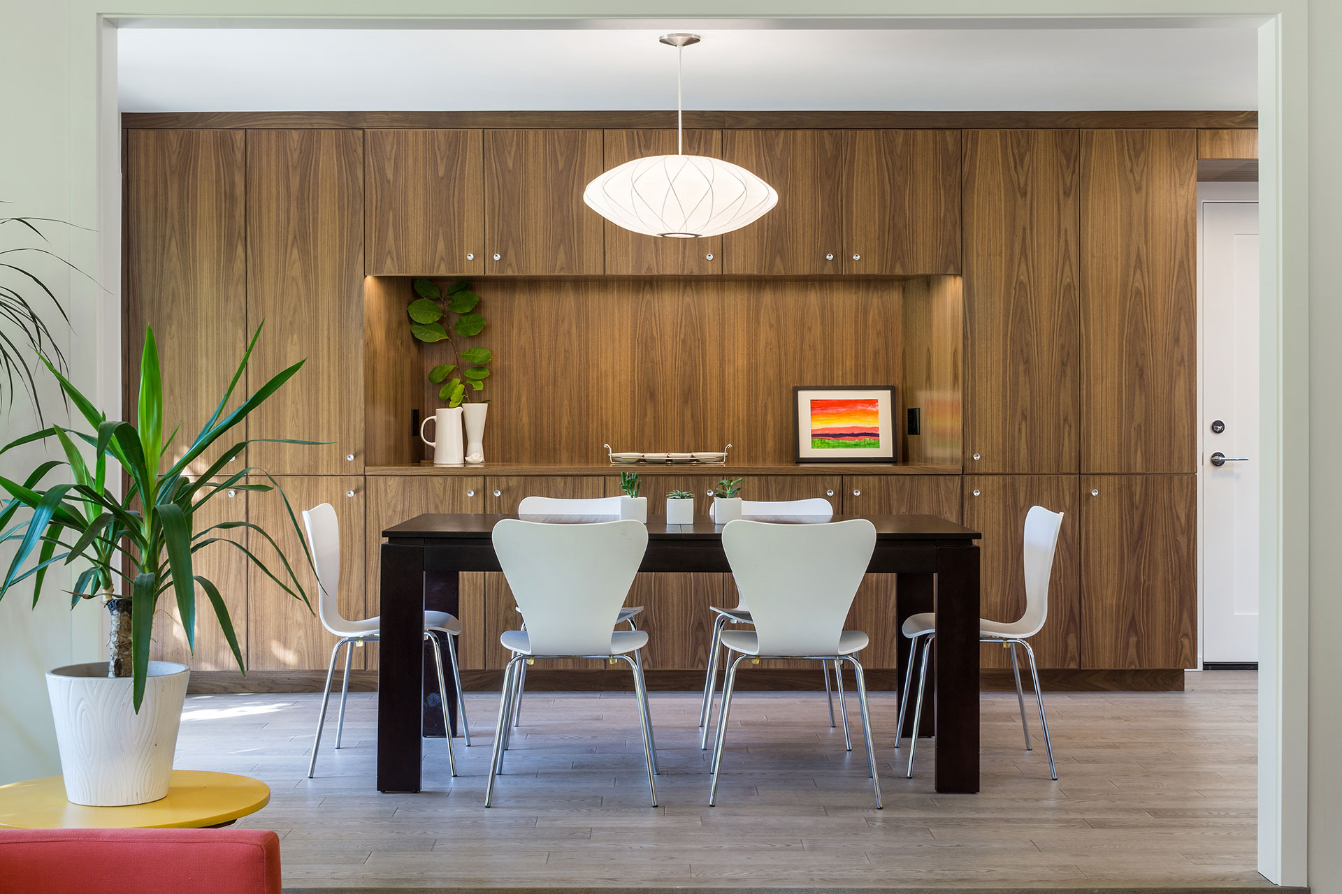
Other space adjustments included the removal of the wall between the kitchen and dining room and the removal of an entry hall closet. A wall of walnut cabinets spans the kitchen and dining area, creating connectivity and consistency.
Now, the flow and feel from one space to the next make perfect sense.
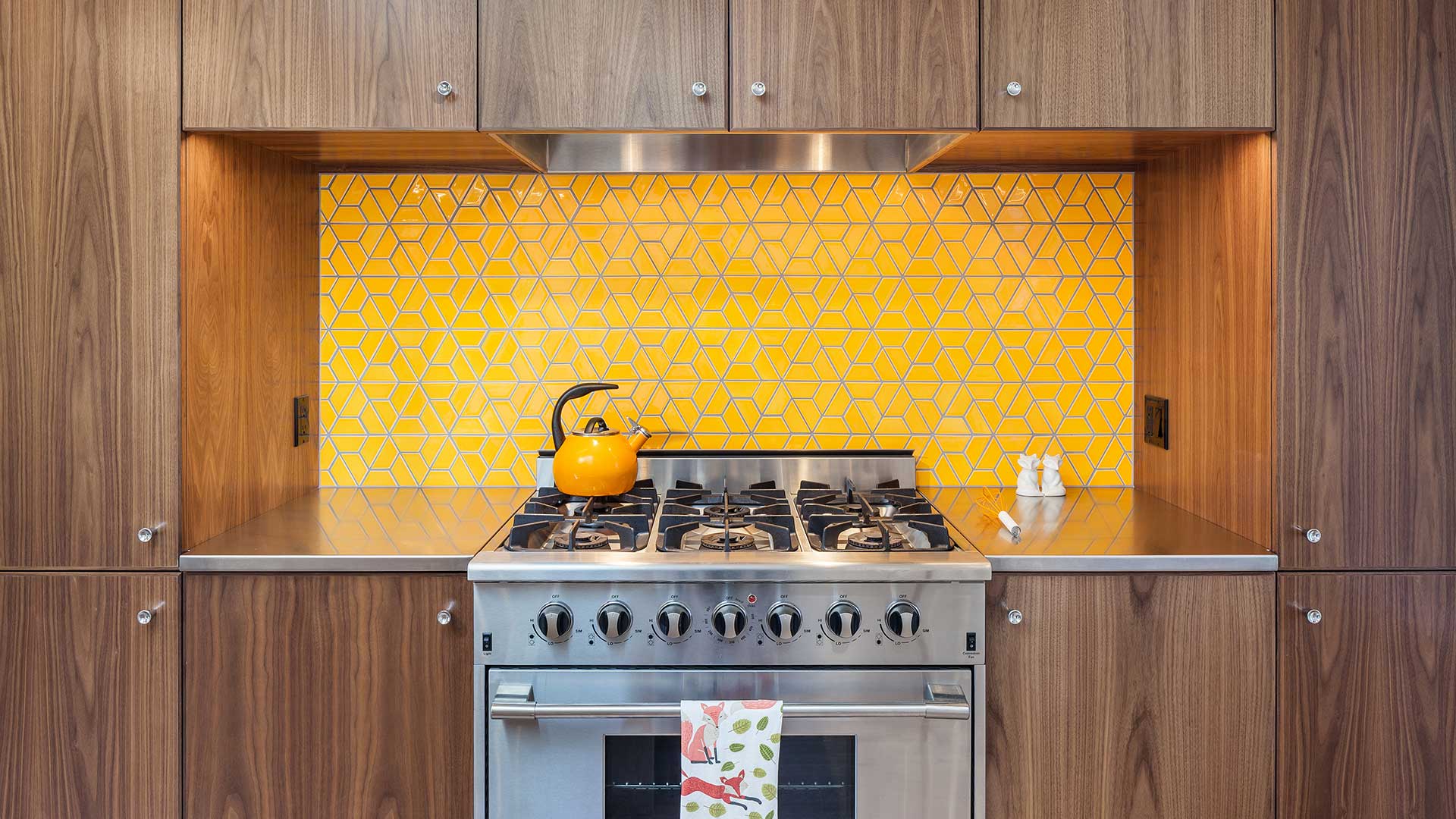
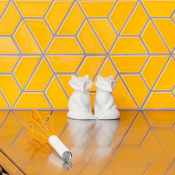
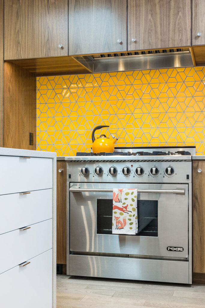
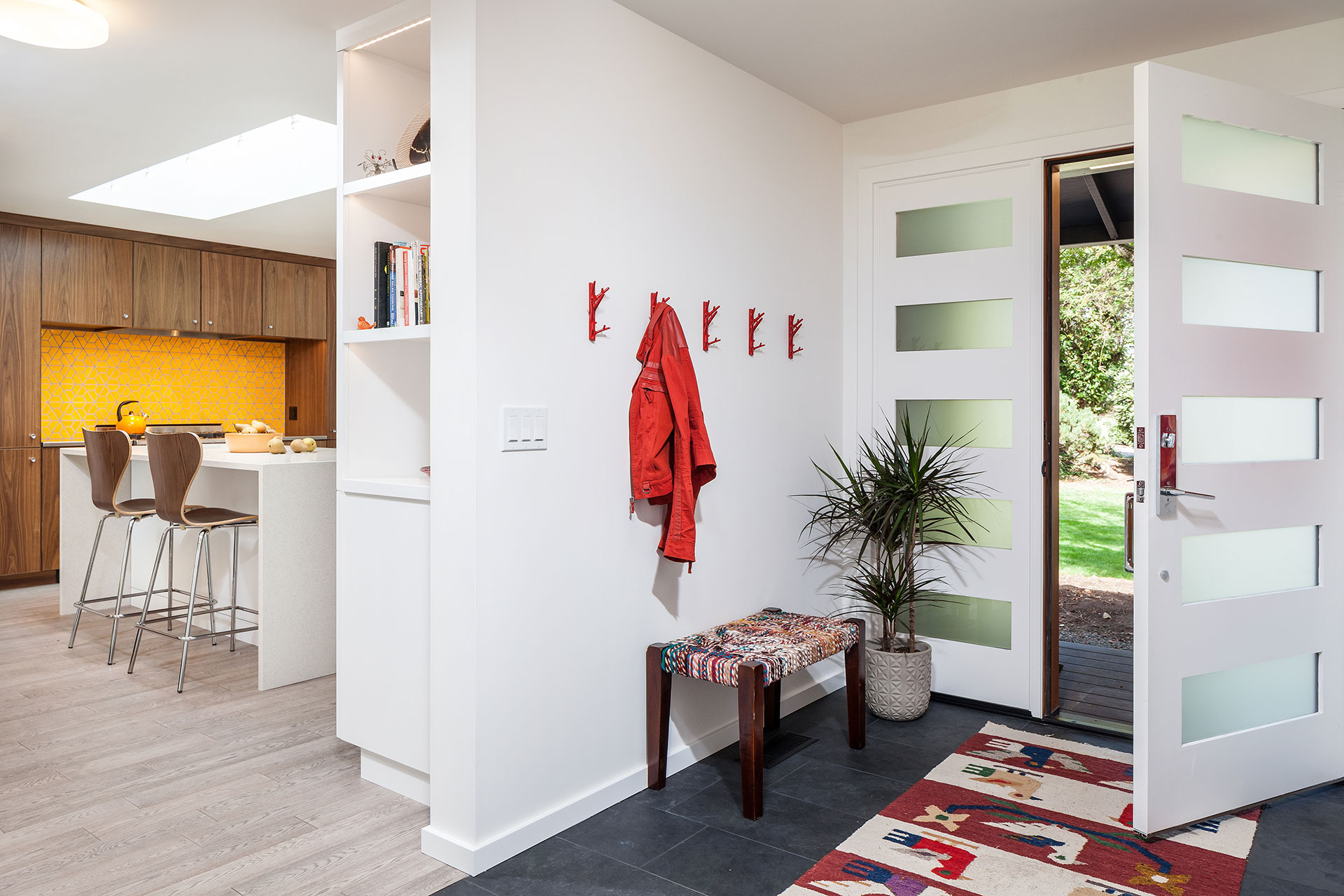
It is fun to work a client’s favorite color into a project. This orange hex tile by Clayhaus adds a touch of sunshine to the kitchen. The impeccable accent adds a colorful pop to the work area. It also differentiates the rich millwork wall in the kitchen from its companion wall in the dining room.
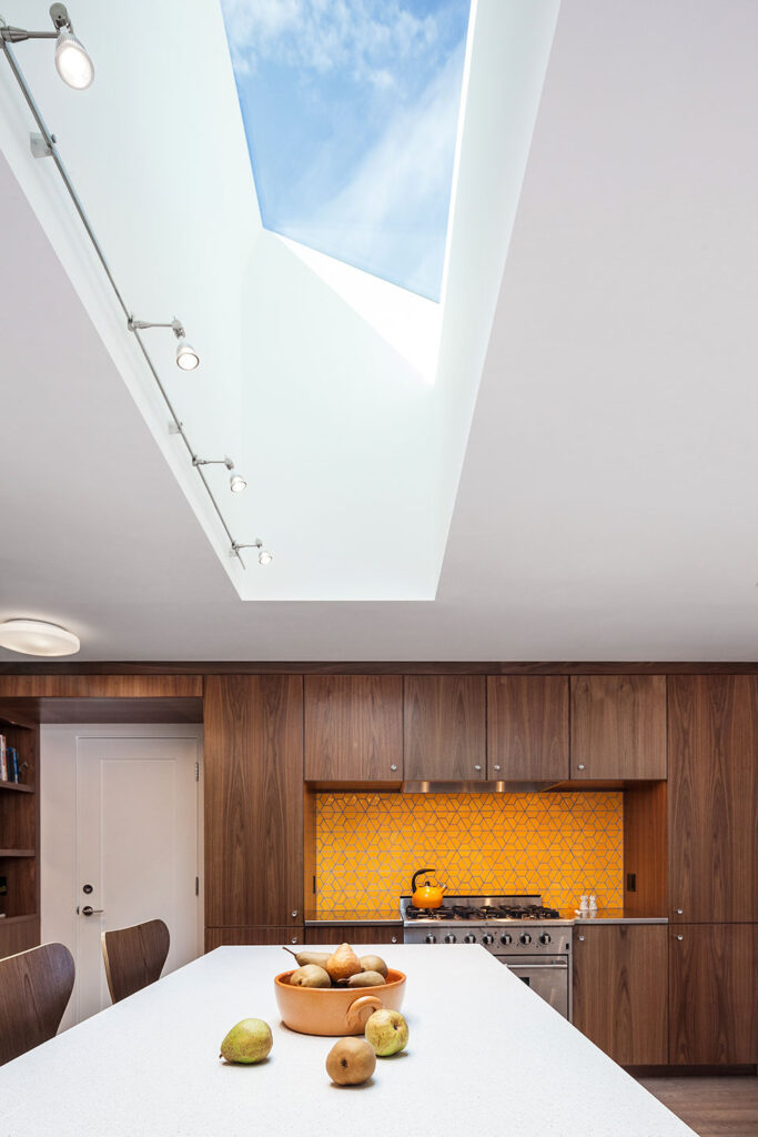
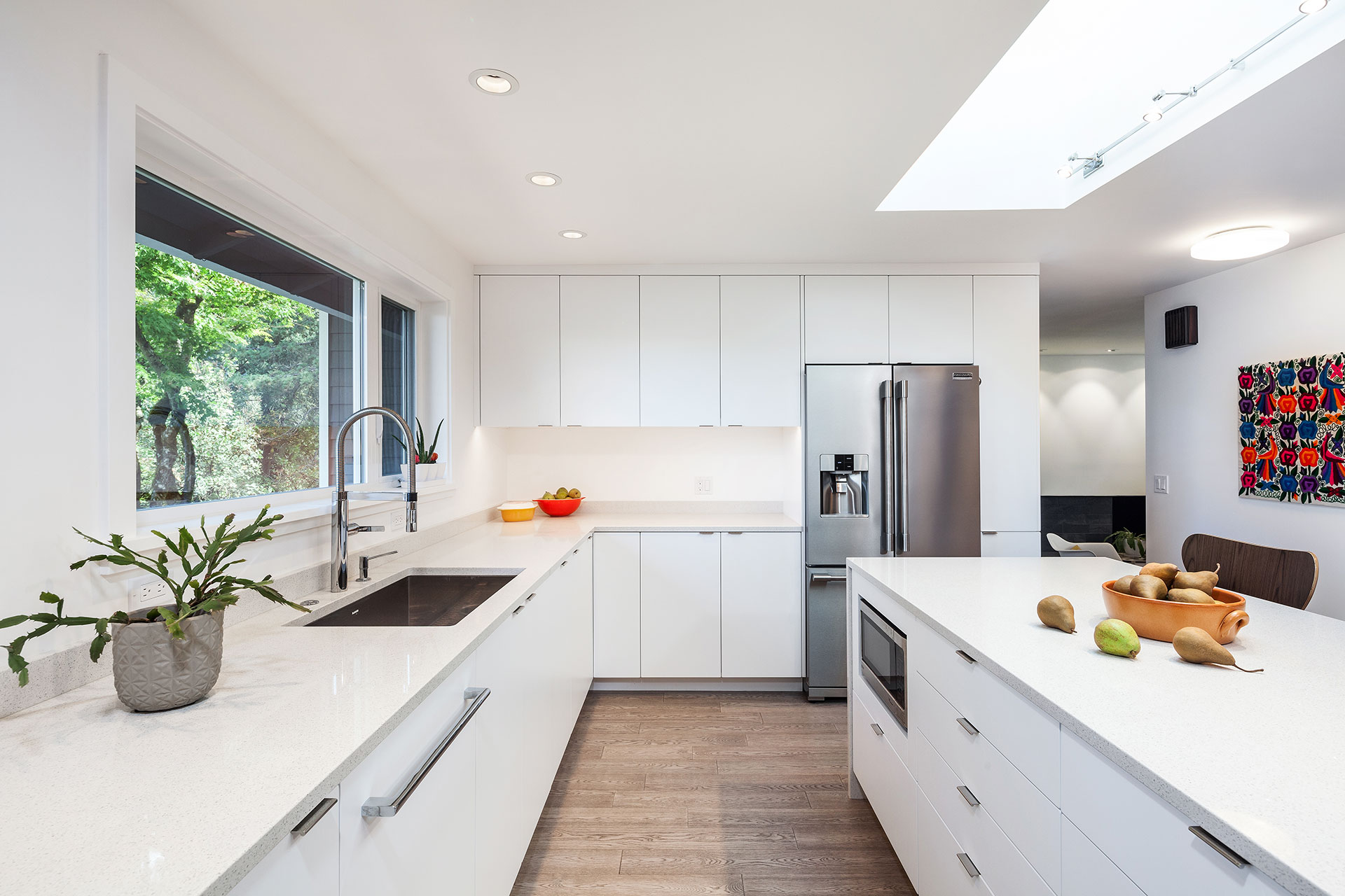
How do you make the best of an existing low-ceiling situation? The answer for this residential remodel was to add an eight-foot-long skylight over the island. It adds visual interest as well as ample natural light.
Here comes the sun.
The plain sliced walnut millwork is a sophisticated detail that creates visual consistency between the kitchen and dining areas. The wall frames the workhorse part of the kitchen while adding hospitality appeal to the dining room side—a striking backdrop and buffet area.
The residential remodel gives the entry a more welcoming appeal. A defined porch directs guests through a stylish door and sidelight entrance. The reworked floor and ceiling plan provide clear views for easy wayfinding.
Black slate flooring highlights the entry hall in contrast to the wood floors throughout the home. Hooks provide a spot to hang up coats and then head on in.
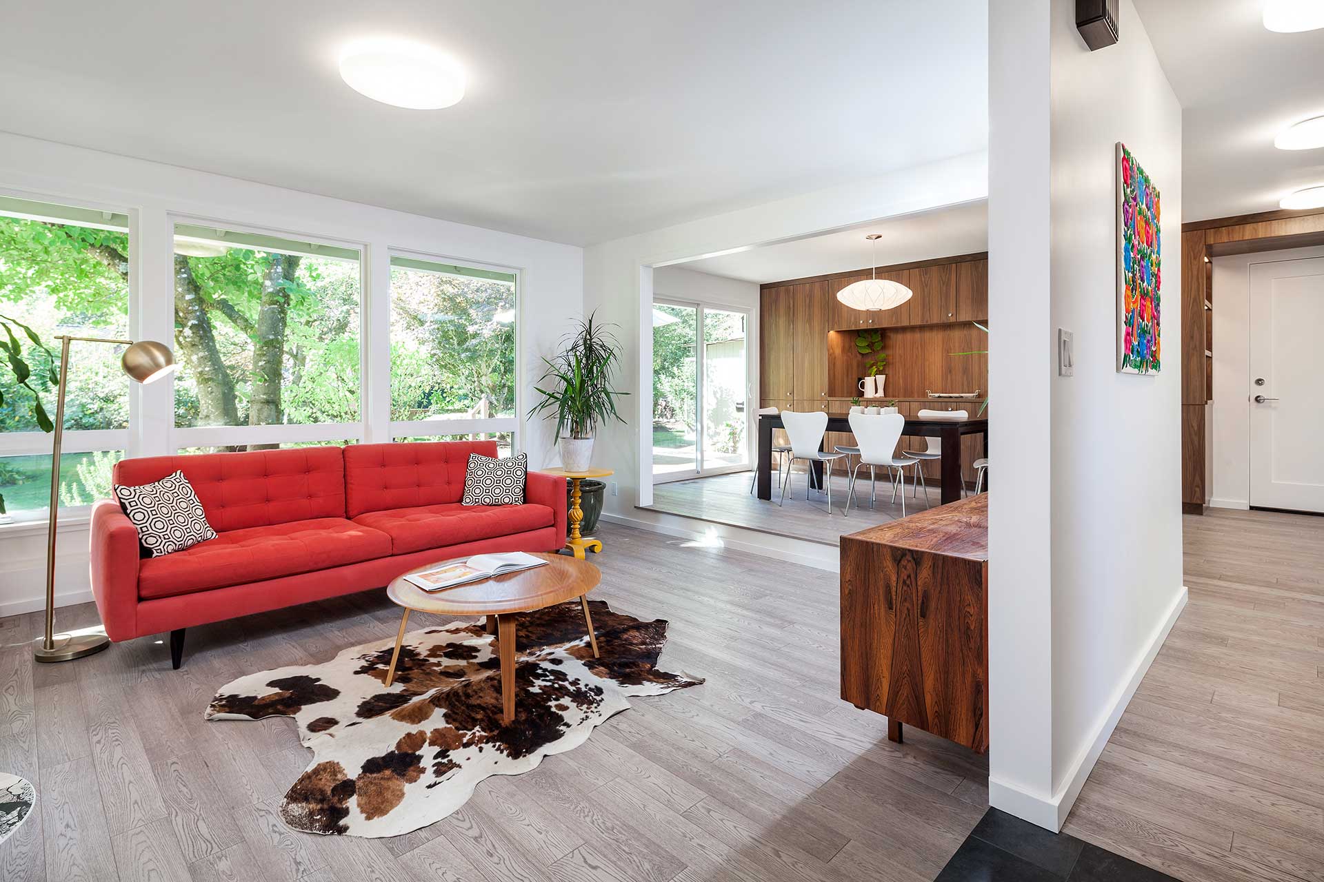
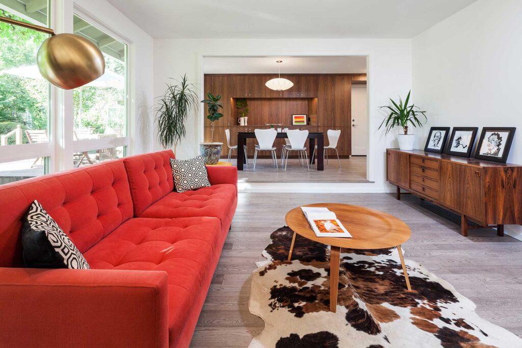
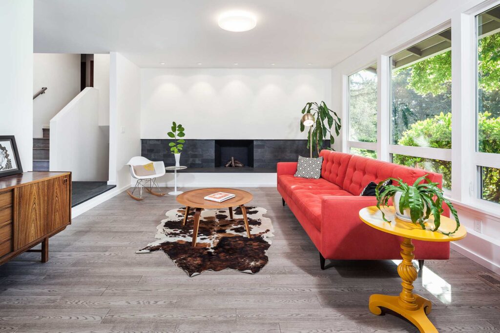
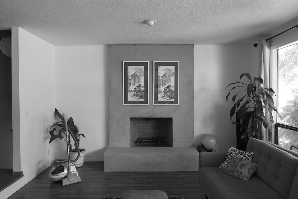
This sunken living room needed a better sense of style. New centered openings allow family members and guests to sit, relax and enjoy the views.
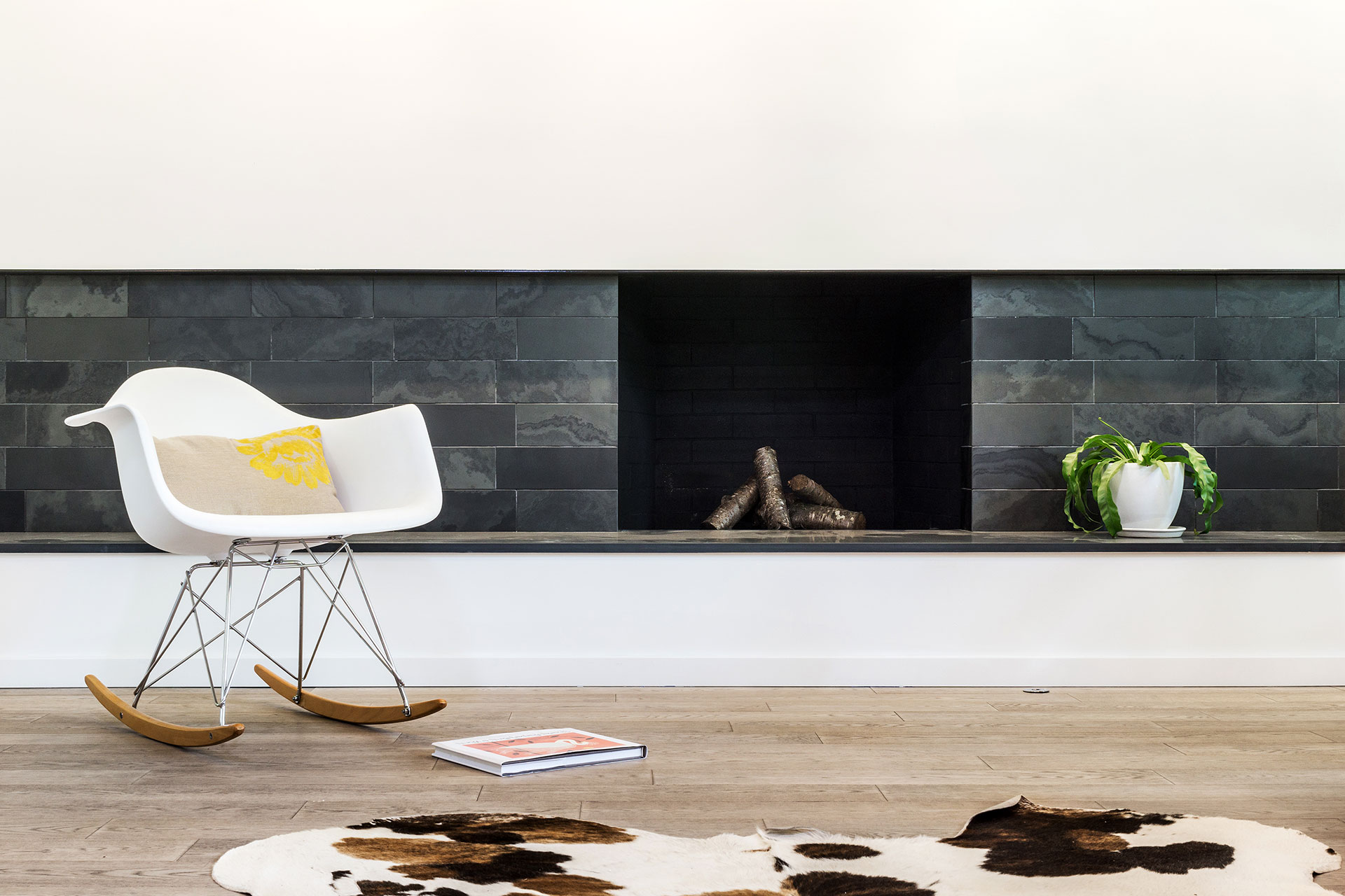
The elongated horizontal line of the redesigned fireplace visually re-proportions the room, making it feel more open and spacious. From short and squat to long and lean, the space feels more inviting while the honed black slate gives it a refined aesthetic.
