Visit our website on your desktop for more project info.
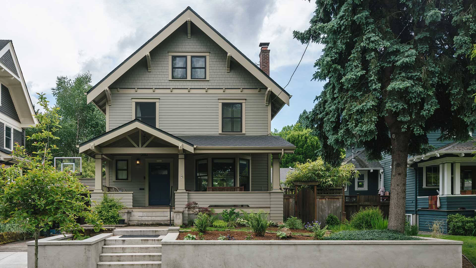
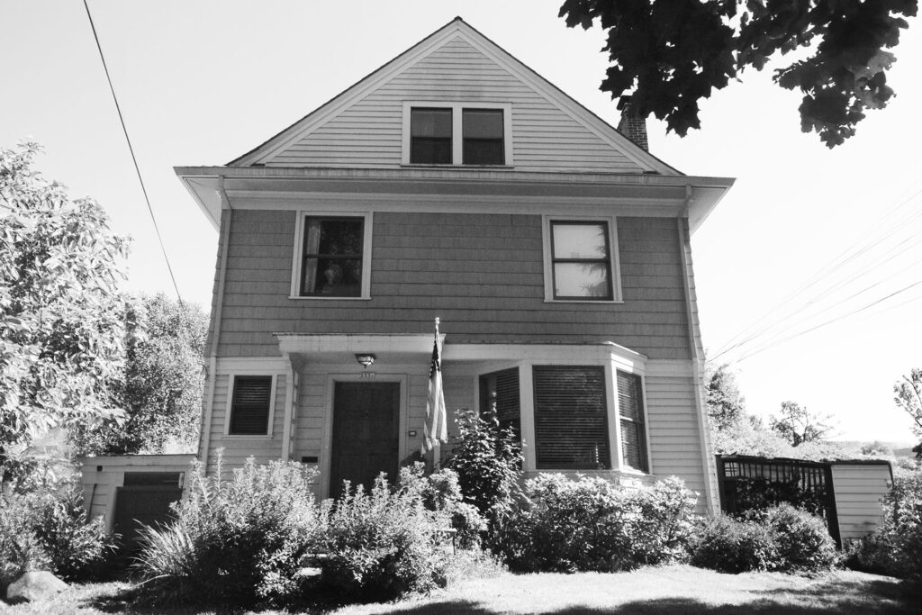
Some design decisions just don’t make sense. That is what happened in the story of this poor Craftsman house, located in Portland’s Laurelhurst neighborhood. It is always a pleasure to help clients who are ready to make things right by returning a home to its architectural roots. In this case, making things right required a whole house remodel.
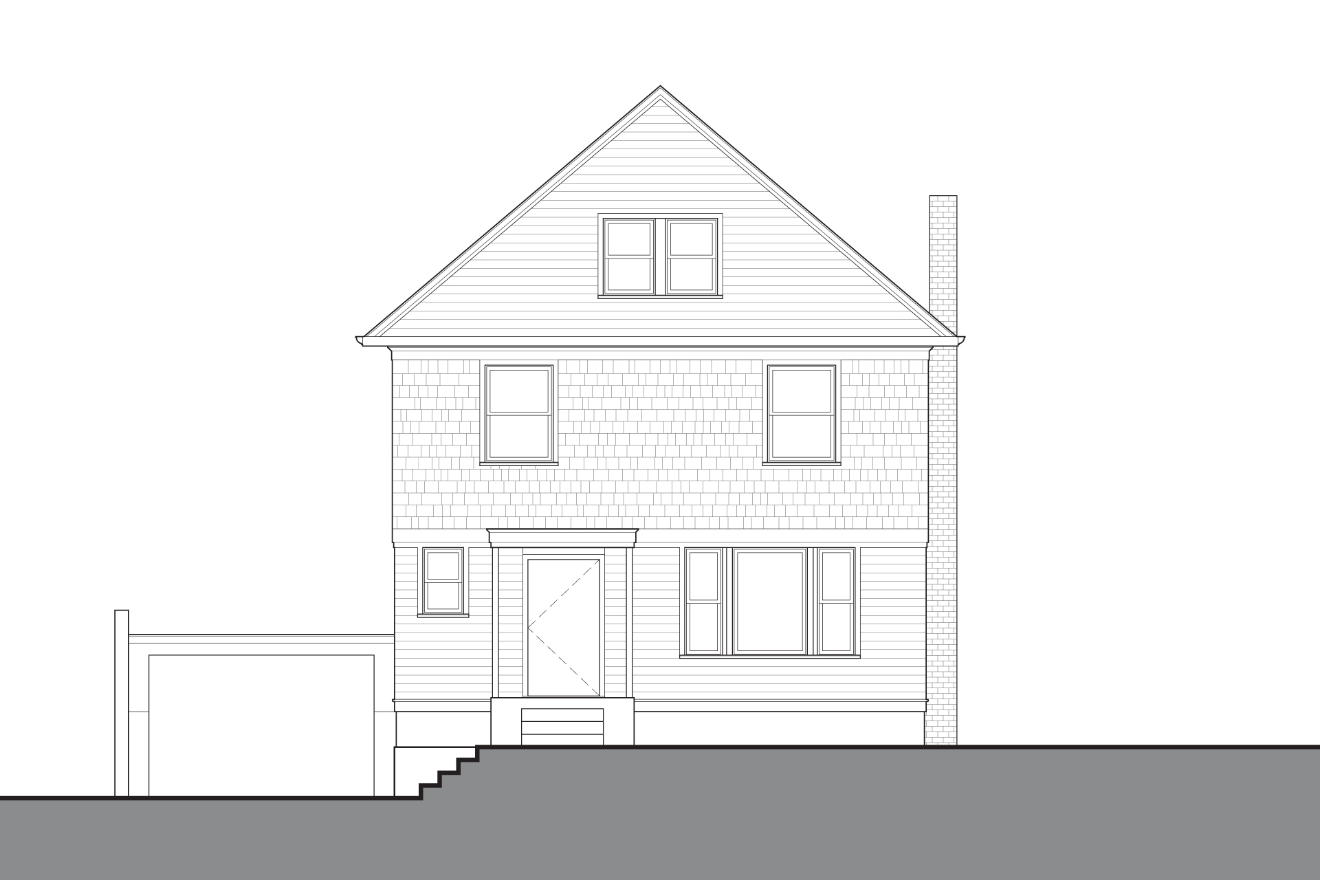
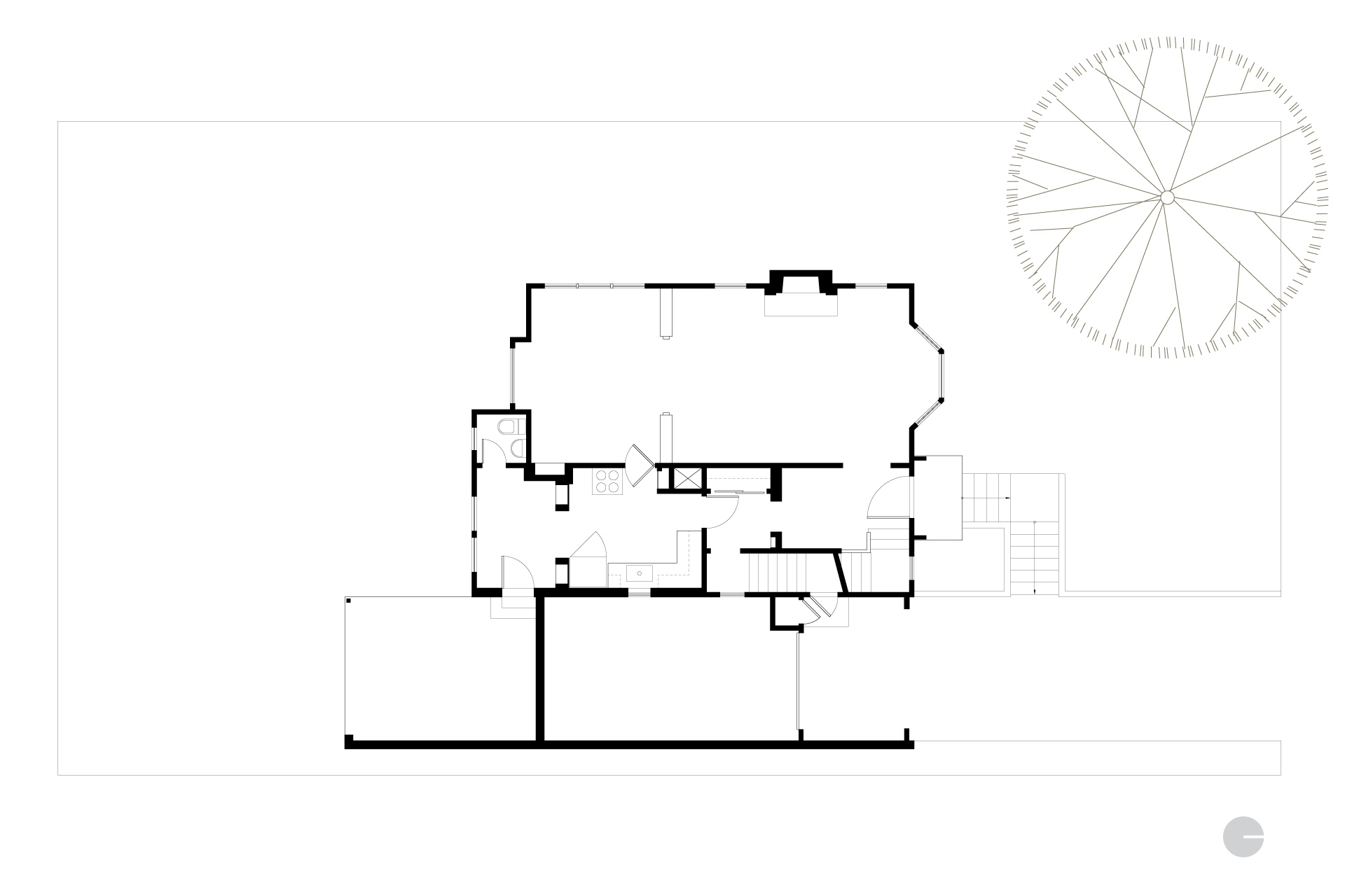
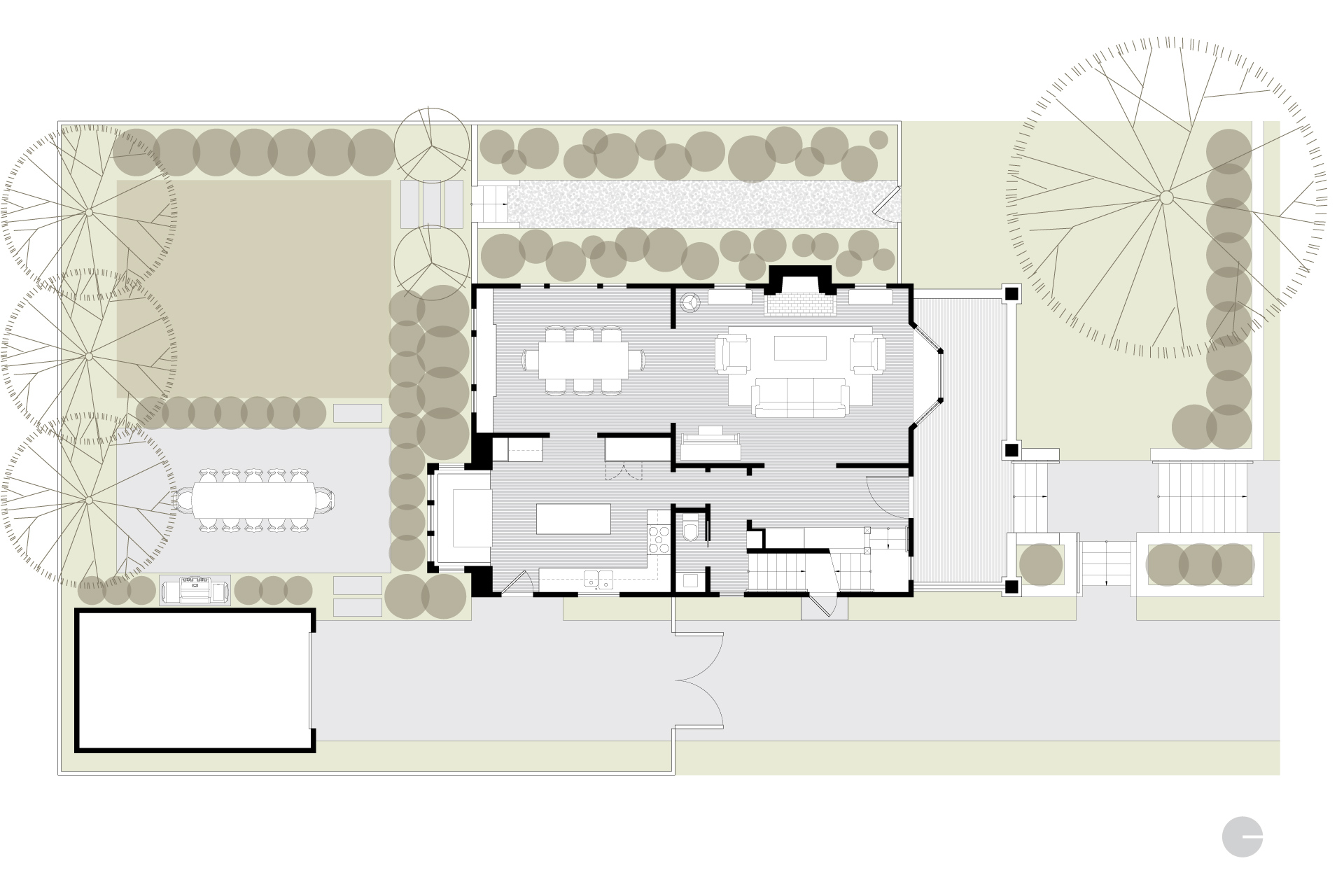
Illogical additions and the stripping away of cherished details left this home a bit of a trainwreck. A well-considered master plan laid the groundwork for creating a functional layout and bringing back the charm and character.
The whole house remodel featured three different phases and spanned five years.
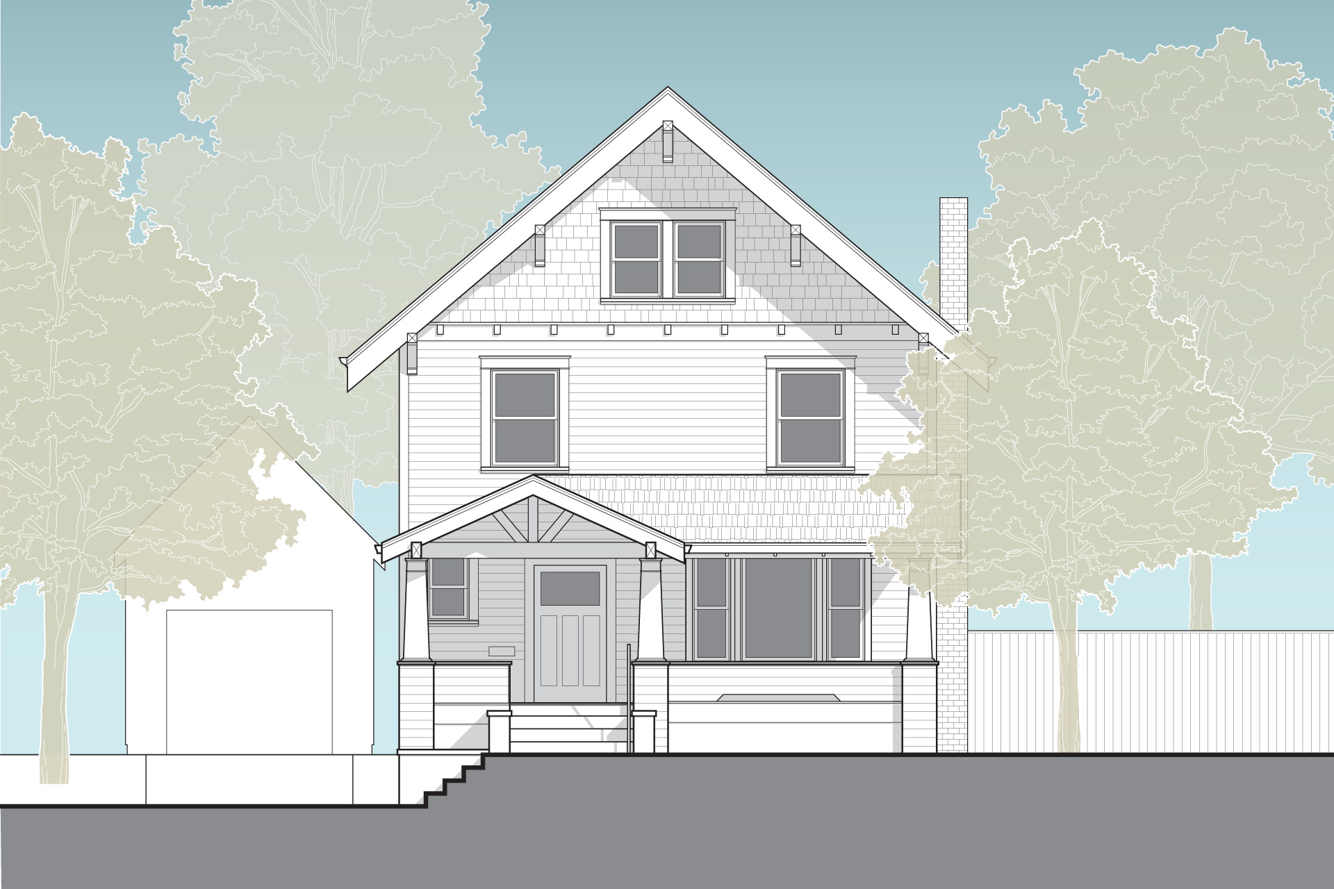
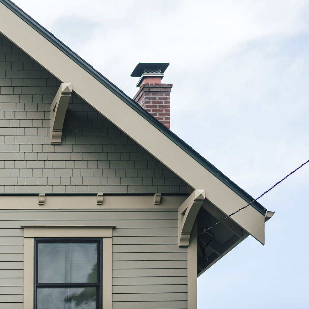
The exterior work of the whole house remodel refreshed the façade with all of the classic detailing of a beloved Craftsman—eaves, custom brackets, a substantial bargeboard and a combination of lap siding and shingles. Furthermore, the addition of a full-width front porch reintroduced the home into the neighborhood in a welcoming way.
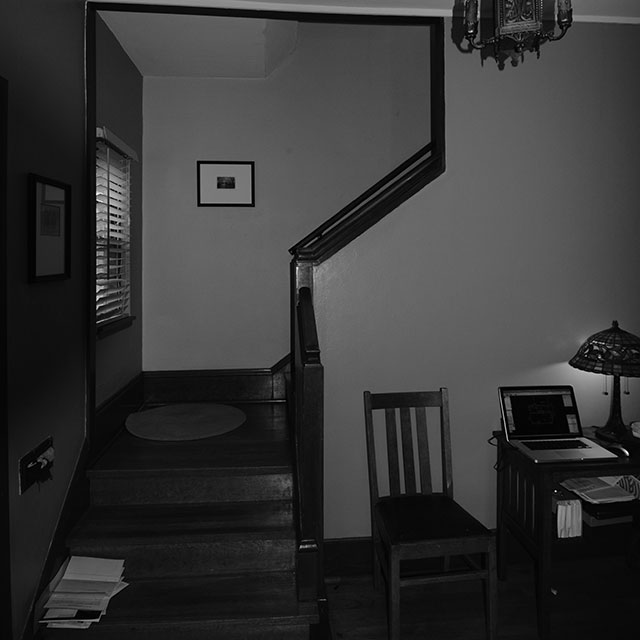
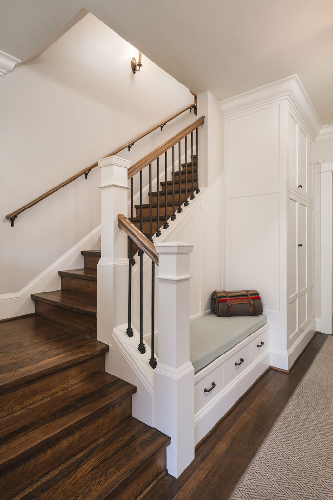
This enticing appeal continues in the entry, where an enhanced stairway and bench seat create a distinct—welcome home—sense of arrival.
When embarking on a multi-phased effort, it is important to create happy places amidst the chaos of long-term construction. The client was clear that the renovation process had to begin in the kitchen.
The open, light-filled layout provides views of the backyard. A central island supports efficient food prep while maintaining a distinct separation between the work zone and circulation space.
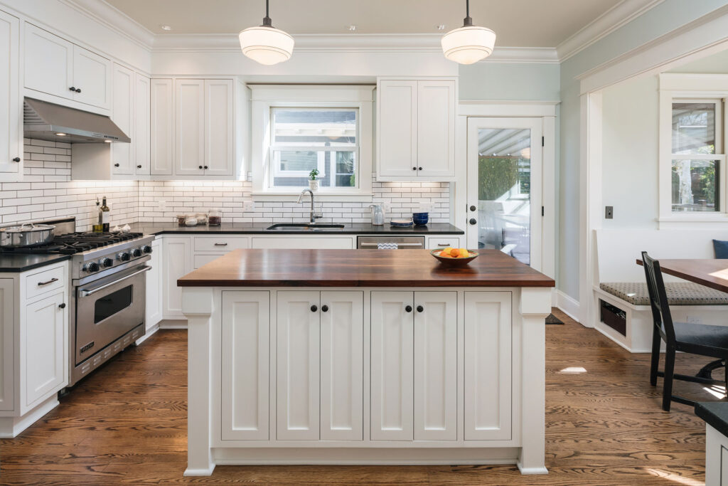
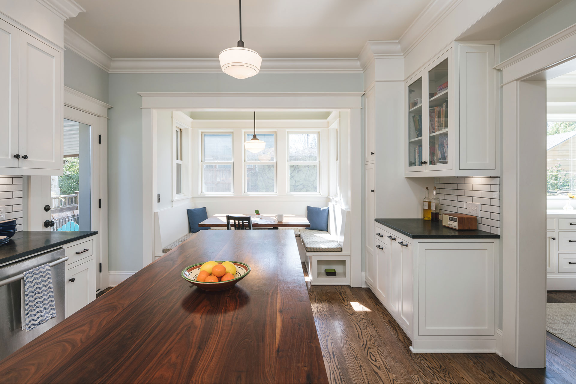
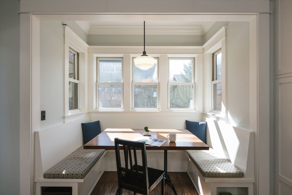
An addition at the rear of the home creates a cozy dining nook. The butcherblock table matches the island—rich wood tones to complement the classic black and white palette. Finally, mouldings, flush inset cabinetry and honed black granite countertops provide the finishing touches.
The clients’ kids found the booth to be their favorite place to do homework.
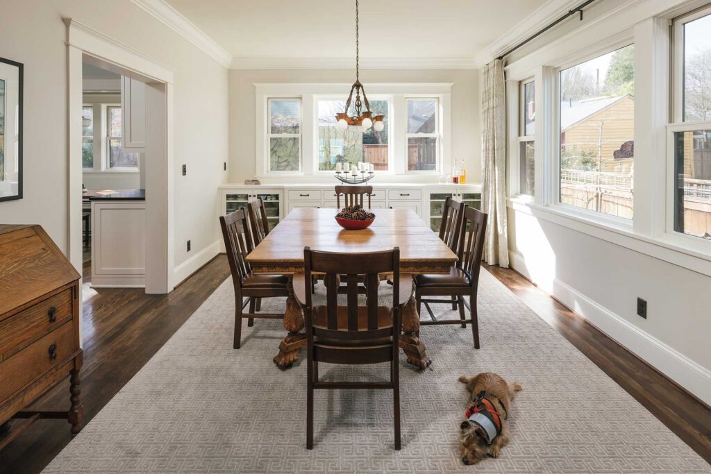
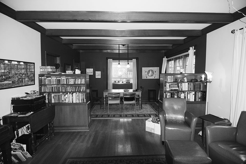
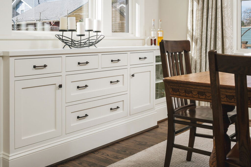
The dark dining area also begged for a renovation. By removing the fake beams and adding new windows with views of the backyard, the room feels larger. Light paint colors bring the space to life while a custom built-in adds Craftsman character.
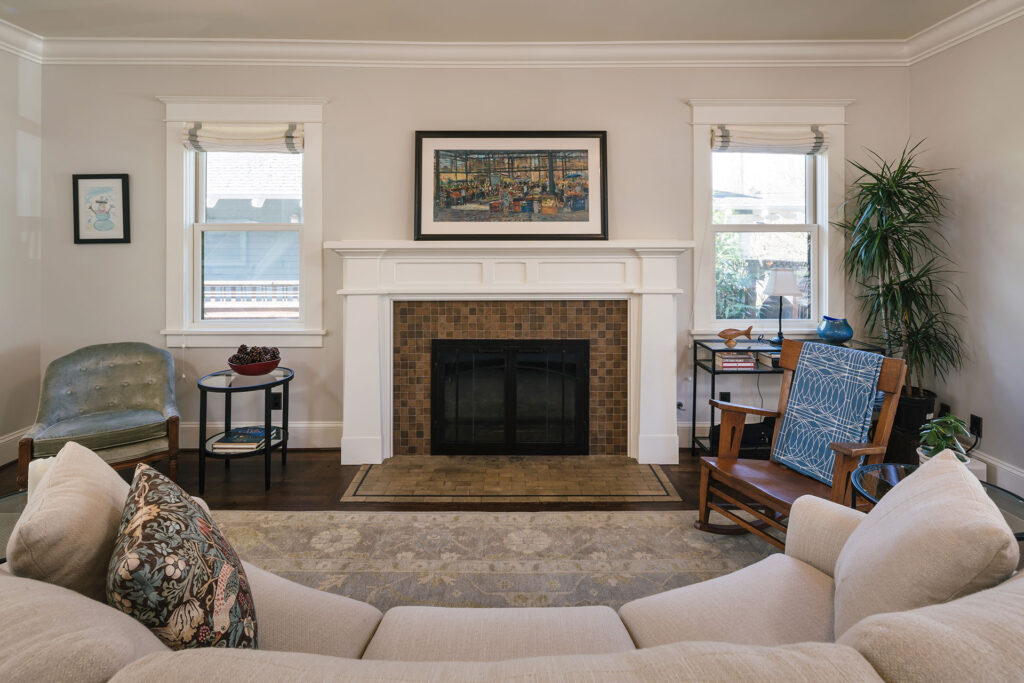
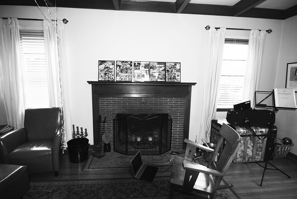
The living room lacked style. It was very vanilla—and not the good kind. Traditional mouldings and a dark hardwood floor enrich the space while a refined fireplace mantle completes the look.
