Visit our website on your desktop for more project info.
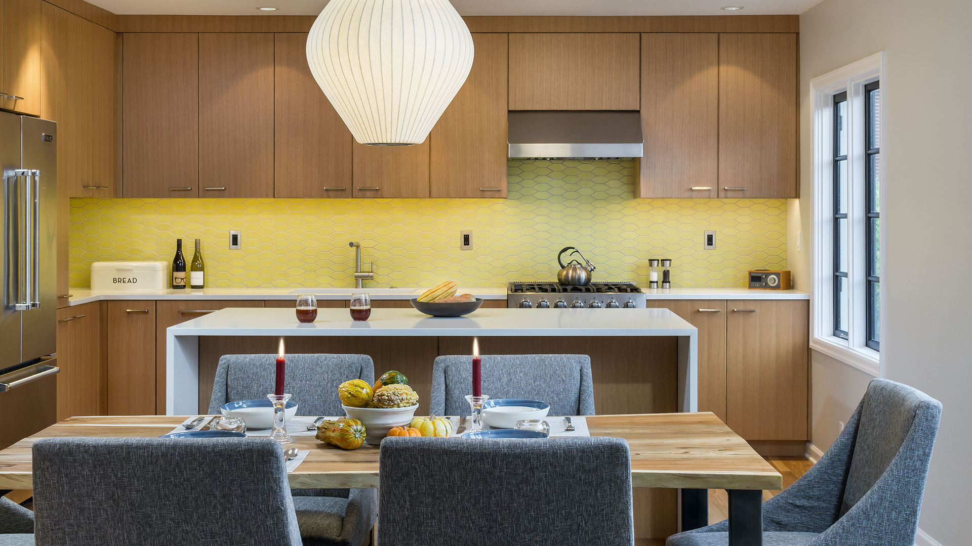
Creating an open kitchen and dining area continues to be a priority renovation project—a space that suits modern family life and entertaining with ease. This kitchen-dining overhaul amps up functionality while adding the perfect contemporary touches to this 1940’s Alameda home.
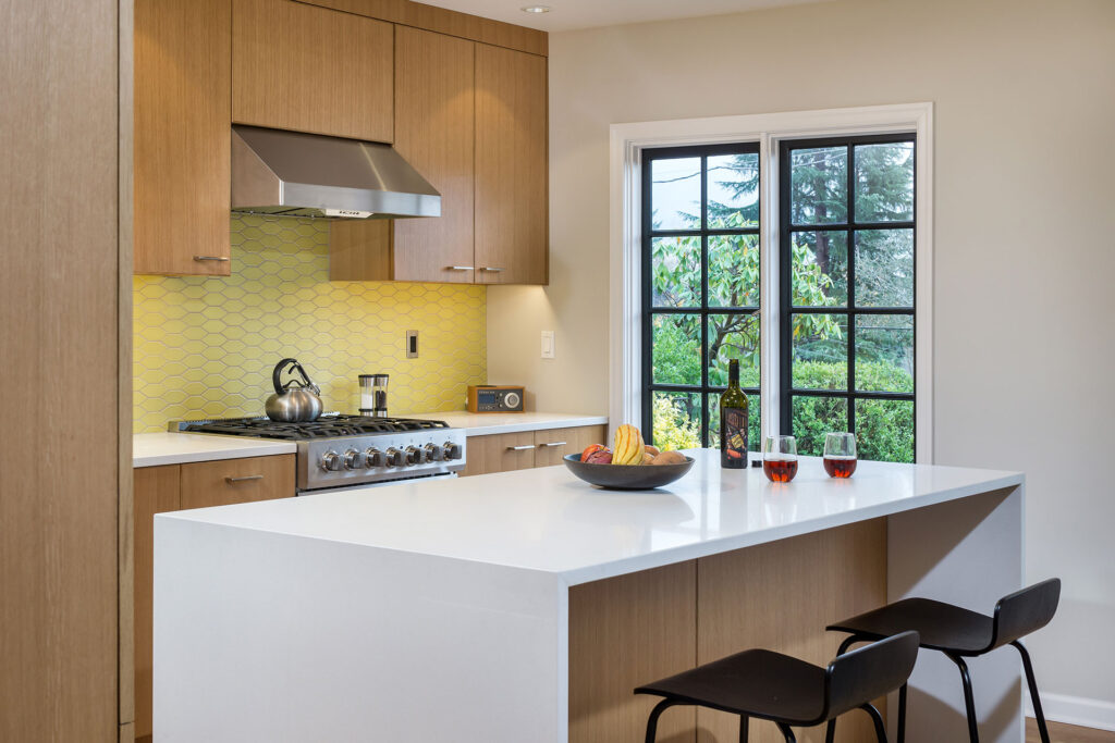
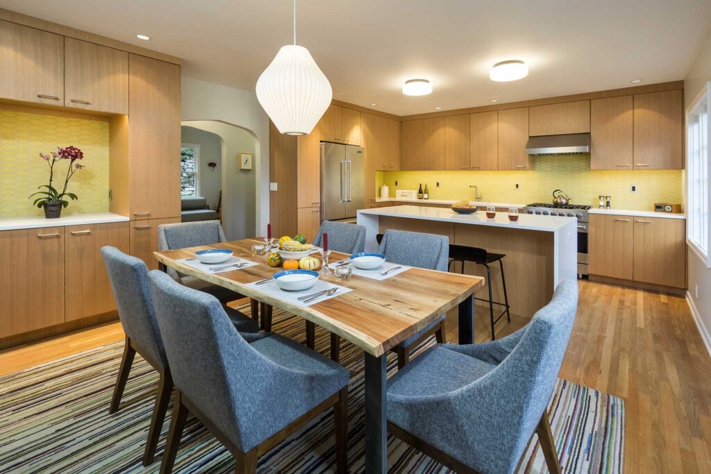
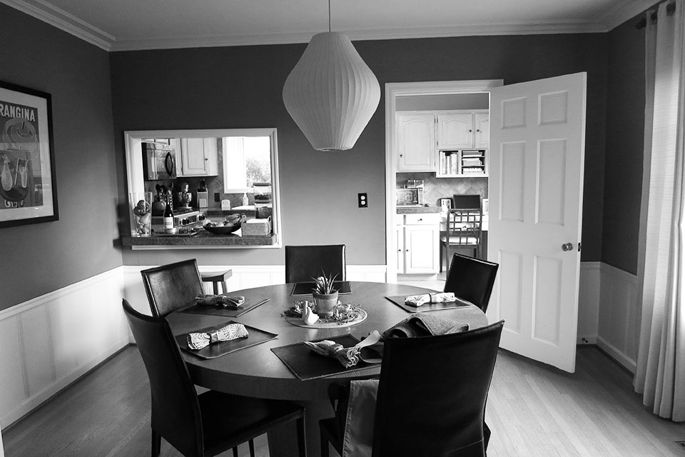
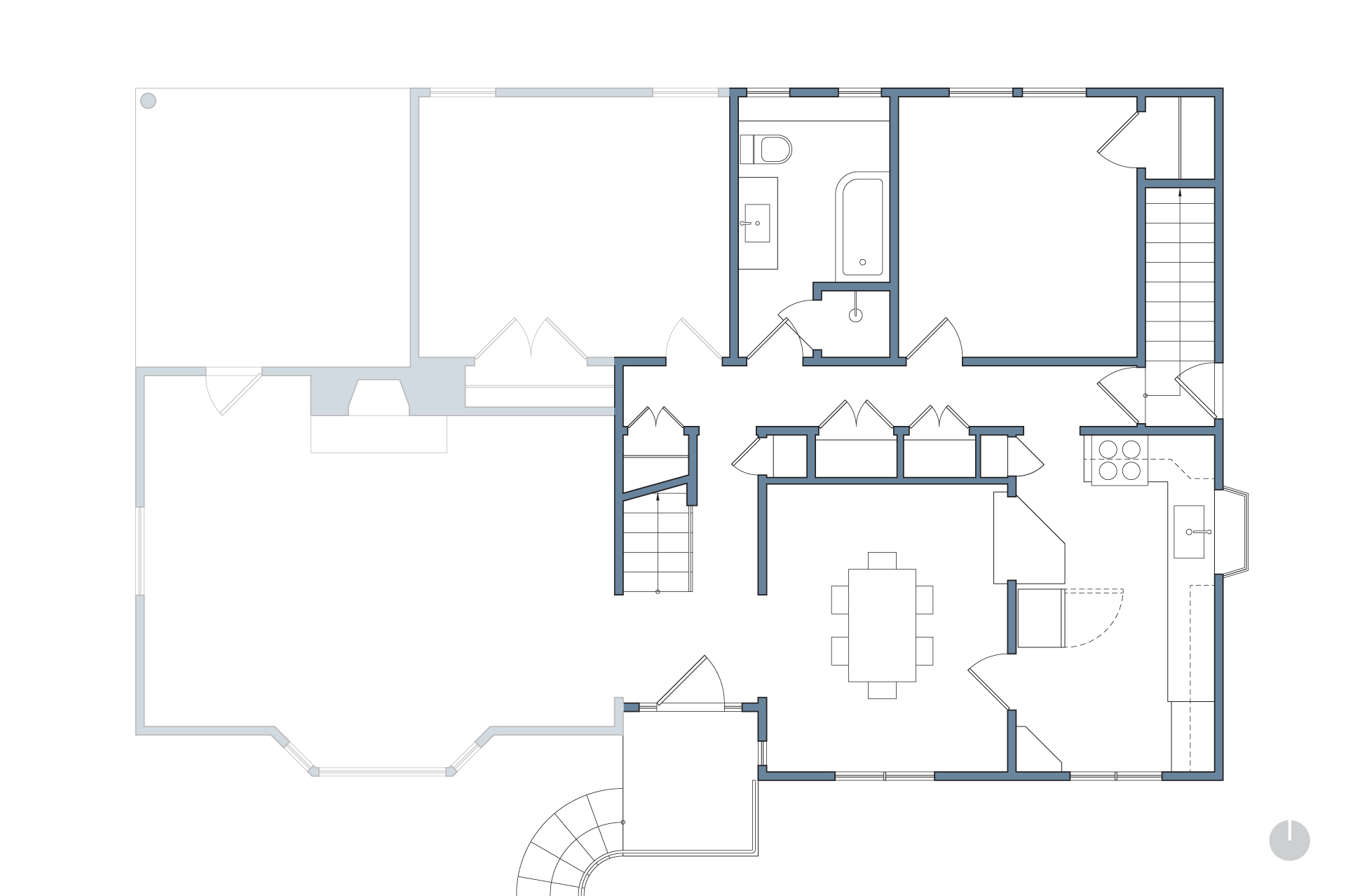
In the existing plan, a wall with an opening resembling a drive-thru window separated the kitchen from the dining room. Further, a door or window on every wall created an unworkable layout. The client wanted a kitchen renovation that would not only create an open plan, but also improve functionality.
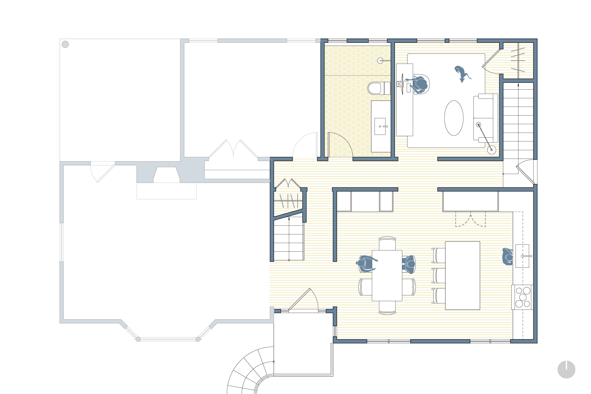
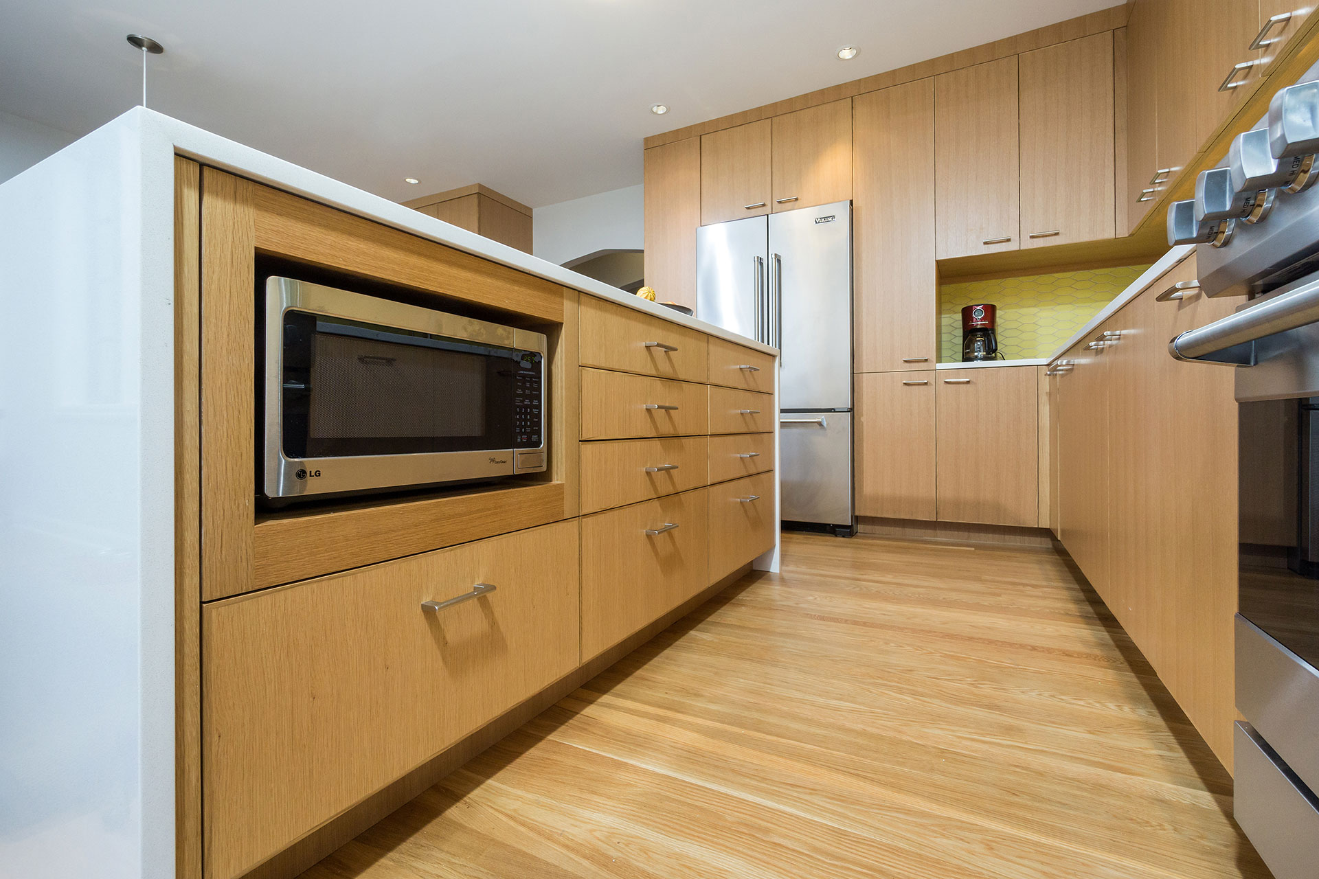
By removing the dining room wall and adjacent storage, the reworked plan accommodates the coveted island configuration. The island acts as a natural buffer between the working and eating areas of the kitchen. The kitchen is no longer a thoroughfare, but an efficient, function-packed space.
The new design also closed up a view-less window on the side wall of the house. This created more wall space for cabinetry and countertops.
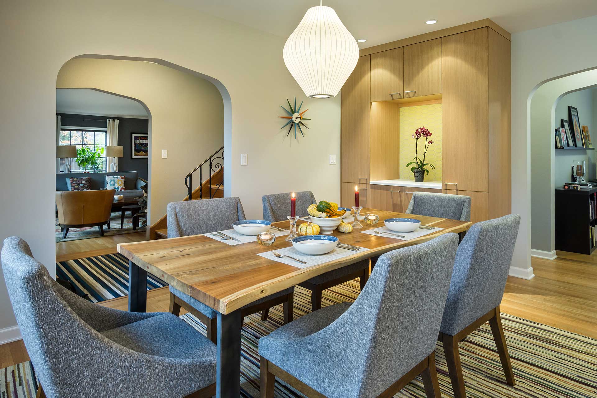
Aligned pointed arch openings improve the spatial flow and visual connections from space to space. They also give a thoughtful nod to the historic details of the home.
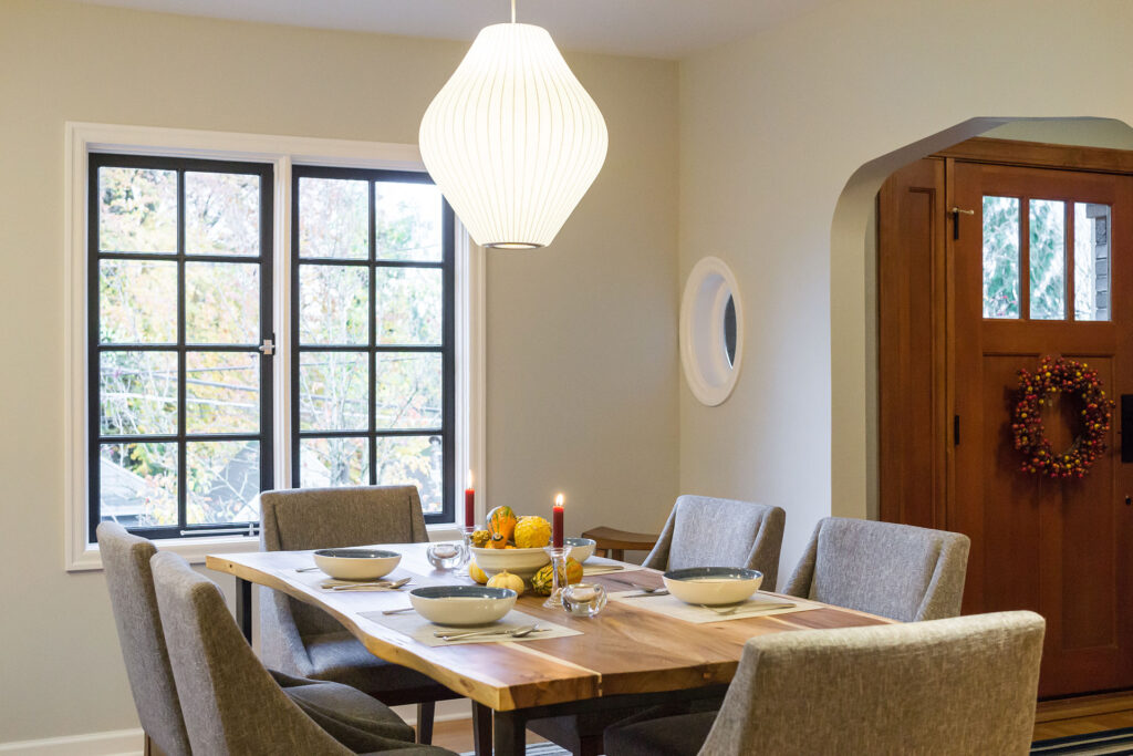
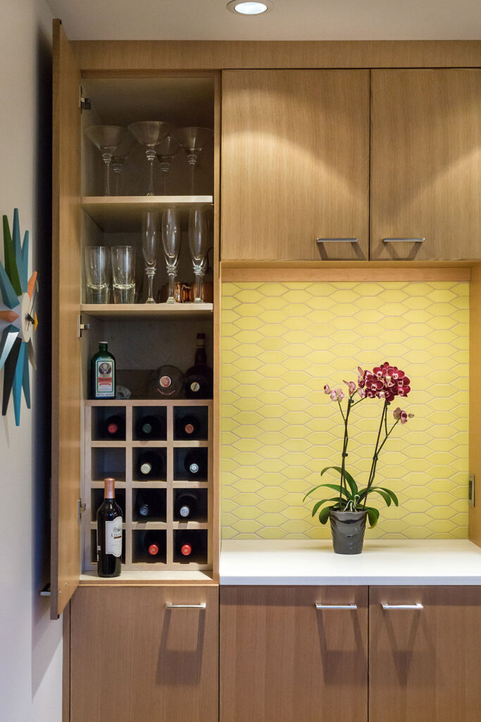
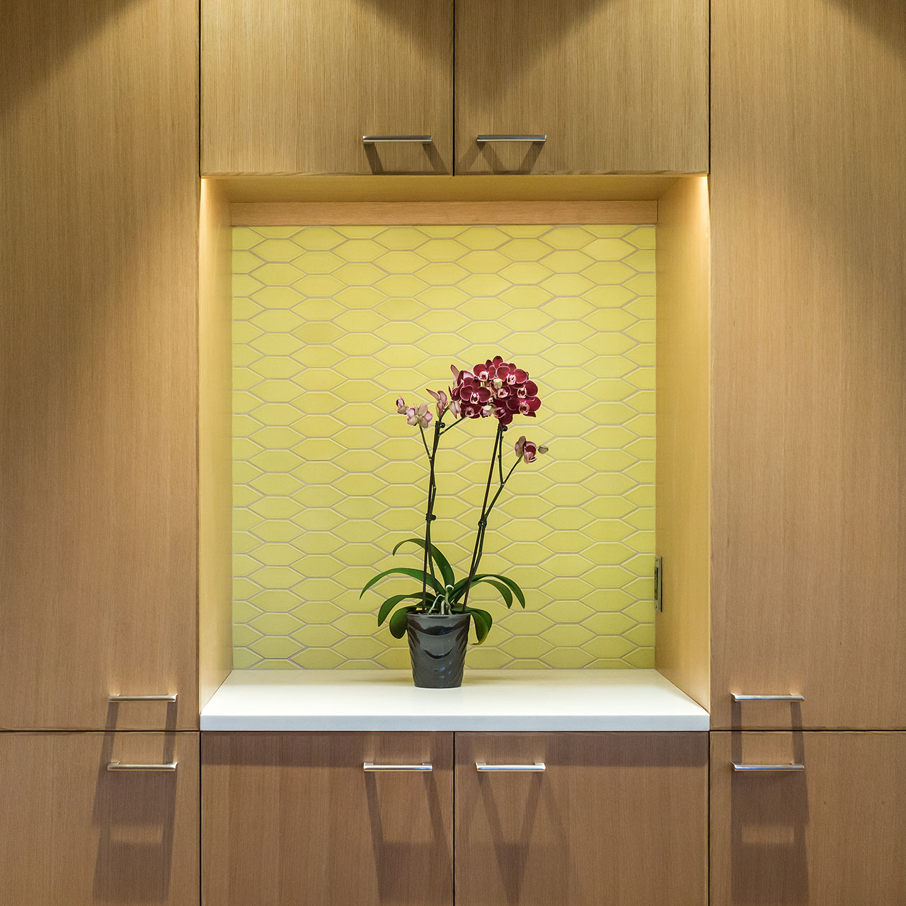
The full height cabinetry spans both the kitchen and dining walls, tying the spaces together. Built-in wine storage at the dining room provides added functionality while an adjacent niche creates space for serving drinks.
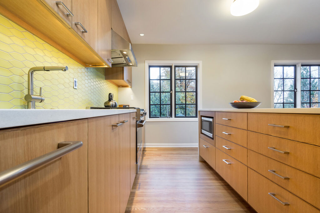
Hexagon accent tile, from Clayhaus Tile, in an eye-catching citrine, energizes the space—a refreshing finishing touch for this kitchen renovation.
Quartz countertops and rift white oak cabinets add to the light and bright appeal of the open space. The waterfall edge island and simple polished chrome hardware maintain the clean lines of the modern design.
Ample storage, space-saving details and a well-planned workflow maximize efficiency. This kitchen renovation proves that you can knock down walls and improve functionality all at the same time.
“A gut kitchen renovation is a huge undertaking, and Lisa was there for us every step of the way. Her clear design vision, commitment to quality and advocacy for us with our contractor got us a result we couldn’t be happier about!”
Sarah Z.
Homeowner
