Visit our website on your desktop for more project info.
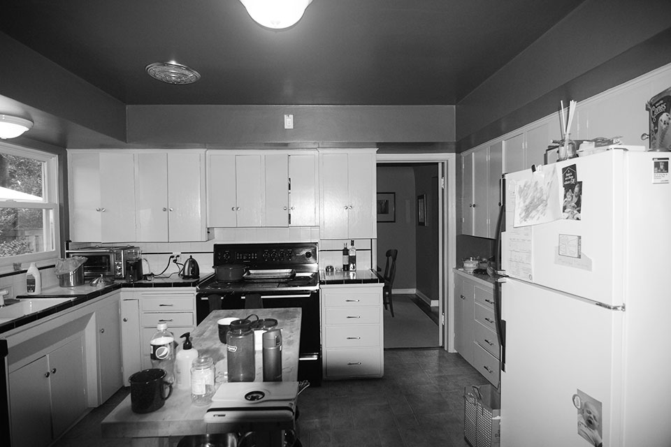
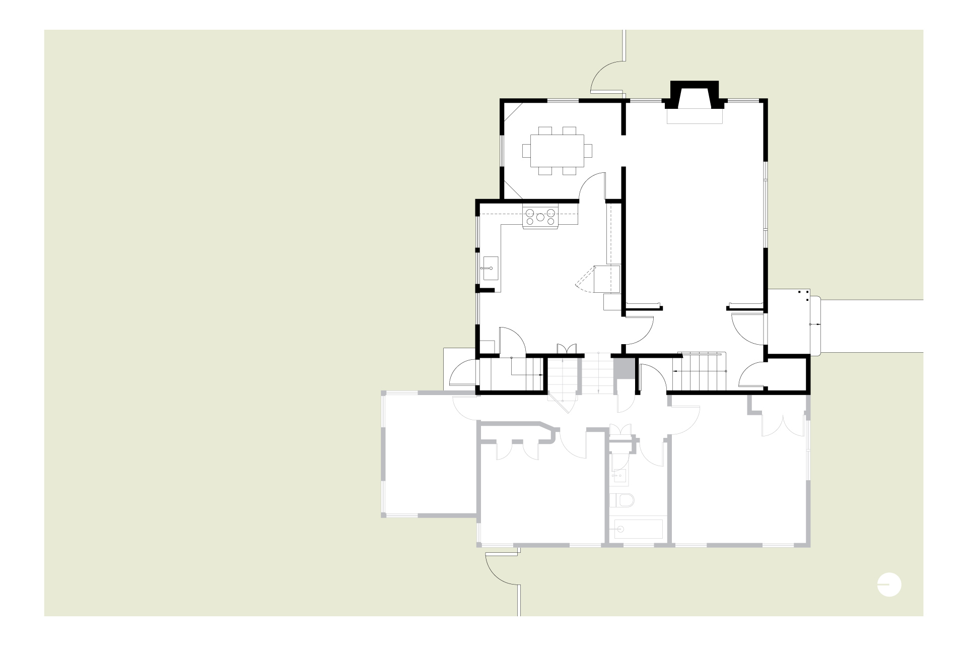
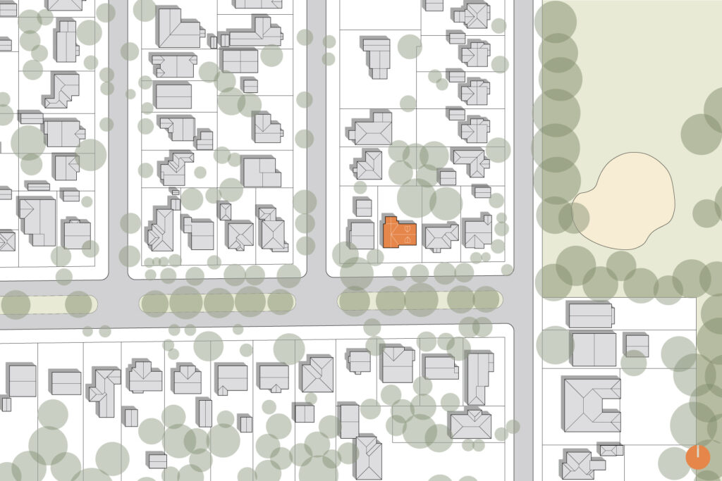
This 1940s split level, located in Portland’s Concordia neighborhood, was a unique contemporary design for its time but was missing the mark on memorable details. To make matters worse, the kitchen was isolated from the dining area and suffered from an unworkable layout. A kitchen remodel changed everything–all the right design moves to add the missing pieces. Now the home makes perfect sense.
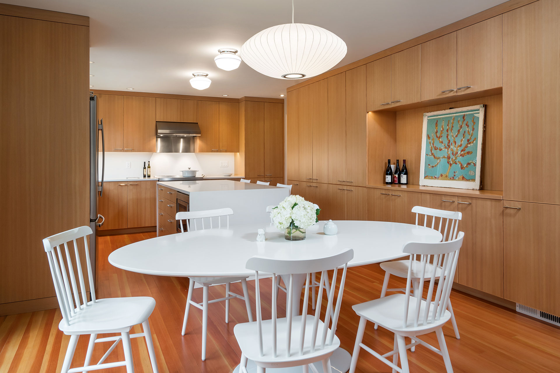
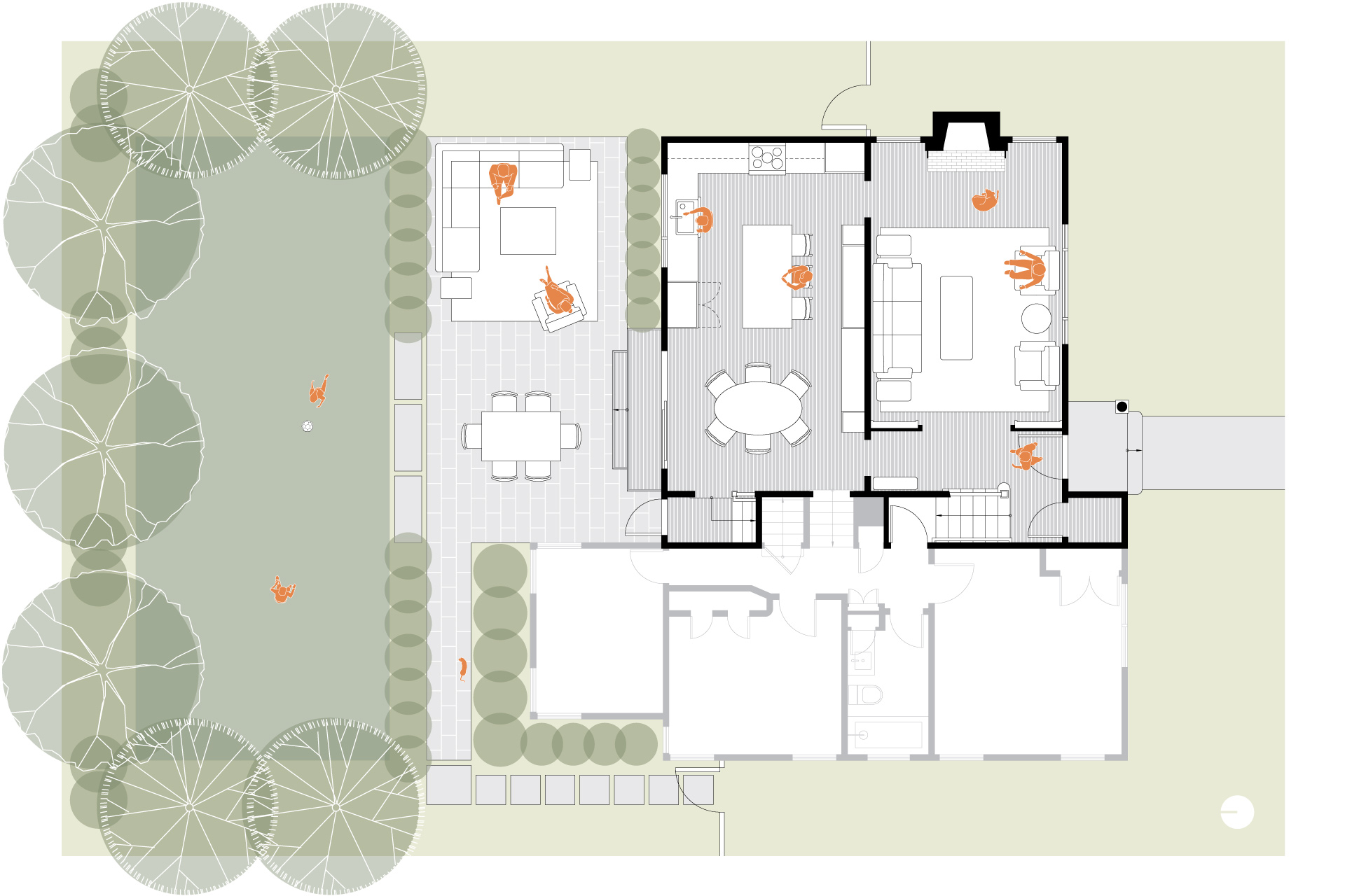
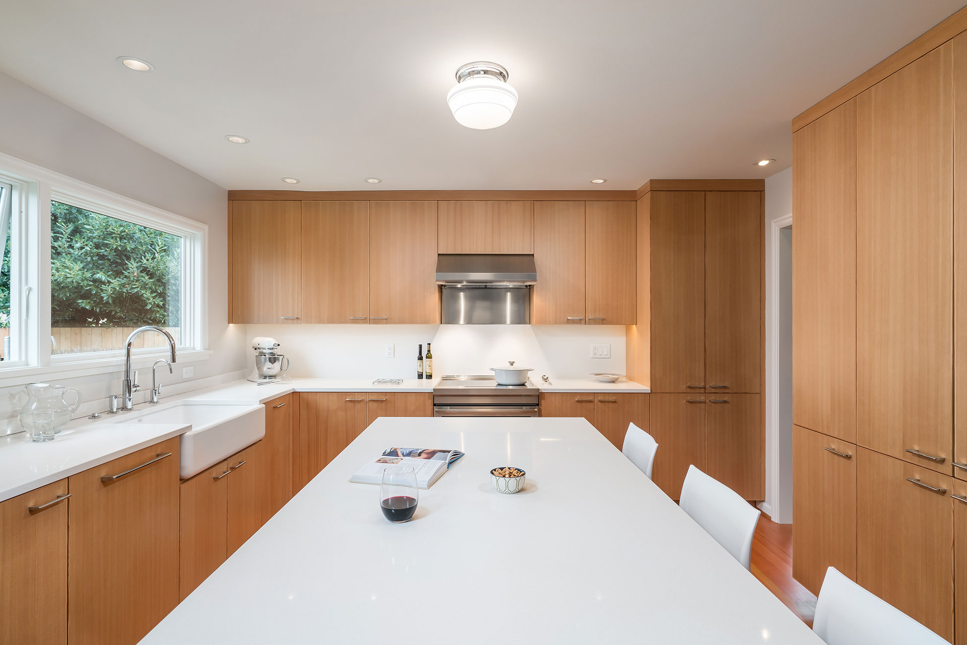
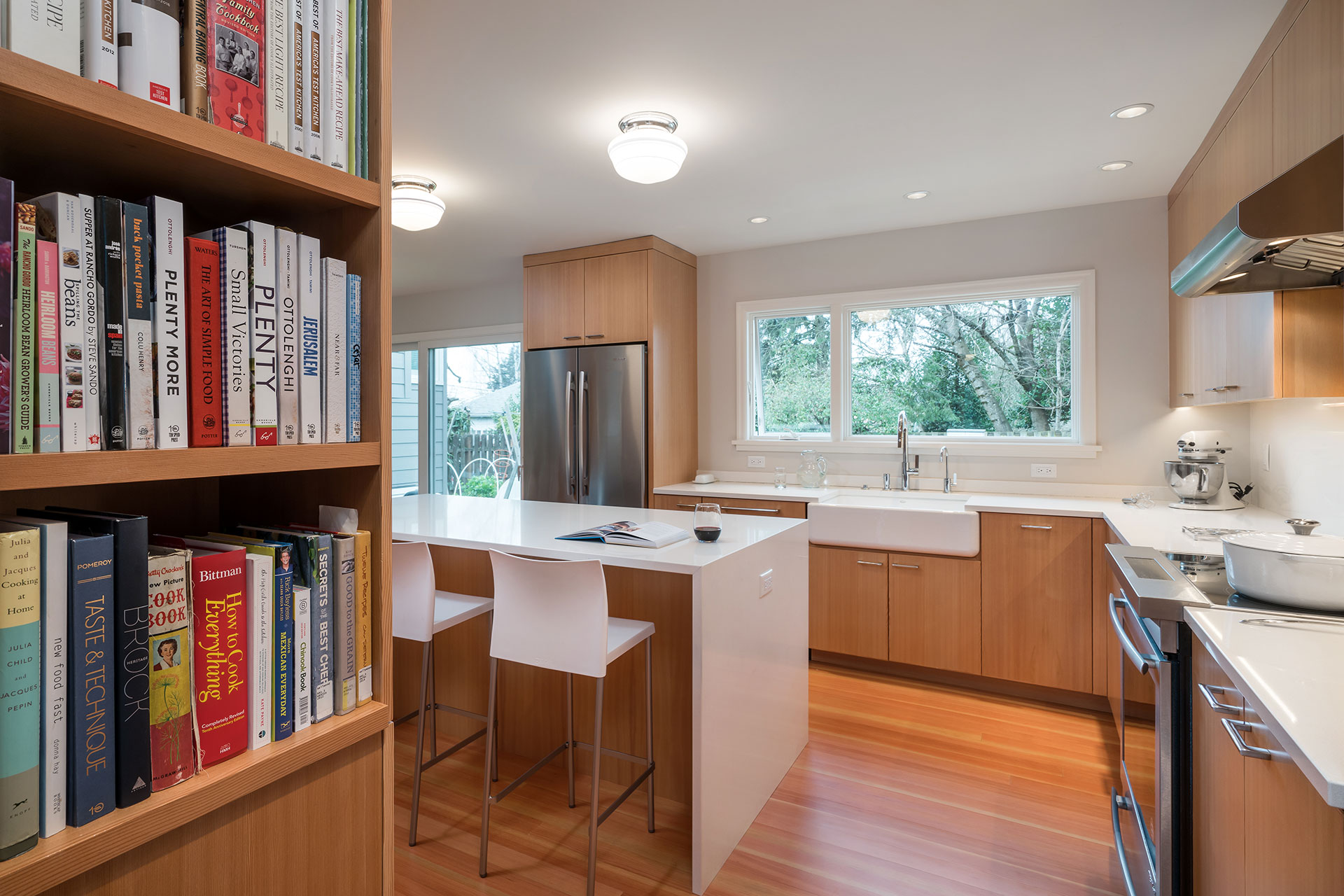
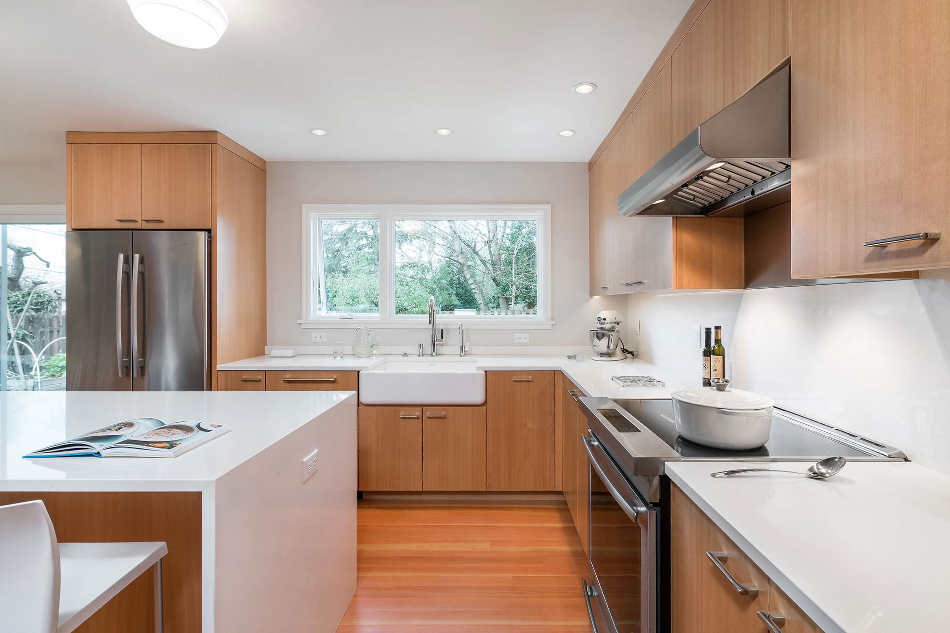
For this kitchen remodel, we flip-flopped the location of kitchen and dining room and tore down the wall between them. Then, we added a 22-sq.ft. addition to square up the space. These two small moves made a world of difference—a totally revamped first-floor living experience.
A striking bank of clear vertical grain fir cabinets ties the kitchen and dining area together. The millwork maximizes storage and supports entertaining while providing the perfect space for an artistic touch. Rich fir floors compliment the warmth of the cabinets. White accents and chrome finishes add to the mix, making this space a modern masterpiece.
A large window and sliding glass doors flood the space with natural light. Additionally, they provide enticing views and easy access to the renovated back yard.
Built-in bookshelves bookend the millwork wall—nice nooks for cookbooks, keys and charging stations.
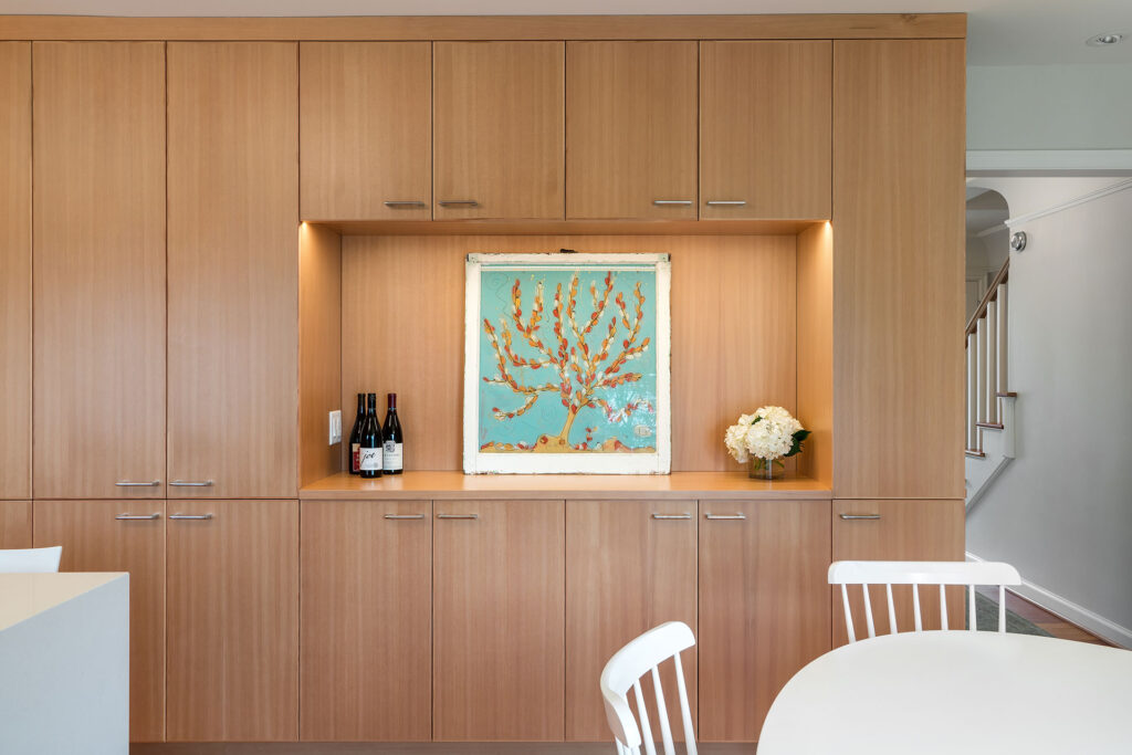
A recessed alcove built into the cabinetry in the dining room serves the dual function of both buffet counter and art display nook.
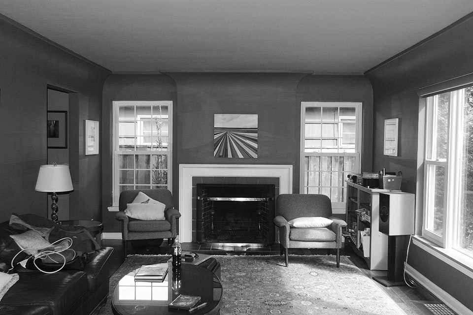
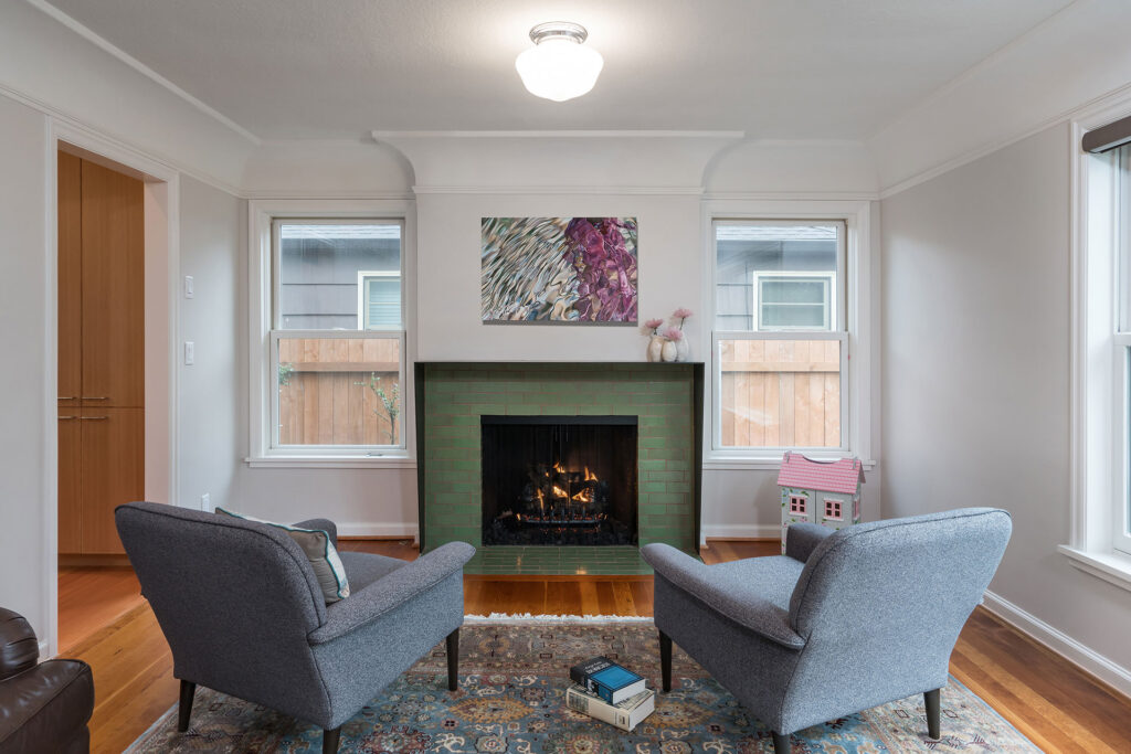
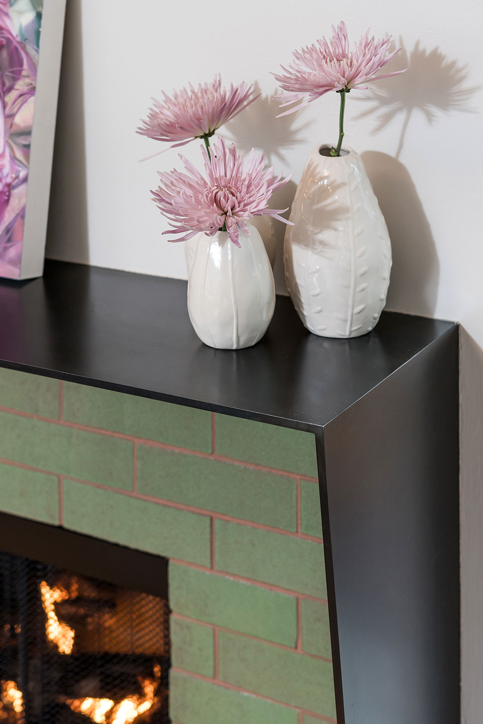
We didn’t stop with the kitchen remodel—the existing living room also needed help. To begin, we added picture rail below the existing cove moulding, transforming the space. Then, we gave the fireplace a modern facelift which included a custom blackened steel surround and green brick cladding from Fireclay.
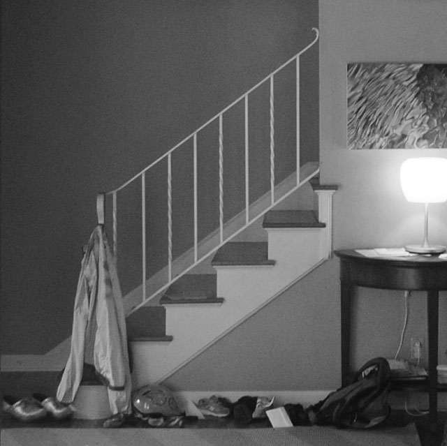
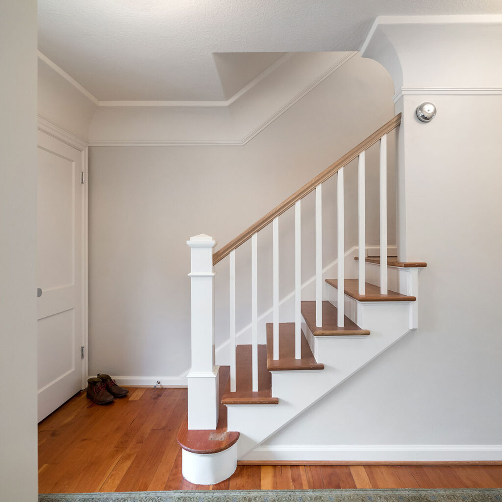
We then tackled the entry hall. A flimsy iron guardrail on the stair lacked substance. By bulking it up with a traditional newel post, wood pickets and a white oak handrail, the stair now has a better presence at the entry.
Finally, we replicated the original cove moulding found in the living room and added it to the entry. This not only added visual interest to the space, but also created cohesiveness throughout the home.
“Working with Lisa on our kitchen remodel was enjoyable and easy. The renovations feel like they have always been this way and always should have been this way. This is our forever home, in large part because no other kitchen on the market is as perfect for us as this one.”
Tim C. & Laura J.
Homeowners

