Visit our website on your desktop for more project info.
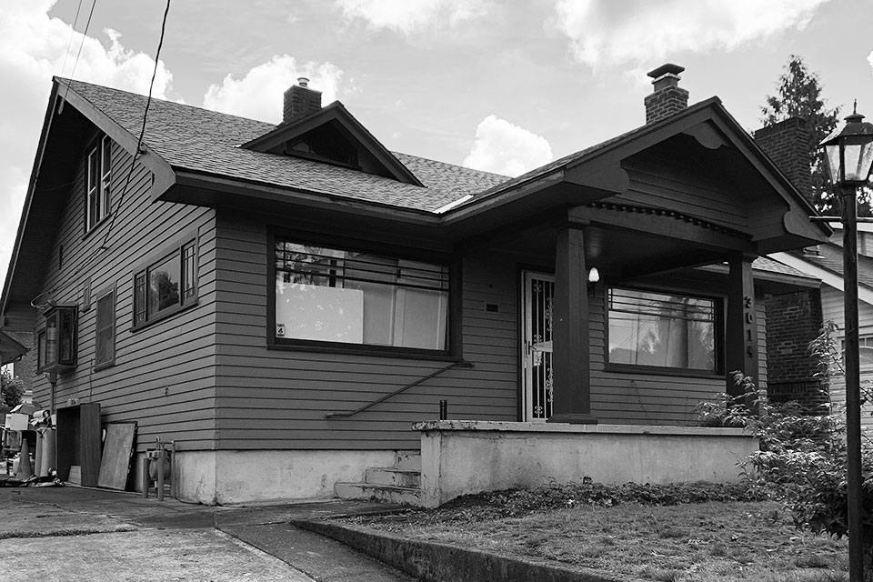
After 30 years in her treasured 1920s bungalow, Irene craved a change. First and foremost, she wanted to age in place in her cherished home with plenty of room for her grown children and grandchildren to visit. A remodel designed for aging in place was the answer. She wanted a design that addressed every space, detail and system to give her peace of mind for the future. Furthermore, she wanted to prepare the house to stay in the family for years to come.
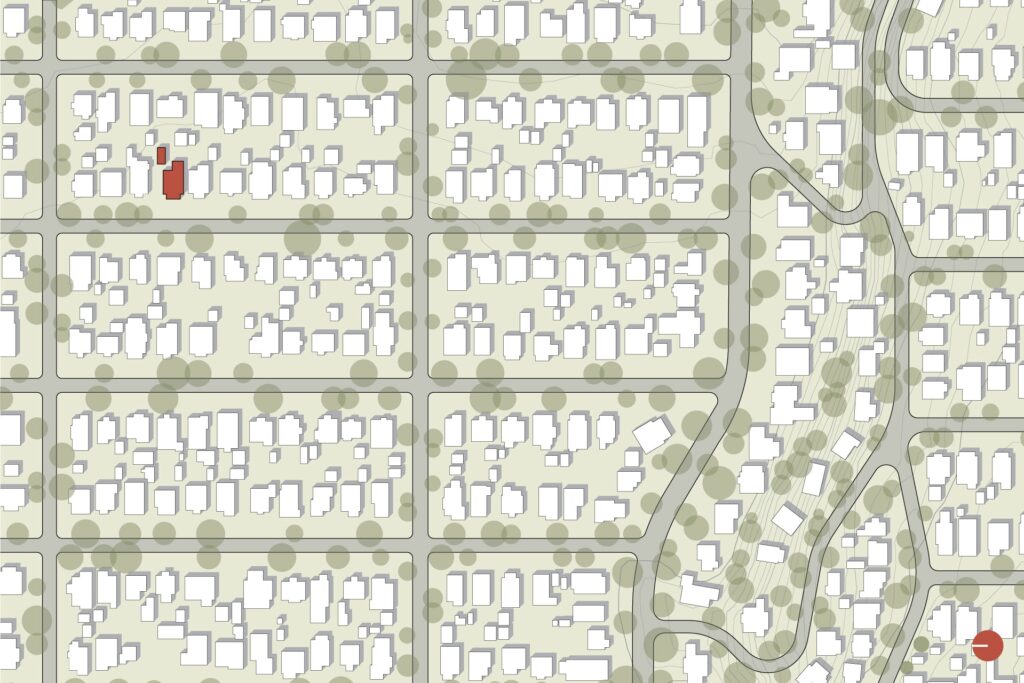
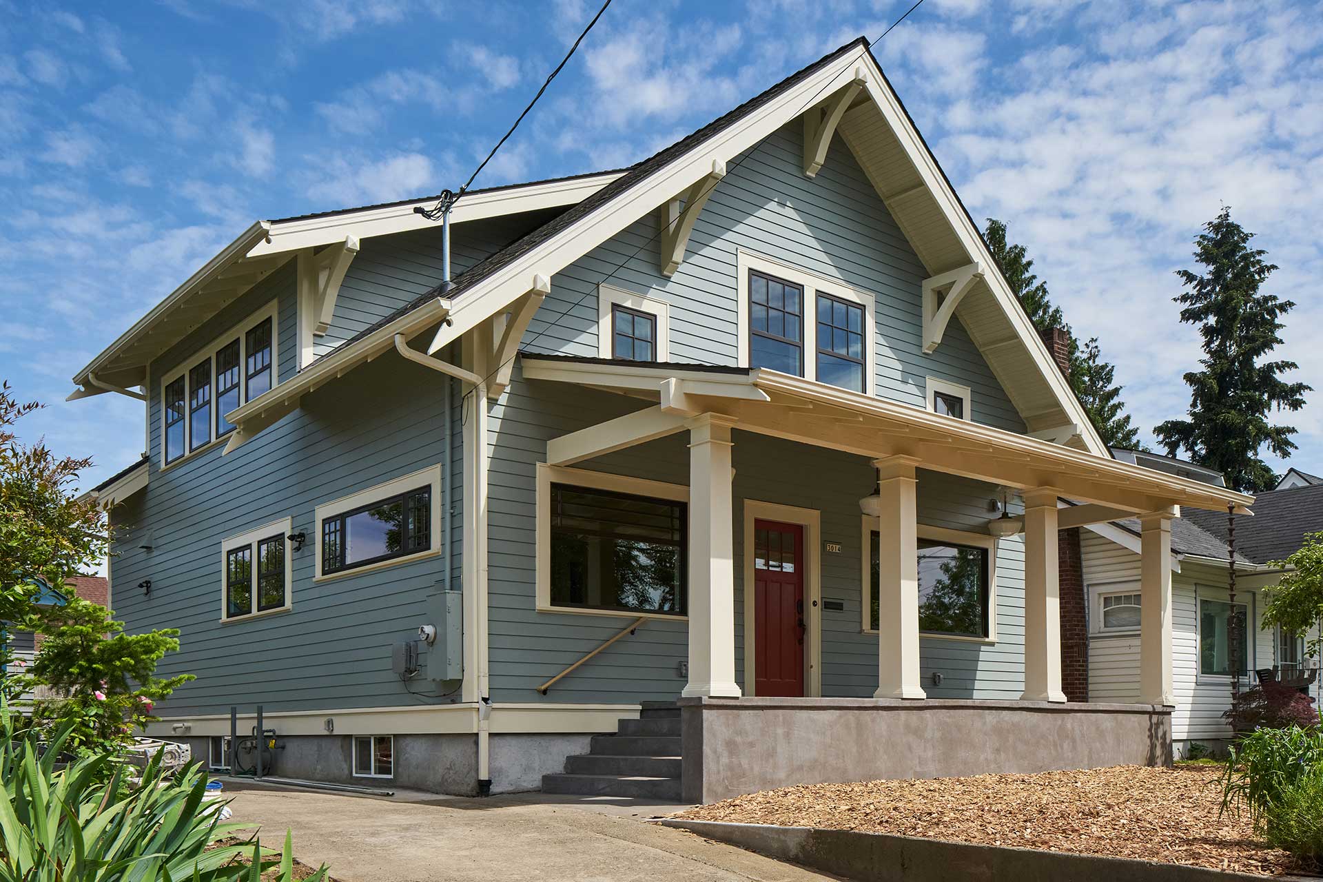
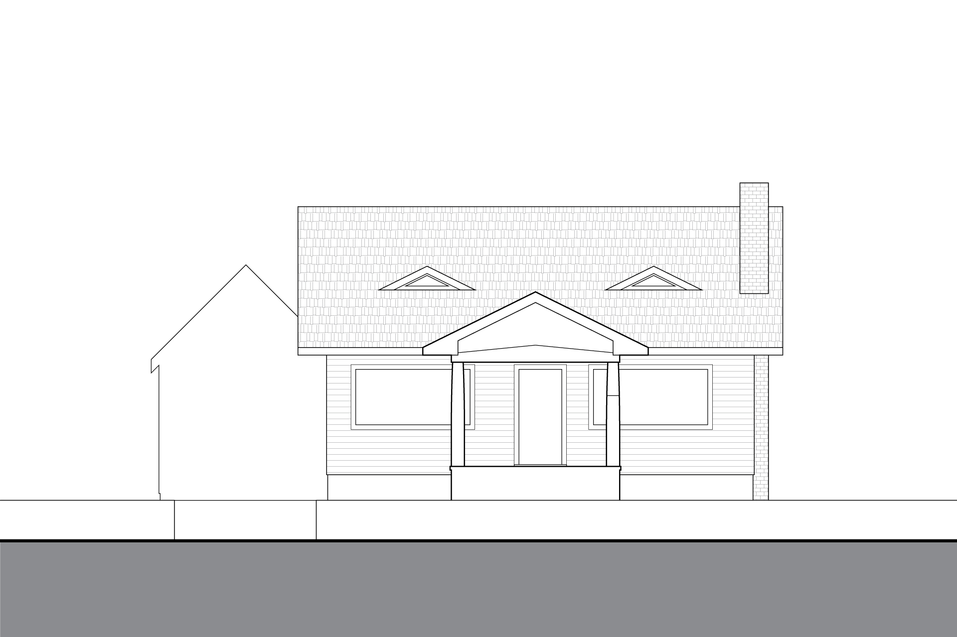
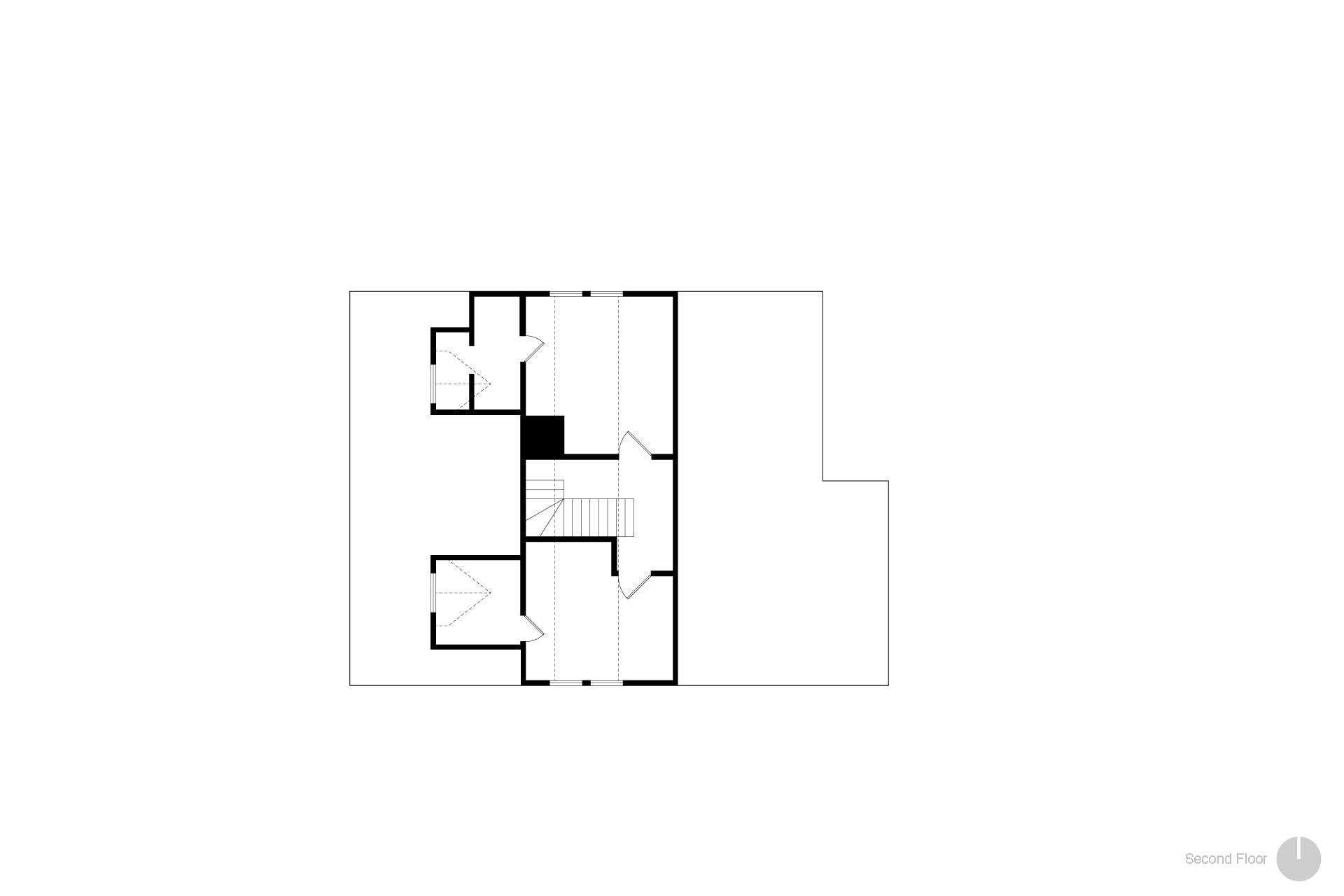
In this case, the remodel involved removing the roof and gutting the structure down to a few first-floor walls. A home with two full stories plus a basement took its place.
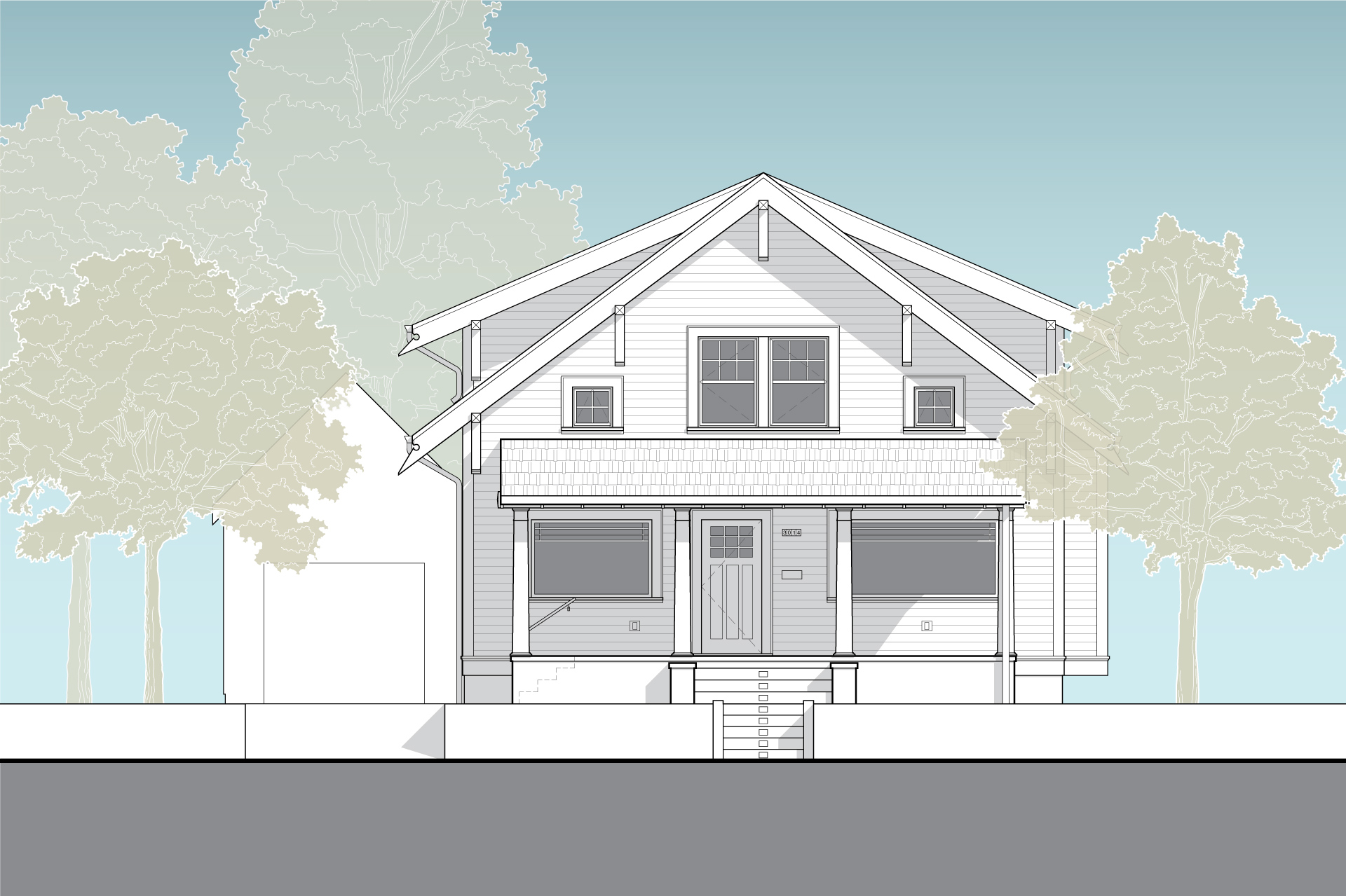
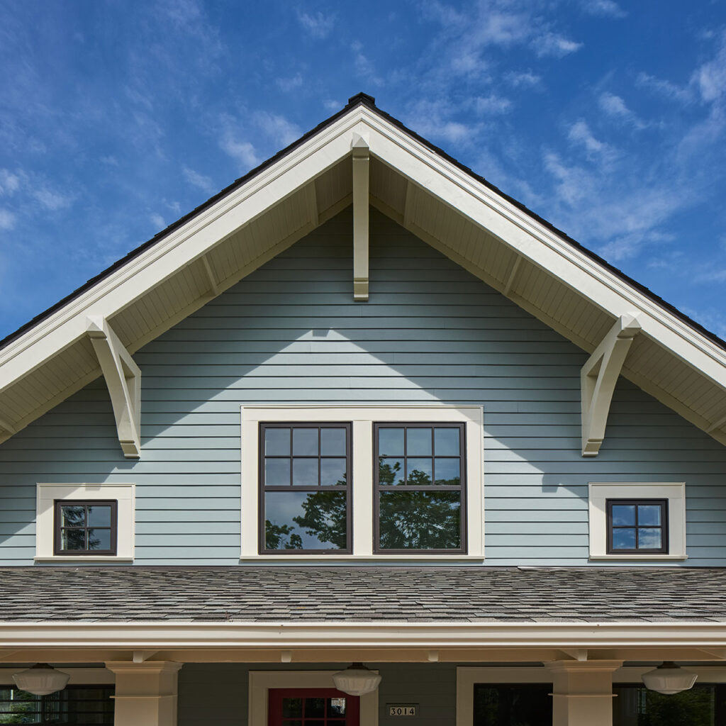
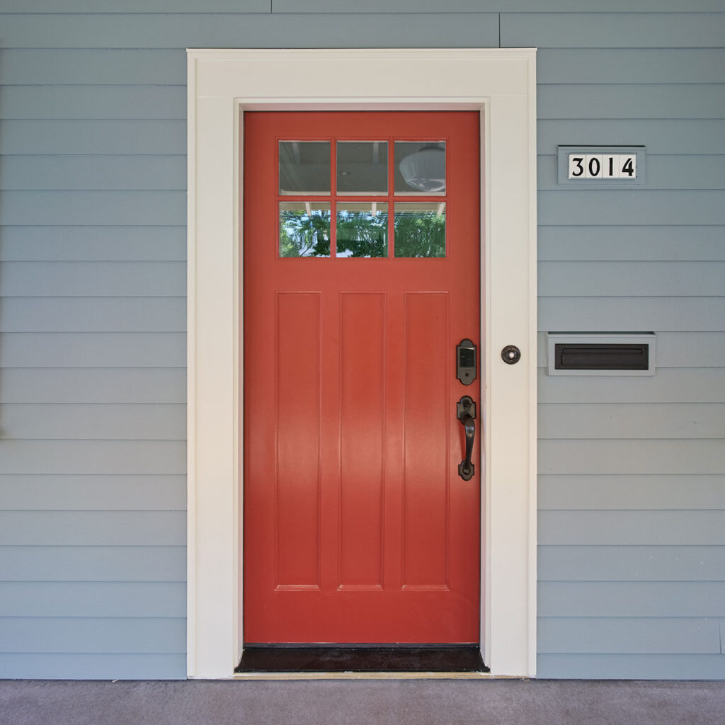
The exterior design features a full front porch, tongue and groove soffits as well as barge board brackets, and lap siding. These details reintroduce the bungalow to the urban neighborhood with a distinct street presence.
Other notable exterior design elements include divided-light windows with the same pattern as the original house. Additionally, custom rafter tails created in honor of her beloved complete the design.
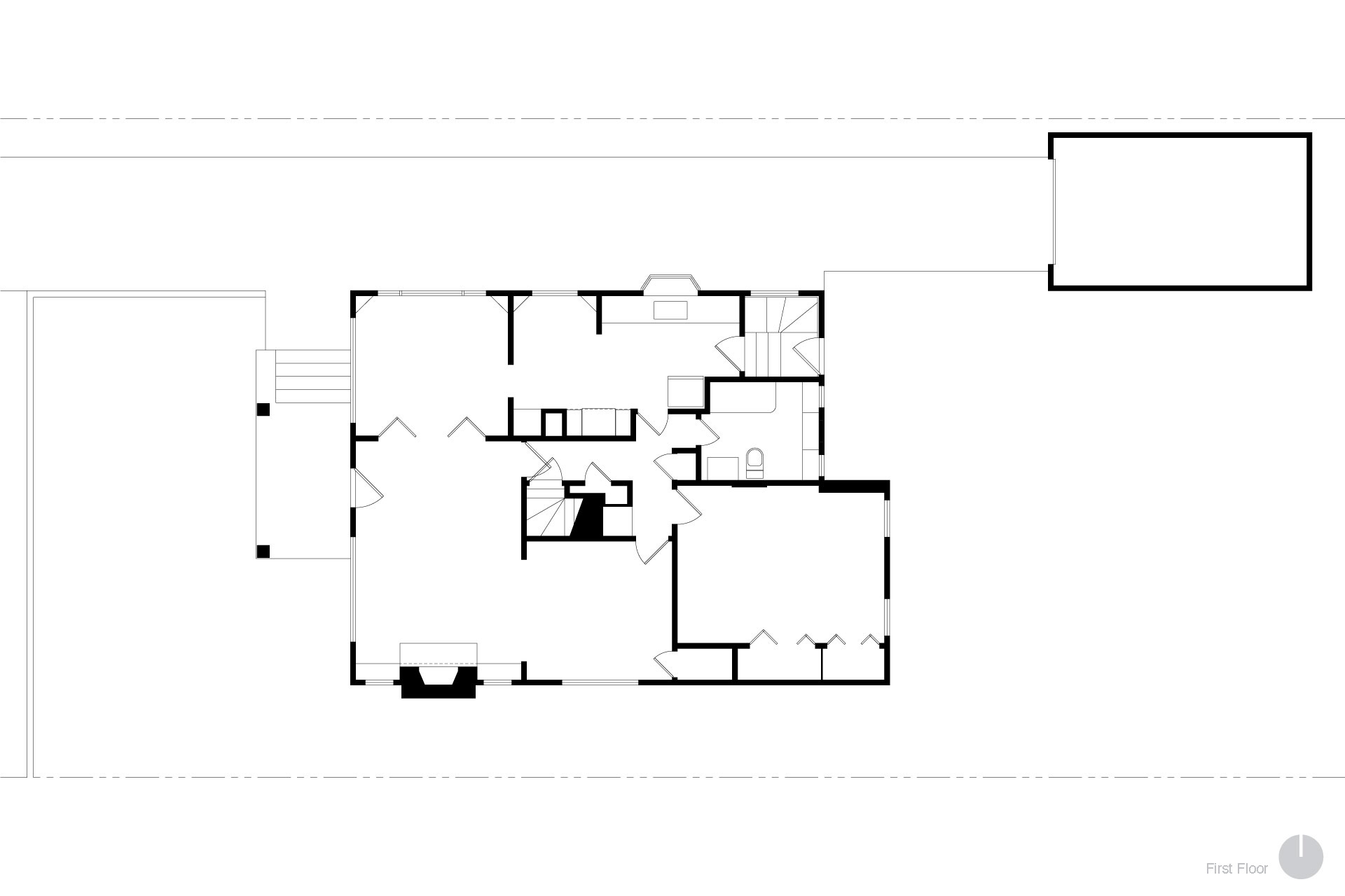
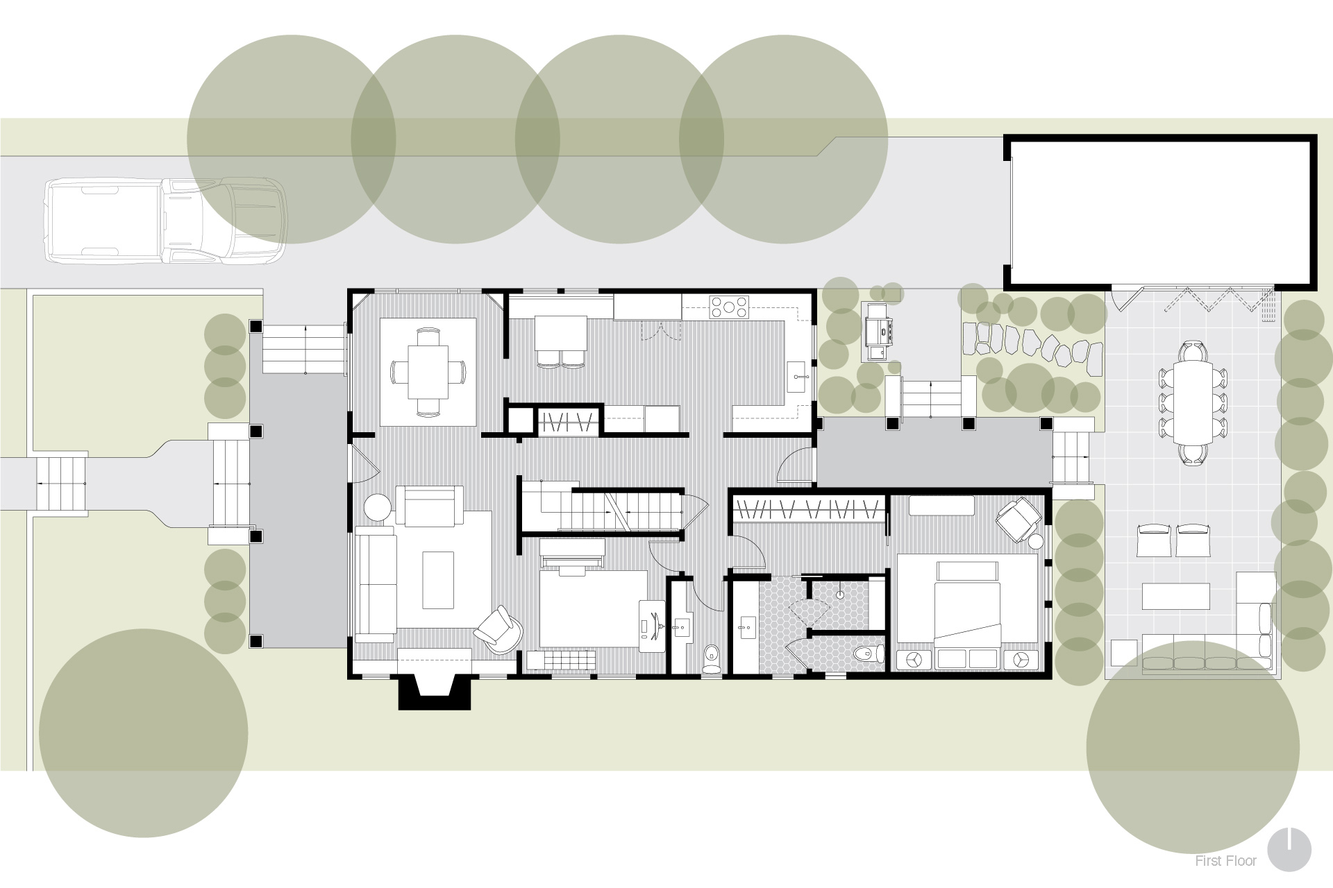
The interior highlights include a fully reworked first floor plan as well as an addition at the rear of the home for a new primary suite. Designed to accommodate aging in place, the remodel offers ample space and a more accessible layout. Asa result, Irene now lives her daily life on the home’s main level.
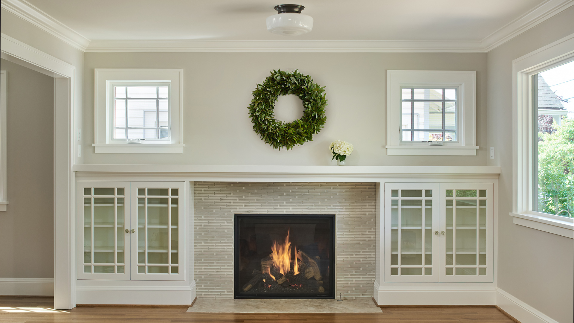
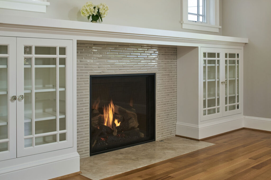
Equally important, finishing touches maintain the Craftsman charm while supporting modern living. For example, the living room features a gas fireplace with an Encore Ceramics tiled surround and classic painted built-ins.
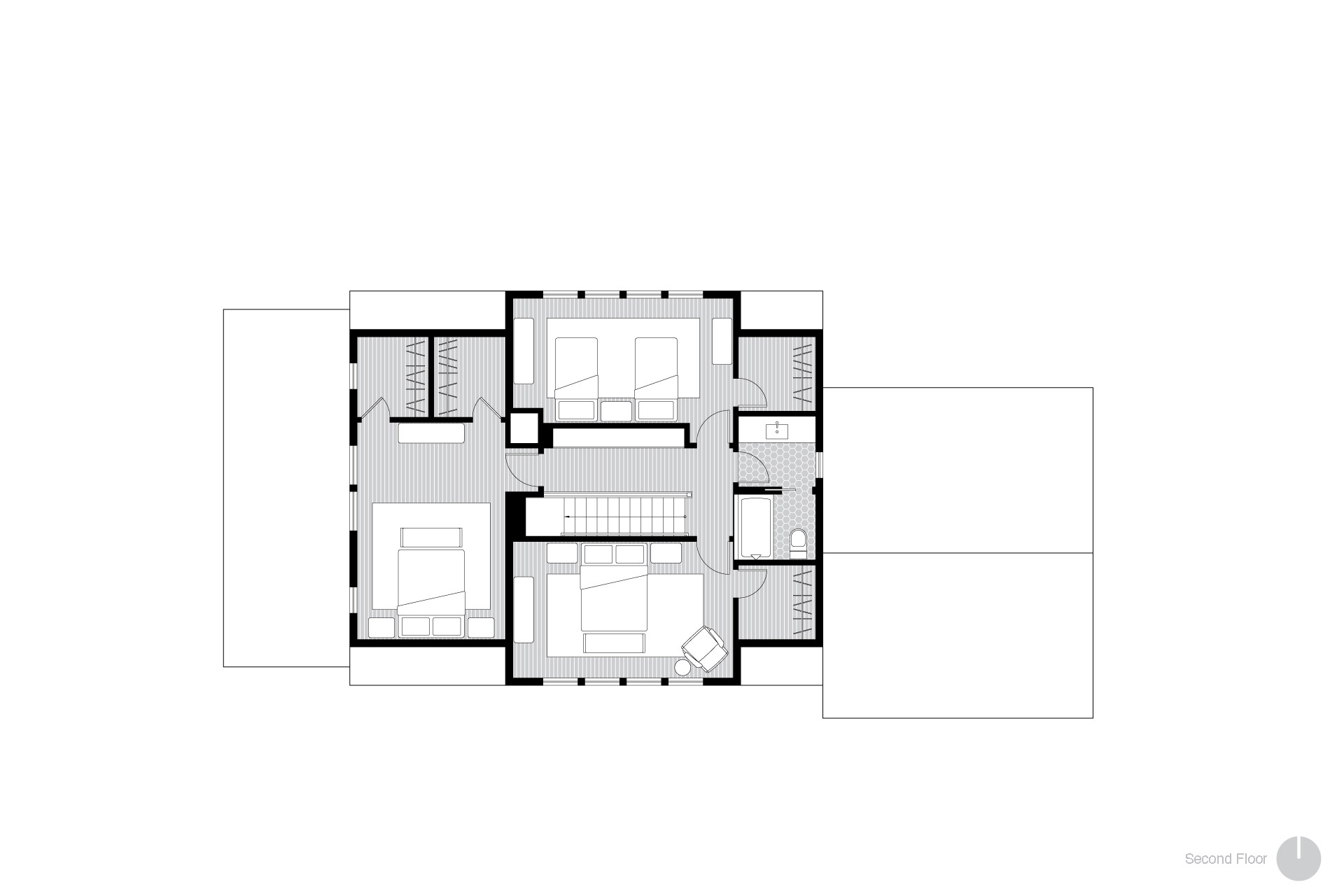
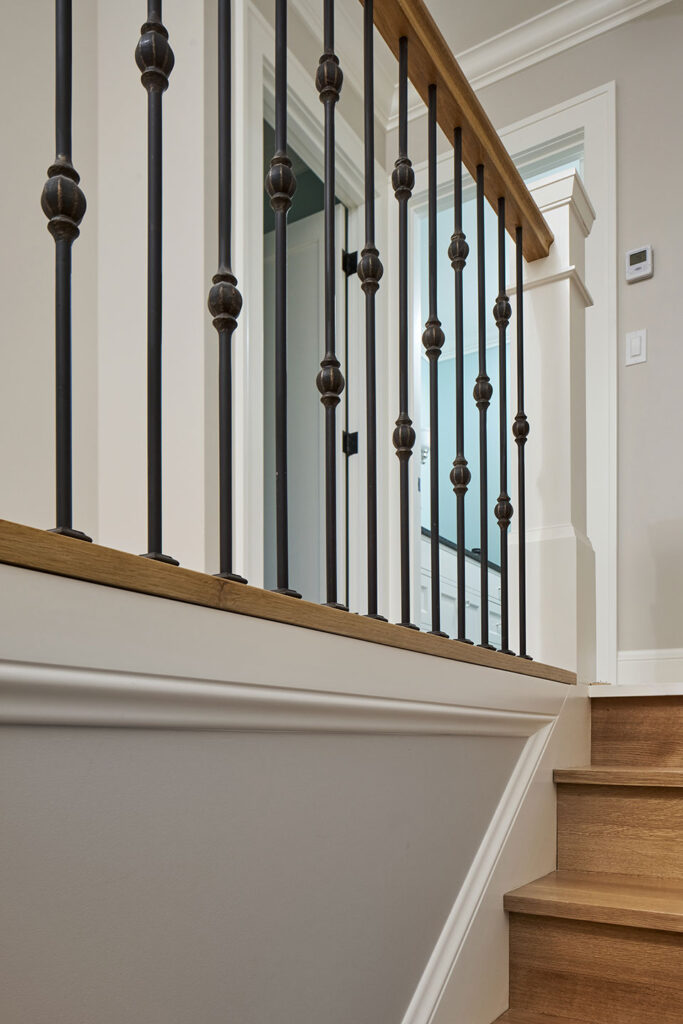
By gutting the home and raising the roof, the existing attic space became a livable second floor. It accommodates three bedrooms and a full bathroom—the perfect place for visiting family. Additionally, a code-compliant stair replaced the existing steep (dangerous!) staircase. Decorative iron balusters with a white oak handrail round out the look. The open design maintains a desirable connection between floors.
Craftsman detailing and character feature throughout the home.
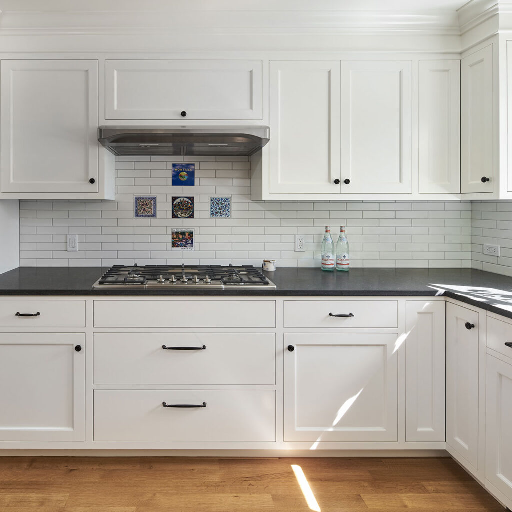
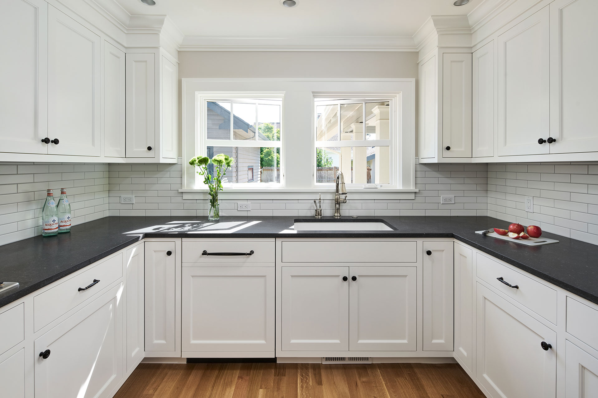
The new kitchen focuses on clean lines and simple details. White-painted, flush inset cabinetry contrasts with black quartz countertops. In addition, the crisp white subway tile backsplash highlights Irene’s trivet treasures, a collection from her many travels.
Natural light floods the kitchen via windows that provide views to the backyard.
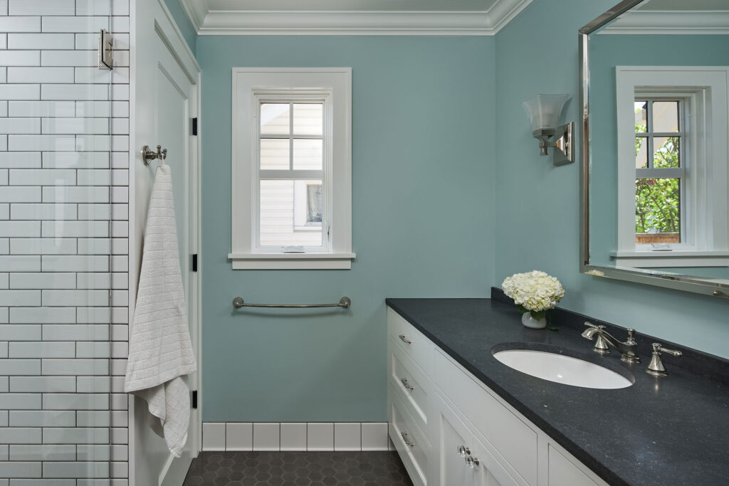
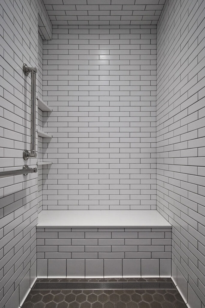
The primary suite remodel includes a fully accessible bathroom to truly address aging in place. Well-appointed and packed with function, the space includes a walk-in shower with a bench seat and grab bars, and a sauna too. Finally, the tile details and polished nickel finishes elevate the aesthetic of the accessible features.
While designed to support Irene’s daily living, the future functionality of the home remained top of mind. Her son Josh, who will inherit the home someday, supported every step of the process.
“Lisa has the skill to understand a client’s desires and make them a reality. My remodel accommodates aging in place perfectly.”
Irene B.
Homeowner

