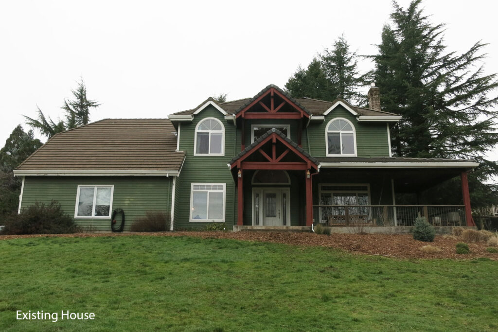
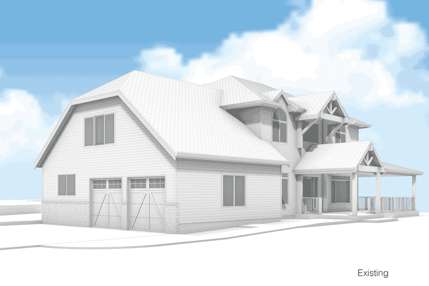
A house on a hill should be a beacon of architecture, not an architectural eyesore. This 1990s West Linn house needed an exterior facelift to live up to its prominent position. Here is how to make an ugly house look good.
Defining a style
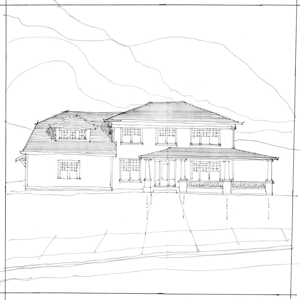
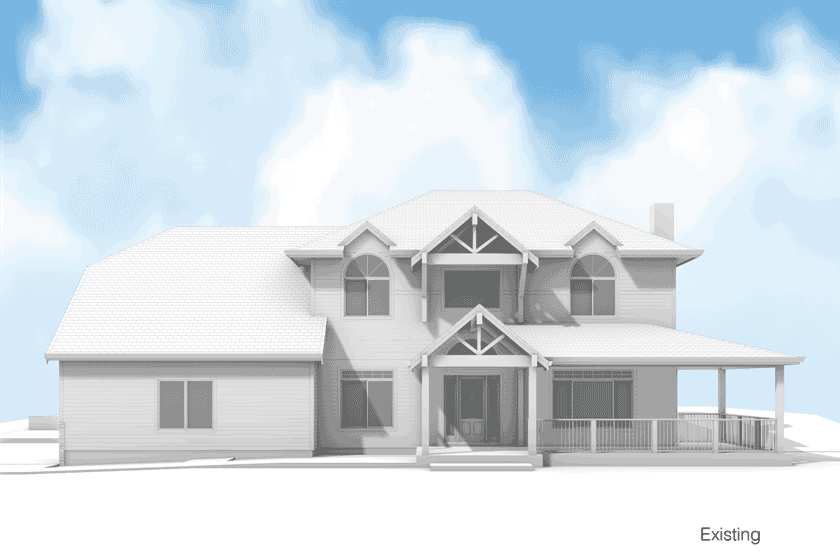
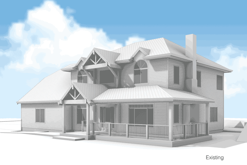
Good architecture provides thoughtful organization and a sense of style. However, this home lacked all of the above. It mystified us with a little bit of everything. Imagine if someone went to the sale section at Home Depot and bought a bunch of stuff and put it all together. The house lacked cohesiveness, from the numerous window shapes and sizes and lack of exterior detailing to the mismatched roof.
What was the intended style? It was impossible to identify, so we gave it one. Since we needed to maintain the large hipped roof, we proceeded with the design principles of a Foursquare Craftsman. Selecting this distinct style guided the remaining design decisions.
Starting with the porch
While a hipped roof provided the prominent feature of the original house, the complementary hipped porch roof included a questionable gable. Then, for reasons unknown, the original team added another porch roof above that! And don’t even get us started on the little ‘cat ear’ things on the eaves and the 1990s deck-style guardrail. What should be a welcoming entry point lacked any enticing detail, including wimpy 8×8 posts for columns.
So, to point the new architectural style in the right direction, we removed the upper porch roof and the cat ears. In addition, we eliminated the gable at the lower porch roof and made the entire roof a hip. Not only did this look better, but it also allowed us to improve window sizes and placements. Next, we adjusted the guardrail to a 24” height. This is more typical of a traditional Craftsman and provides a place to sit. Last, we updated the porch columns to reflect the traditional Craftsman style and added layers of detail and trim.
Right-sizing the windows
When no two windows are alike, one might think there was a sale at the window store. First, the slider windows were not appropriate for a traditional house. Next, the arched windows didn’t even make sense. Then, the second-floor window placement failed to align with the first-floor windows. Last but not least, the windows were undersized for the scale of the house. In addition to creating a displeasing exterior aesthetic, it impacted the interior. The spacious interior rooms feature tall ceilings, so small windows look awkward.
Our strategy for correcting the window situation started with selecting all double-hung windows. This is the appropriate style for a Foursquare Craftsman. (Note: In the areas where we needed egress windows, we used casements but configured them to look like double-hung windows.)
To create regularity and rhythm, we specified a uniform window size. Including divided lites in each window adds familiar details to reflect a traditional style and provides visual interest. Since we got rid of the dopey gable roof on the porch, it allowed us to make taller windows in the middle part of the upper floor and line up the sills. Finally, by aligning the second-floor windows with the first-floor windows, we achieved a more cohesive facade.
Dormers can make a difference
The big blank roof over the garage created an overwhelming sight. Furthermore, the playroom inside didn’t have a view of the front yard. Adding a dormer with windows and divided lites visually breaks up the large hipped roof. This added detail improves the exterior while allowing more natural light into the playroom and making it a room with a view.
Siding, details, and trim
The list of unsightly facade details is long: fake stone on the garage door wall, a big blank wall over the garage doors, insubstantial door and window trim, and ugly fascia-style gutters. The exterior lacked detailing and interest and included elements more appropriate for a more modern or commercial building.
To rework the unsightly exterior, we started by removing the fake stone on the garage door wall. Then, by adding a cantilevered awning with custom wood brackets over the garage doors it helped break up the large blank facade. This detail also provides some coverage from the elements at the garage door opening. Next, we added 1×6 trim and backband at all doors and windows and chunky 2” thick wood sills. Integrating a cornice detail, consisting of a 1×12 with bullnose trim, around the top of the house, under the eave adds texture, detail, and shadow lines. This element creates a ‘cap’ for the building. New gutters in a traditional K-style provide some shape and detailing as a finishing touch.
Improved energy performance
All of the exterior work, including replacing the siding, provided the opportunity to improve energy performance with insulation on the exterior of the house. If you’re going to replace your siding, this is the one and only time to add exterior insulation. It is a HUGE improvement to your home and you will likely never have the opportunity to do it again.
An exterior facelift provides more than just curb appeal
This exterior facelift illustrates how details matter. There are a lot of products out there, but one house shouldn’t incorporate as many as possible. Good architecture makes sense. It offers order and style to achieve a visually pleasing and functional home, inside and out. If your exterior leans towards ugly, there is hope. Give us a call to explore exterior facelift possibilities—and how they may improve the interior of your home as well.