Visit our website on your desktop for more project info.
This 1950’s daylight ranch in Vancouver, WA was living in the past and needed a mid-century home remodel. It had wacky details inside and out and outdated finishes everywhere. Additionally, all of the nooks and crannies had become storage for this avid outdoorsman. Bikes, hockey sticks, and skis were creeping into every space—the clutter was overwhelming. It was time to turn this closet back into a home—a house perfectly suited for the modern outdoorsman.
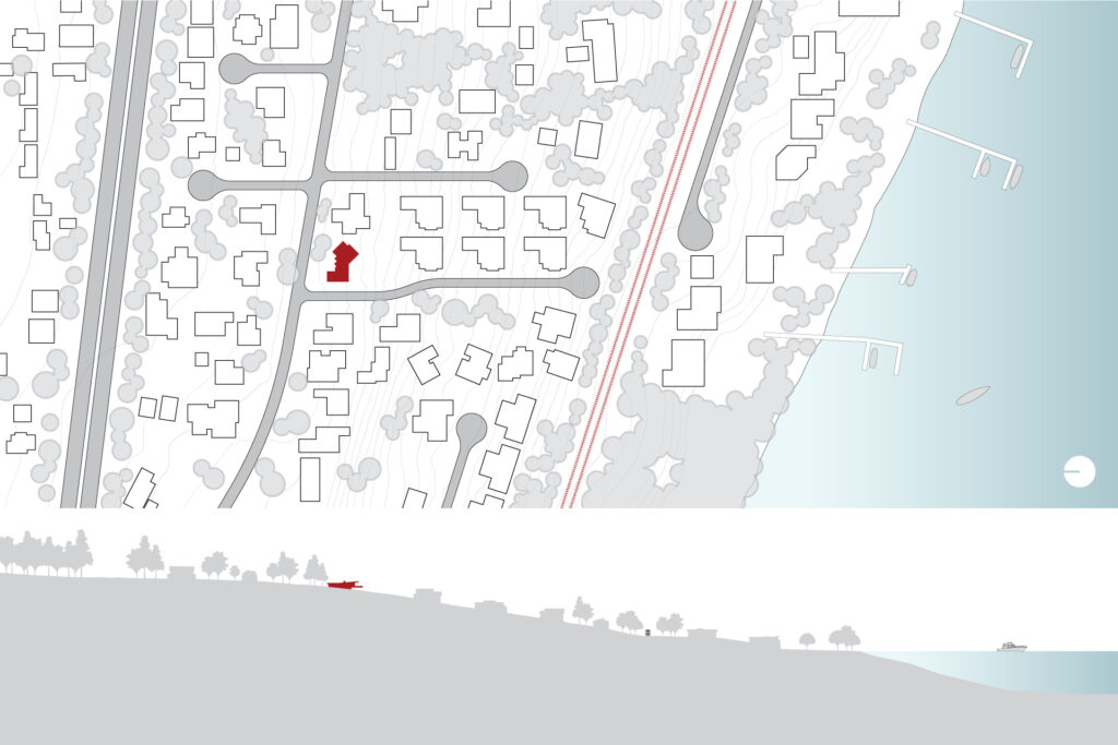
Exterior and interior updates improved the look and feel of the home. From a welcoming entry to proper storage spaces, every aspect of the first level received a makeover.
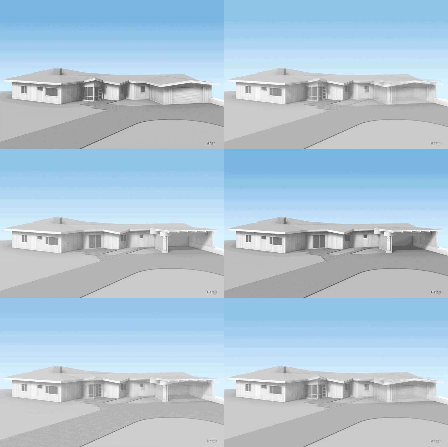
Exterior renovation work included an addition at the front door in order to make the interior space function better. It had the added benefit of making the entry more visible from the street. Additionally, the removal of the old carport and construction of a new garage created a secure space for all that gear!
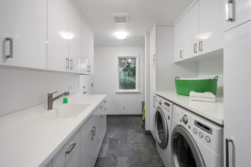
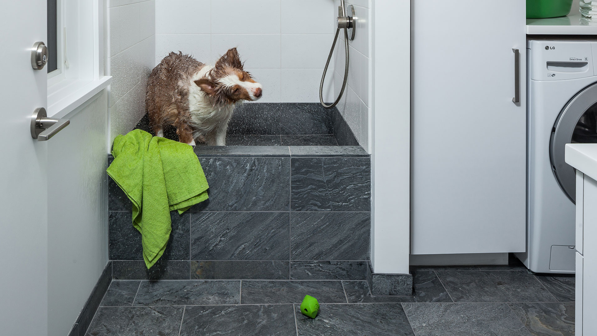
Access from the new garage leads directly into a mudroom built to withstand everything this outdoorsman throws at it. It includes a utility sink for washing gear and a man’s best friend, as well as a washer and dryer and plenty of storage and counter space.
Finish selections, including natural slate tile, custom RTF cabinets and solid surface countertops, support the heavy use of the space while keeping the room light, bright and easy to clean.
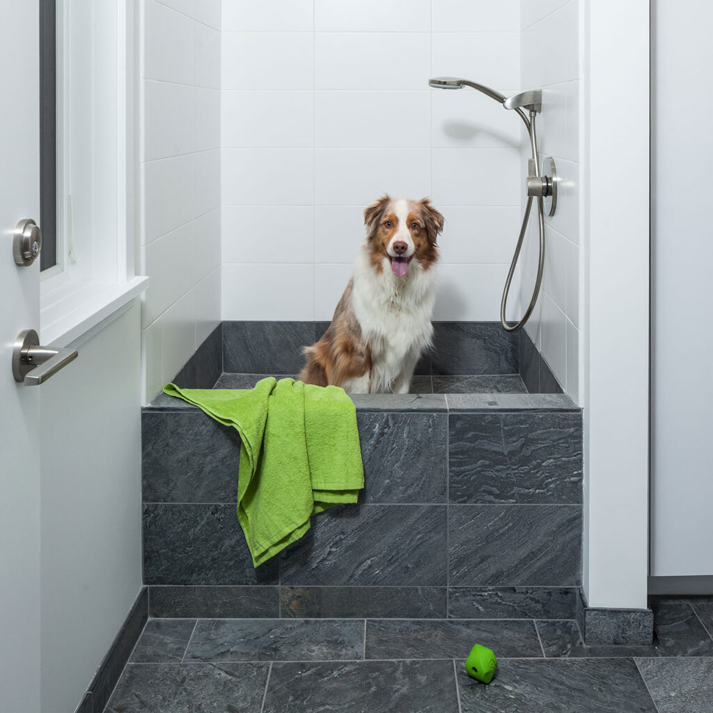
What dog would say no to bath time now?
This utility sink makes life easier in so many ways. The elevated height means dog washing is not a back-breaking chore. Bath time essentials are right at hand, which minimizes any dog’s escape plan. And finally, it is the perfect place to rinse out all that gear, with a convenient hanging rod for those drip-dry items.
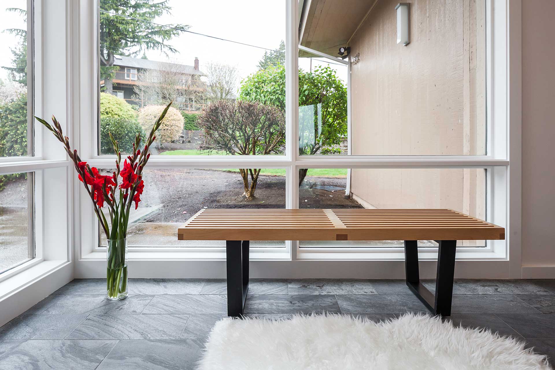
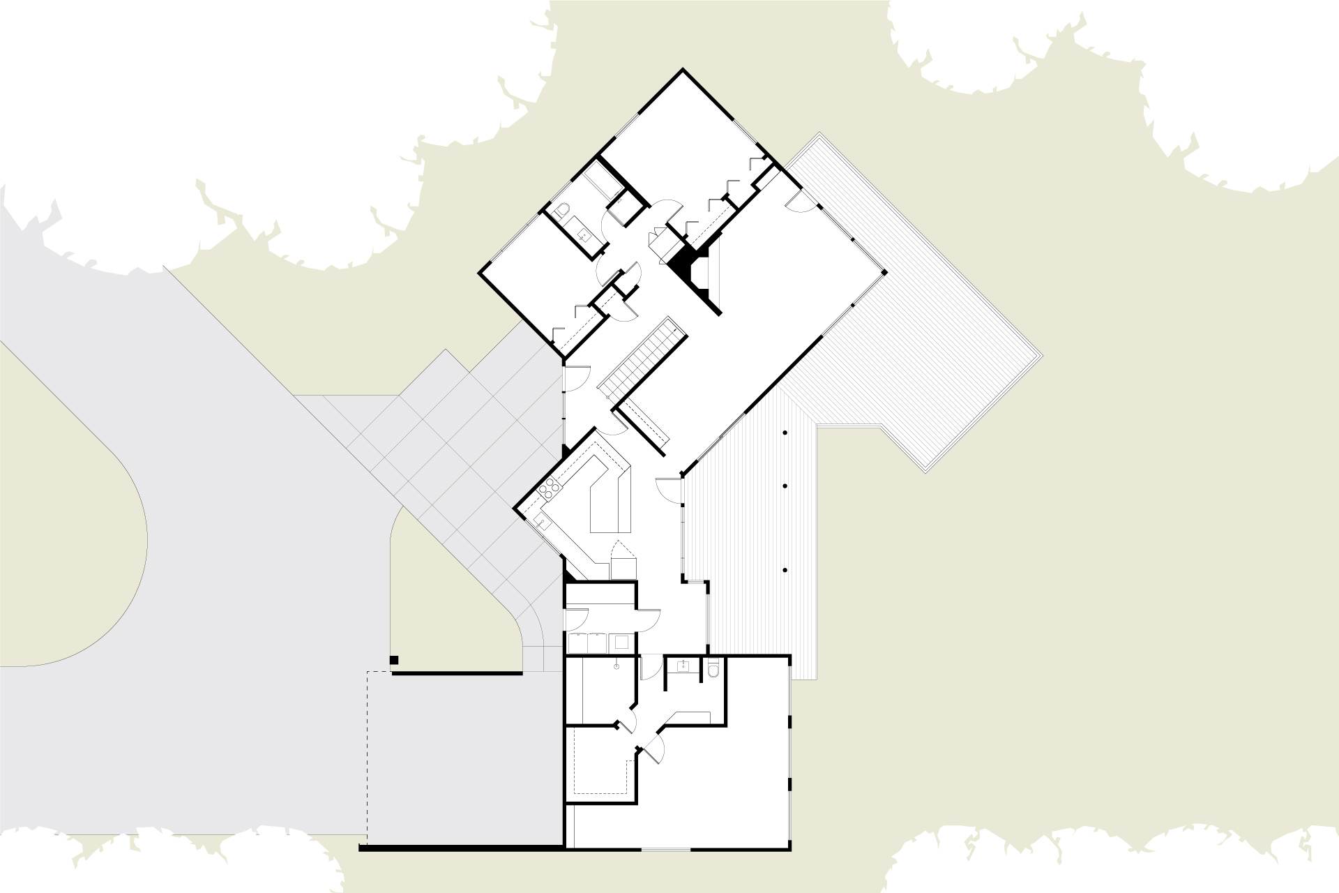
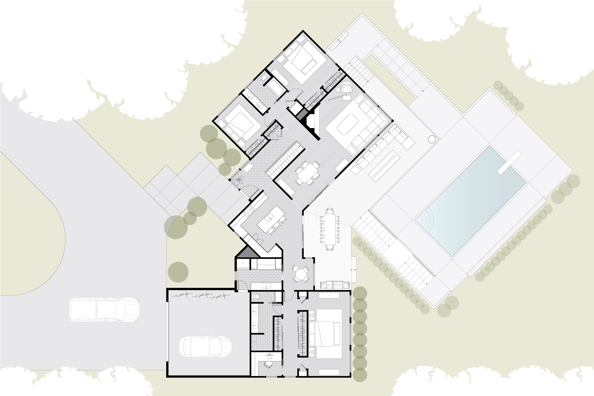
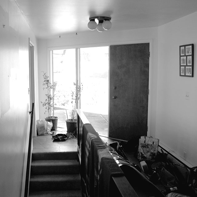
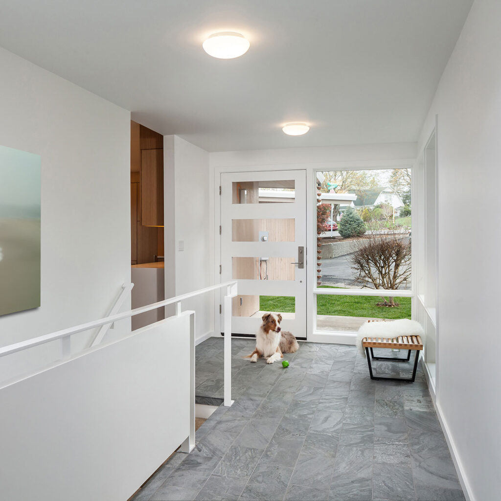
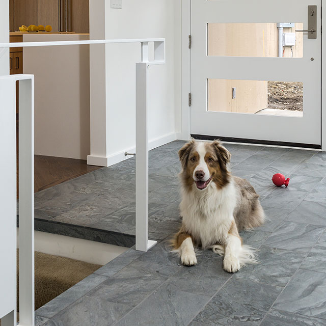
Thoughtful planning eliminated awkward spaces and improved the flow of the home during this mid-century home remodel. The reworked entry provides a welcoming sense of arrival and more space to safely maneuver around the staircase.
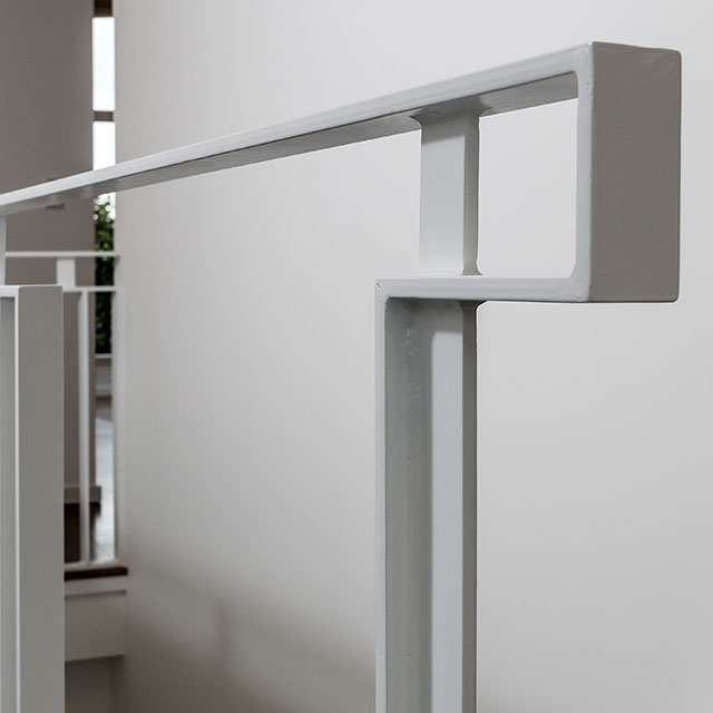
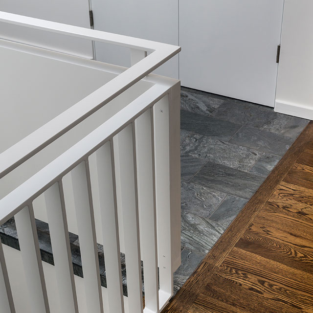
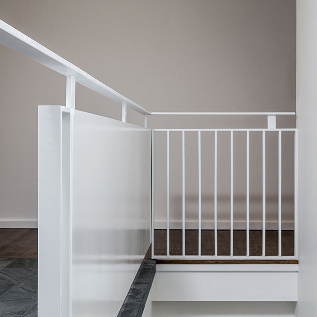
The new front door and window walls flood the area with light while the redesigned staircase makes a statement within the space. A new custom steel guardrail has a sculptural feel. The clean lines and white finish add to the modern appeal of the updated space, and the shimmer of the silver slate floor provides the perfect accent.
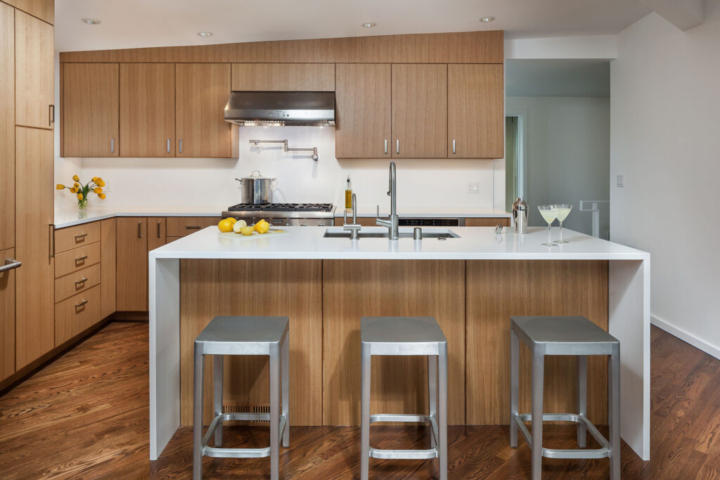
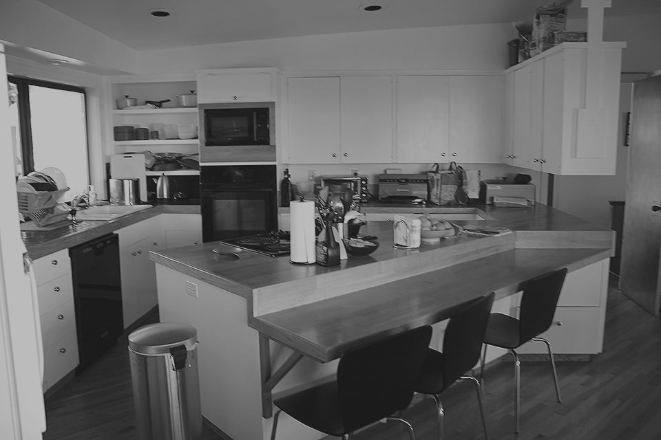
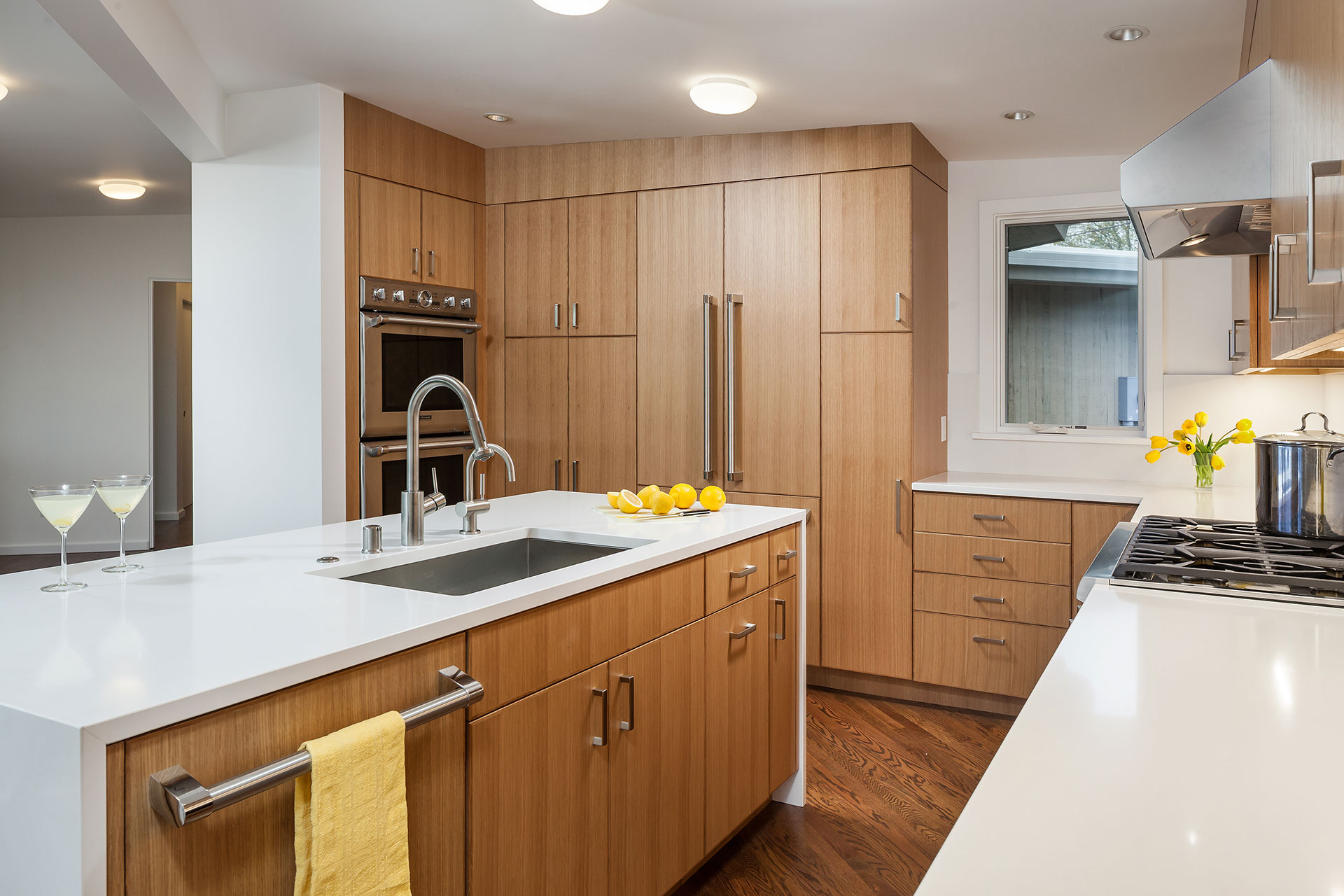
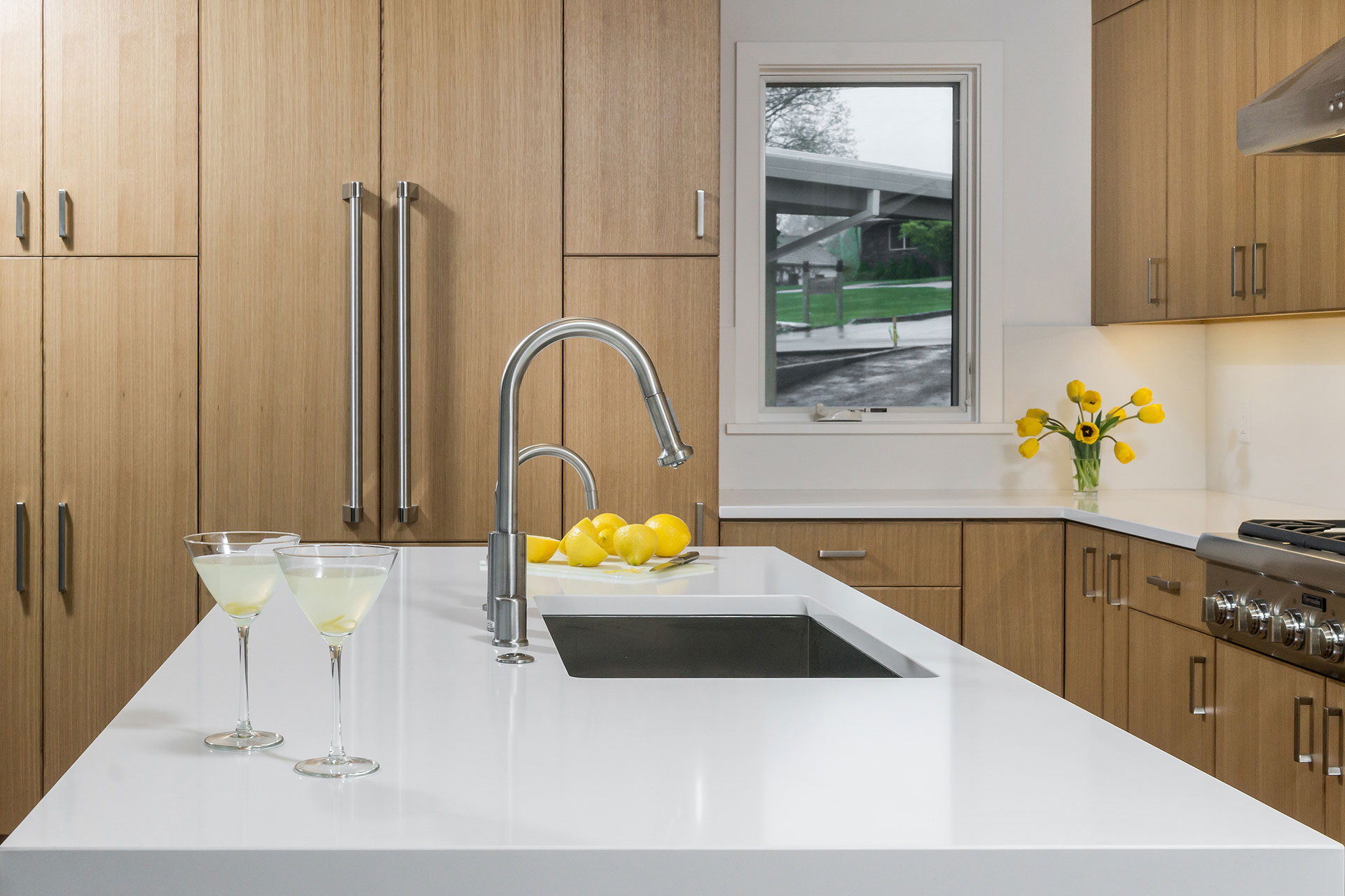
The renovated plan eliminates obtrusive angles in the kitchen. A floating island improves the workflow and makes the space more inviting. Further, an enlarged doorway opens the kitchen to the dining area.
A dark stain applied to the original oak floors complements the rift white oak cabinets and ties the space into the rest of the first floor. The warm wood tones of the cabinets paired with white quartz counters creates a distinctly modern aesthetic.
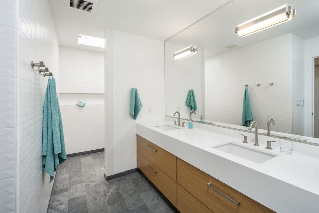
Prior to this mid-century home remodel, the primary suite was a space planning mess. Thoughtful reorganization turned it into a well-organized private oasis. It now includes areas for sleeping and bathing, ample storage, and even a quiet work nook.
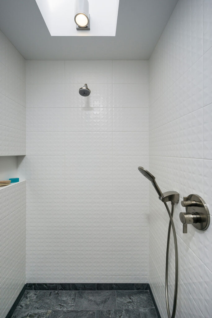
The sleek design of the bathroom features a walk-in shower with the signature silver slate tile. A large format ceramic tile wraps the space in an appealing geometric texture while rift white oak cabinetry and white quartz countertops complete the look.
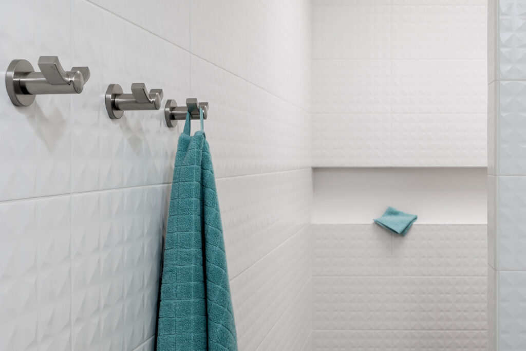
A skylight infuses the shower area with natural light.
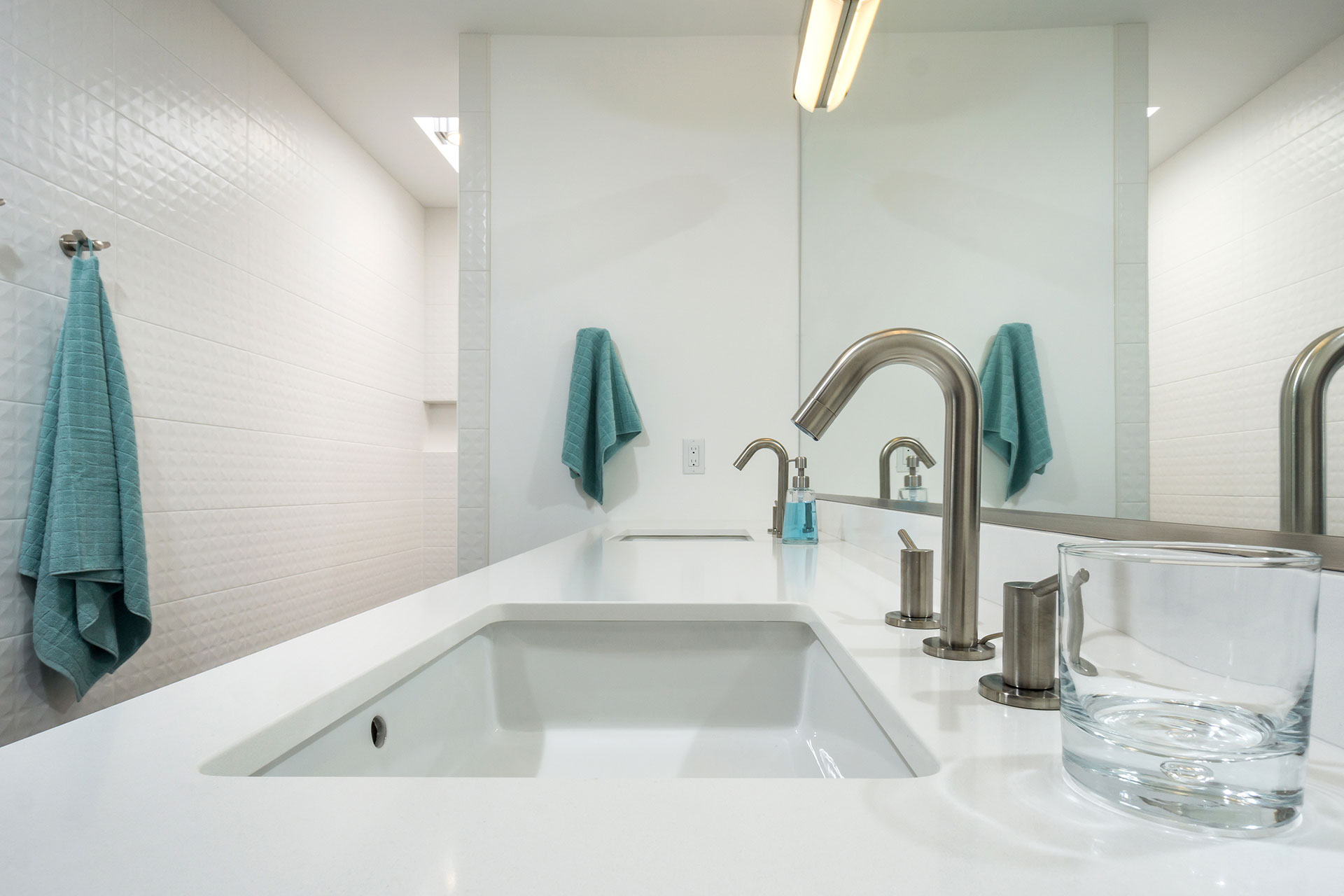
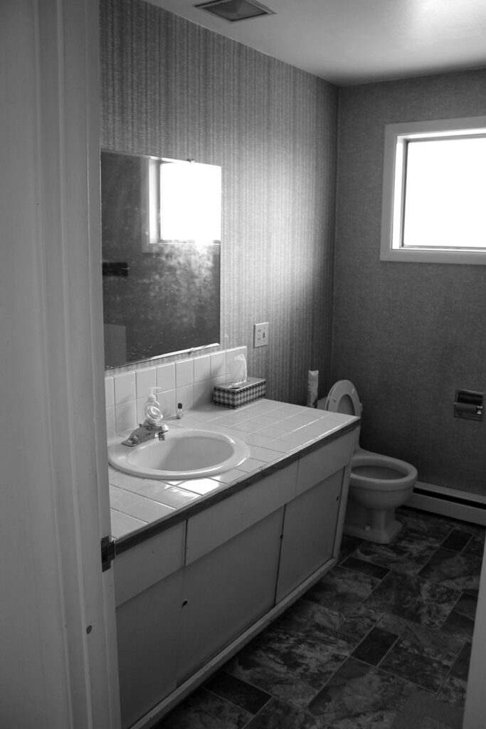
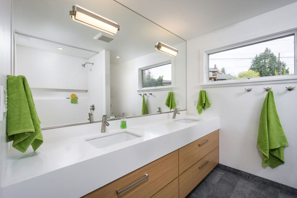
The remodel addressed every inch of the first level, including the guest bathroom. Another space infused with light and elevated with a clean, fresh palette.
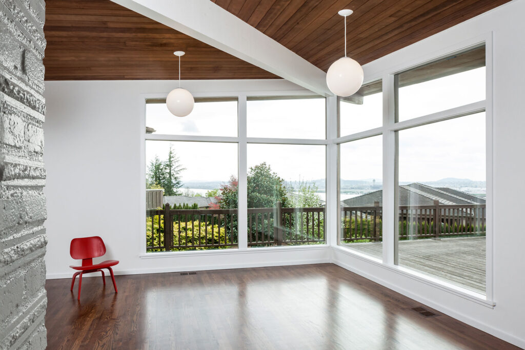
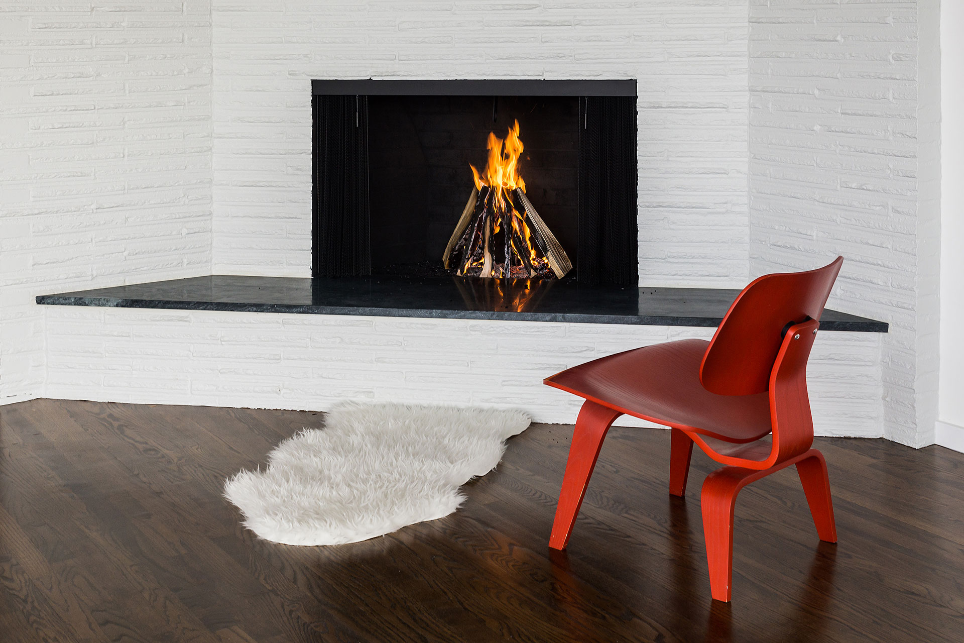
The living area takes advantage of dramatic window walls. A fresh coat of paint, updated lighting, and a new fireplace hearth transform the room—simple updates with a big impact.
